Once upon a time a man called Lewis Carroll wrote a fantastical story about a girl called Alice… Now the launch of Disney/Tim Burton’s 3D film has catapulted the classic tale of Alice In Wonderland into the marketing stratosphere with brand owners jumping on the hype and linking everything from fashion to food to the Alice publicity machine…
Branded products launched to coincide with a film release have become hugely popular and are a potentially lucrative – but short-term — money spinner. Great for brand visibility by association but often just a way of telling and help promote someone else’s story. And this got me thinking about the role of storytelling in packaging.
Storytelling is, of course, a timeless art and a powerful way of connecting with people. And many brand owners see their packaging as a great platform from which to tell their story. But not all stories are compelling. Some are tedious, unbelievable or just irrelevant. Or worse still the story becomes someone else’s story. The moment you adopt someone else’s story you often weaken your own and lose authenticity and credibility. And this can be the danger when you opt for what is essentially movie merchandising rather than a great packaging design that coherently and creatively tells its own story.

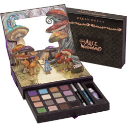
But, there are exceptions to every rule. Whilst it is, of course, aligned to the film, Urban Decay’s new Alice In Wonderland Book Of Shadows eye make-up palette is a perfectly designed packaging interpretation of the story with its pop-up scene and fantastical illustrations. But, more importantly, it is perfectly in keeping with the brand heritage and growing portfolio and the vastly different but still darkly gothic and illustrative style of UD’s previous Vol I and Vol 11 Book of Shadows.
And that is the crux. There are many ways to tell a story. But the best way will be your way. At the heart of a compelling story is a universal truth and all brand stories should focus on their fundamental truth. Otherwise the story simply becomes at best an entertaining distraction. And packaging design has the power to tell a story that is so much more evocative.
Memorable brand stories are the ones that are able to break out of the category style. But more than that they are able to develop an overall narrative across everything they do using the whole pack – graphics, typography, words, material, shape, symbol and texture — to bring that story to life in a desirable way.

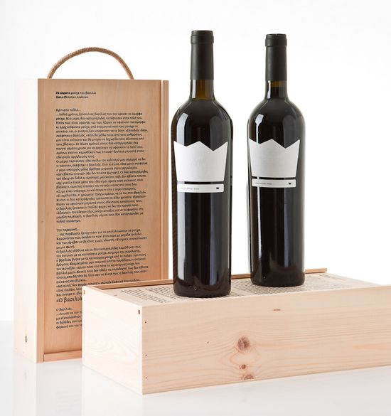
Interestingly Greek wine brand NAKED KING – with a name prompted by its positioning as a premium new wine free from filtering and chemical treatment — has also aligned itself to a classic fairy tale (‘The Emperor’s New Clothes’) but is using the tale to reinforce its brand truth and positioning rather than relying on this recognition to lead the communication. The label is shaped like a crown with the name embossed rather than printed to show a king without anything on. The completely plain wooden box has the children’s story printed in in big child-like font with the words ‘the king is naked’ highlighted. A new and distinctive visual and written narrative that is refreshingly unique.
Tell a story, re-tell a classic story if you so wish…but find a way to tell it in your voice.
Jonathan Ford, Creative Partner Pearlfisher