We’re still talking about being ‘good’ and, ergo, wanting to do ‘good’. But what is the definition of goodness? It now seems that the goodness remit is so wide, how do we know if we are really doing good? The design news week on week is full of ‘good’ brand initiatives and campaigns: Coca-Cola’s Replenish Africa Initiative (RAIN) “Water for Schools” and the Avon Foundations donation to the Fund for Global Womens’ Leadership to name just two featured this week…
Of course, we applaud the profile of these big campaigns and the difference that they are looking to make. But, to be truly good, we can’t just pay lip-service to goodness with a public display. We need to look at not just everything the brand says but everything it does and delivers. And what better way than by putting the ‘good’ brand in the hand. Time to better focus on – and applaud — good brand design and packaging?
The new Galaxy ad campaign focuses on their link with the Rainforest Alliance and the packaging that now bears the Rainforest Alliance Certified seal. A step forward. Yes. But what about the whole 360 degrees holistic brand experience? I can’t comment on Galaxy’s packaging credentials and the materials used but the crux is that goodness can’t just be stuck on. It needs to be integral and about the whole thing – ingredients, people, process, provenance, the retail environment, and the all important emotional factor…It’s about taking the worthy and making it also seductive and desirable and this is where design – as the key consumer touchpoint – has the power to become the true visual representation of goodness.
The challenge to designers is to consider the totality of the packaging as well as considering recycling, convenience and environmental issues…Here’s a few favourite good designs…
We have been inundated with so many new water brands and so many associated with good causes but all this water is still depleting our most precious commodity. How do we choose the most good?
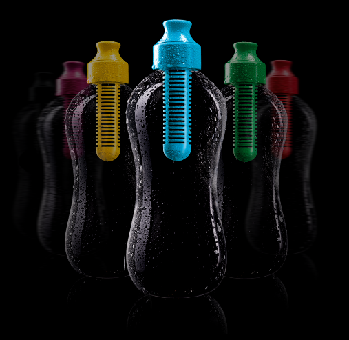
Enter The Water Bobble designed by Karim Rashid and produced by Move Collective LLC. A stylish patented water bottle that filters as you drink – it does good by giving great taste, saving money and by being both reusable and recyclable. But not only does it do good — it also looks good (and different).
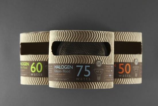
Mongkol Praneenit’s light bulb packaging for General Electric summarises goodness as well as it can…The design is simple, effective, and eco-conscious and entirely suitable for General Electric’s new high-performance, low-carbon footprint light bulbs.
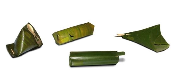
And what about ‘good’ take-away packaging. Today, most disposable goods are wrapped in man-made, often petro-based materials that usually last far longer than the items they protect. Israeli designer Tal Marco’s design uses die-cut banana leaves that are flexible and easy to fold into numerous forms, the waxy surface is ideal for food application and they lend themselves well to many retail applications – as well as giving scope for ingenious brand design solutions…

It’s about putting design at the top of the good agenda – designing out the bad and designing in the good – and building good values at the start of the creative process to ensure that successful and desirable ‘good’ brands are delivered for the future.
Is your brand really good (enough) to go?
Jonathan Ford, Creative Partner Pearlfisher

