POPSOP Collections: Local package design. Part 1 — Argentina.

Brand comment:
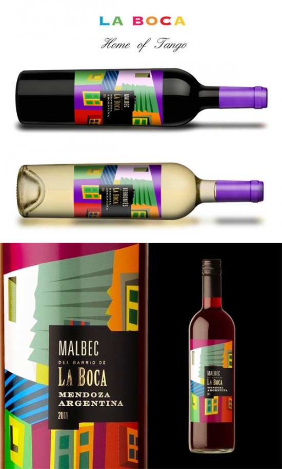
La Boca is an icon of Argentinean identity, with a strong international transcendence in several aspects: historically, culturally, and artistically (Home of Tango). For this reason, it was chosen as a resource of visual communication to express the essence of our young, fruity and un-oaked wines.
Designed by Argentinean graphic designer and branding expert Guillo Milia.
II. Juice Meds+

Brand comment:
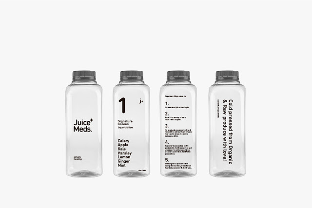
Celery, apple, pineapple, parsley, beet, lemon, kale, ginger, carrot, and mint tastes. Juice Meds+ help to cleanse our body from toxic substances that we consume from daily food. Cold pressed from organic & raw produce. Designed in a simple, pure and funny way!
Designed by the creative agency Empatia, Argentina.
III. Armanini Chocolates

Brand comment:
Diego Armanini is an argentine chocolatier who works with noble and premium products. The logotype was developed to communicate the simplicity and elegancy of the raw materials.
In the same path, the pursuit of an argentine identity was the thread that runs the development of the packaging.
Five chocolate varieties, five geographical regions and their wildlife. Five packs with the goal of transmitting the pride for the land, the importance of the native and the feeling of belonging.
Designed by Natalia Elichirigoity, Argentina.
IV. Winery | Gota Water

Design of a series of 500ml water bottles with illustrations of five neighborhoods of Buenos Aires. Limited edition.
For Winery Vinotecas.
Agency comment:
We have been asked to create the Branding and Art Direction for a new artisan chocolate brand.
We take a small bite of one handmade chocolate and the rest was piece of cake, we just translate our sensory experiences through our graphic design skills, combining colour, flavour, texture… result finally came out!
Bon appétit!
Designed by: Gladys™ Creative Studio, Nacho Saurí, Argentina.
VI. R-Osado De Santa Julia

Brand comment:
This new design illustrates the experience of a Bear flying a light aircraft and a couple of friends playing chess on the wings. This is a playful, allegorical and unreal situation. “OSADAS” is a play on words in Spanish between “R-osado” (rose colour) and “Osado” (daring). It is a bear taking daring actions.
This is a likeable and surprising label due to its creativity since it goes beyond the traditional lines usually found in this segment of wines. By means of this complete change of image, Santa Julia’s «Rosado» aims to attract attention of consumers, who not only praise the quality of wine but also value those products that stand out for the creativity in their image and the consistency between content and design.
Designed by Carolina Saguan, Argentina Mendoza.


