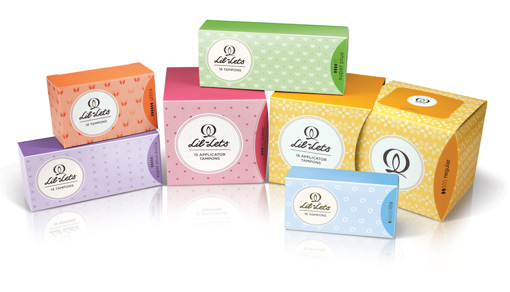
FMCG giants Kimberly-Clark and P&G should stay on their toes in the UK, as the competition for consumers’ hearts and wallets in the feminine hygiene segment is on the rise — with the re-launch of an independent femcare expert Lil-Lets, which is set to introduce the new look and feel of all its range as well as represent two new products.
London-based BrandOpus is the agency behind the brand’s strategic and visual overhaul.
The visual communication of Lil-Lets will be focused on discretion and femininity and implemented through the new Lil-Lets GEM icon on all packaging, deriving from cross cultural symbols for the Goddess, the Earth and the Moon.
Kate Jones at BrandOpus, says, “We have worked closely with Lil-Lets to design an identity for the brand which evokes the discreet and sophisticated world of beauty, cosmetics and fashion. We wanted to create a brand that would stand apart from its competitors by speaking from woman to woman. The GEM symbol is a confident and positive identity for the Lil-Lets brand, which evokes femininity and an understanding of all that there is to being a woman.”
Clodagh Ward, Director of Marketing at Lil-Lets, said, “At Lil-Lets we are passionate about celebrating femininity and all there is to love about being a woman. Working with the team at BrandOpus helped bring this vision to life, underpinning what we are all about, and what the GEM logo symbolises — that we understand and cater for all women’s needs in terms of sanitary protection”.
Photo: redesigned Lil-Lets packages
Another femcare ethical challenger brand Hallo, designed by Parker Williams and launched in partnership with Tesco earlier this year, along with Lil-Lets, is an example of a «feminine» brand with purpose and meaning.
