In line with current thinking, we have been seeing overall a very pared down and streamlined approach to design. Somewhat inevitable perhaps in an increasingly cluttered and competitive marketplace as a way of disrupting and creating difference through stylish simplicity. But, this move has also in some part been driven by the trend for clean, honest, sustainable, natural, organic products and, ergo, a corresponding design. But whilst brands have inevitably been playing safe and not rocking the boat in the recent uncertain times, there has actually never been a better time to kick against the status quo and get noticed by influencing through the shock of the new. And we are just starting to see a more raw, potent and powerful product and packaging expression coming through.
If we look at the wider world, we are seeing a polarised cultural picture with – when, for example, it comes to TV – prime-time, happy, good ol’American shows like Glee ticking boxes for one clean-living (mind) set whilst at the other end of the spectrum there is the growing following for The Vampire Diaries et al. And it is this more dark, more gothic, more sensuous expression that is seducing our emotions and imaginations and which is now filtering down into our brands and brand design.
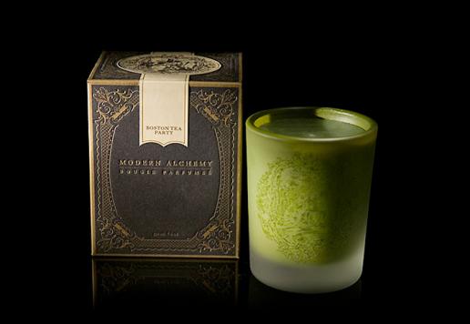
In everything from beauty to food, we are seeing a return to Alchemy and exoticism and a distilling of the potency and raw power of ingredients. And this harnessing of the raw – and maybe darker side – demands a reappraisal of our brands’ forms and communication and there is a rebel yell coming from the gothic inspired packaging of some more primal, noirish brands. Amongst these is French brand ‘Modern Alchemy’, featuring unusual scents (poison apple and black dahlia candles) and object d’art and curiosities, including a collection entitled Memento Mori (Latin translation: “Remember you will die”), rotten luck dice and a Pandora’s box – www.modernalchemyco.com.
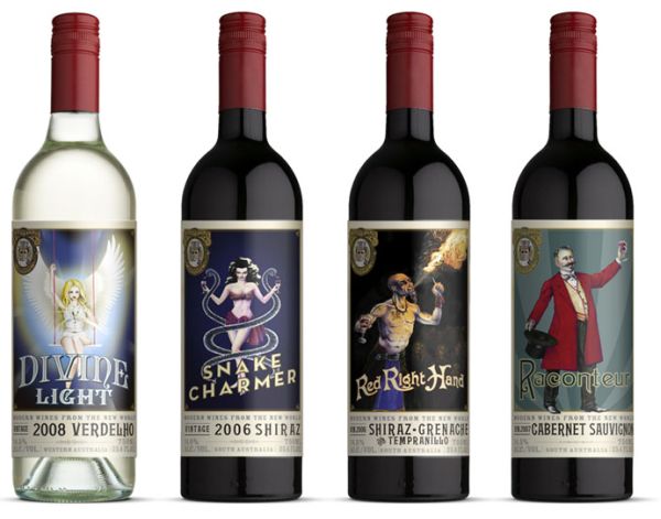
Similarly, Vinaceous wines from Australia also caught my eye featuring a selection of circus inspired characters with quirky personas. Once again the illustration and detailing is quite phenomenal but each label and persona is pertinent to communicating the type of wine it is labelling.

But it’s not just a trend amongst what could be termed boutique brands but a trend that has already entered the mass consciousness and is appearing on our supermarket shelves. Unilever’s recent launch of Marmite XO being the most notable example. It is reported that Marmite XO is matured four times longer for a thicker consistency and more intense flavour. And whilst it is undeniably Marmite, the pack design – with its black and gold palette and heraldic crest detailing — also undisputedly reflects the dark potency and heritage of the product inside.
This shift from the reigned in, considered, pared down creativity we have been seeing to a new creative expression centred on gothic, noir, surrealism will not, of course, be right for every brand. But, we can all look at the new potent-ial for our packaging based on an expression of intensity, detail and sensuality. And, in such tough and competitive times, this might just give your brand the edge — and, indeed, get you noticed as one of a new breed of edgy brands.
Jonathan Ford, Creative Partner Pearlfisher

