The start of the really warm weather has inevitably caused a flurry of consumer spending as we all rush to the suncare aisles, the garden centre or the hardware store… Suncare, gardening, DIY are all huge market sectors in their own right but when I (probably with hundreds of others) browsed these aisles at the weekend, I realised that — with a few exceptions — they are largely static ones. And all three have the potential to be so much more by reinventing and developing a new retail positioning and experiential — ‘X’ — factor.
With suncare, the brand leaders have become interchangeable and defined by their traditional, samey colours and symbyology — blue and yellow is Nivea, white and orange Ambre Solaire… The increasingly layered and scientific language and the time needed to decode it, is sending us running from the sun and buying from fear of ageing and skin disease rather than by pleasure of purchase and the anticipation of our summer holidays… Sun protection desperately needs a new and more desirable look and language that focuses on the benefit of the sun — and the role of the products in helping us enjoy these benefits.
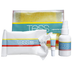
One notable product shaking up the category and putting the focus back on experience is from Tess. The naming of their ‘A Day In The Sun Skincare‘ kit and the products within is light and fun and conveys the joy, warmth and pleasure experienced with sunkissed skin. Whilst the colours used are still category colours they are not favouring the block colour of the traditional brands but ribbons of colour that maybe evoke the sea, the sky, a beach towel… and which, above all, signify a sense of boundless freedom and enjoyment. It is fresh, modern, and direct but also open to interpretation and conveys movement and texture.
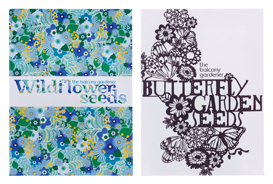
Over and above the trend for allotments, gardening per se is now totally sexy. But, the packaging, for example, for garden implements remains resolutely industrial and functional. We know what they do but the brand communication and packaging could paint us a better and maybe more aspirational picture. Seeds and composts do use colour and photography but the majority look somewhat dated and in no way tap into our more modern and stylish sensibilities. http://www.thebalconygardener.com not only does what it says on the tin but their new range of seeds for small gardens (designed by Chloe Dunne) are exquisitely simple but unbelievably rich in unique design detail.
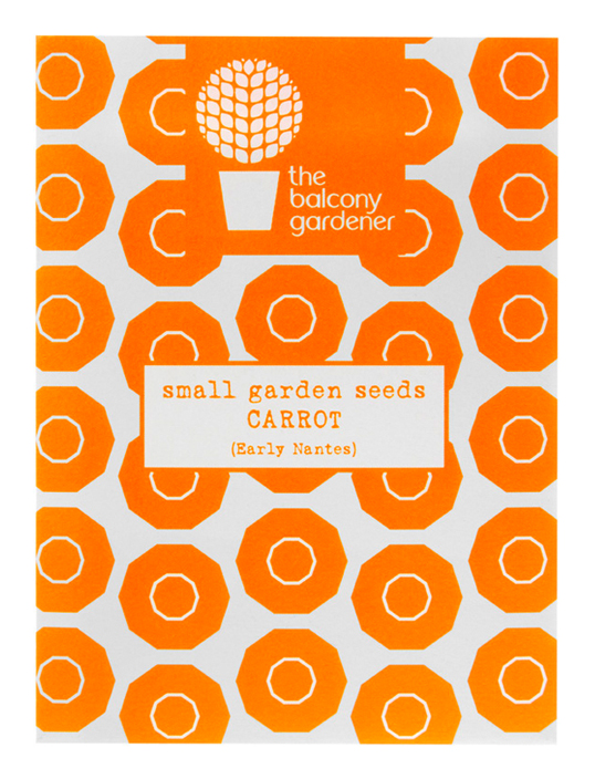
The packaging for their home-grown carrots range uses a section shot of a carrot that is totally unexpected — a true visual representation of the product as well as a striking, contemporary and slightly unusual pattern. Finally, not to blow our own trumpet but….do check out Jme and his herbs and plants (lovingly created by Pearlfisher)
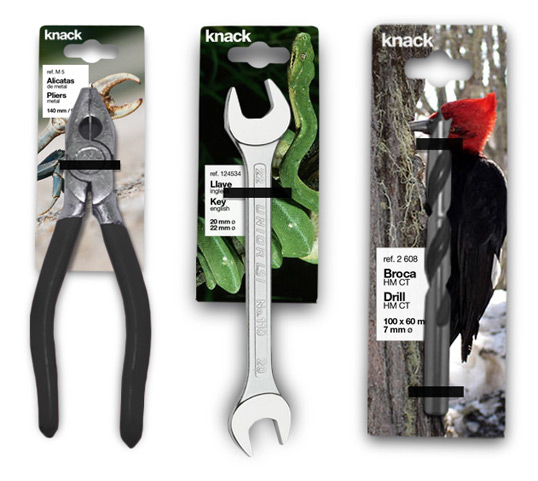
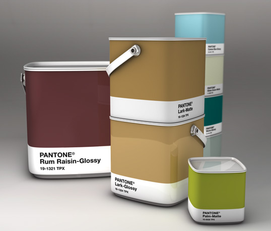
Two DIY newcomers that have caught my eye are the design concept for Pantone Paint from French designer Sammy Halim and from Spain Marc Monguiold‘s design for Knack which uses nature as metaphor for the uses of the tools within the range. Again, both are brilliantly simple but boldly different.
So to sum up: Suncare — come on guys develop a new written and visual rhetoric that brings back the warmth of the sun and provokes sunny thoughts and feelings in us. And as for DIY and gardening, well, these are two of our most creative pursuits — let’s reflect this. Ergo, there is a very real opportunity to truly inspire people at the start through inspirational and aspirational packaging and make the retail experience much more experiential and enjoyable.
Jonathan Ford, Creative Partner Pearlfisher
