Whenever a well-known company has the temerity to rebrand there are always naysayers. It is human nature to be resistant to change and these days everyone considers himself or herself to be an expert in the dark arts of marketing, so everyone has an opinion. What’s more, there have never been more opportunities to publish these amateur analyses.
Presumably Waterstone’s (as was) and/or its agency VentureThree anticipated the big boobs backlash. The new look has been described as resembling pendulous breasts and, yes, I admit that there is a certain chesticular resonance to the marque. Equally I can see that it looks rather like the “m” from parent company hmv inverted. And okay, all right, a saggy bottom at a push.
Understanding and agreeing are two different things. I believe that the kneejerk criticism of the new branding misses the point. Oh, and by the way, it is entirely appropriate that it has changed from Waterstone’s, using a punctuation mark that indicated it was founded by a man called Waterstone, to Waterstones – a neutral plural.
The point is that the new look has injected life and excitement into a dying brand in a threatened sector. Waterstones was inherently associated with old world values, despite being the first UK book retailer to stock the Sony Reader in 2008. The previous identity, with its traditional, bookish serif had to go. The new branding is modern, adaptable and confident, which is just what the company needs.
There are over 100 expressions of the brand, which enables it to adapt to genres, locations, characters and stories. As VentureThree says creating different “w”s for individual stores brings out the uniqueness of each store to life. Take the bones execution for instance. It appears in the Gower Street store in London, the place thousands of doctors go to get their medical reference books.
Crucially the new identity also lends itself to online and mobile applications, which is the direction in which the bookseller must go to survive, let alone thrive.
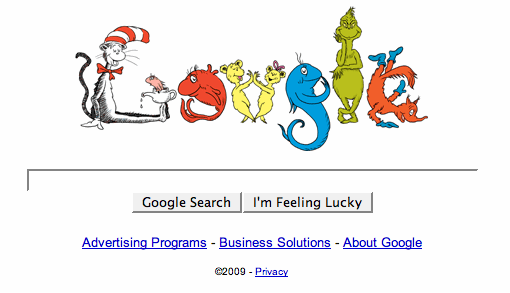
The confidence and adaptability of the marque reminds me of Google. There’s a brand that is big enough to have a lot of fun with it logo and remain true to itself. Indeed the Google doodles have taken on a life of their own – literally with the Pac-Man iteration, which is the thought to be the world’s first playable logo. One of my personal favourites is the Dr Seuss version, but that’s just one of about three dozen favourites.
I look forward to seeing more from Waterstones and I sincerely hope its critics come to eat their words.
About the Author
Chris Hart is Creative Director at Blue Marlin, Bath. His favourite projects span global spirits brands and small-scale artisan products, from Smirnoff and Johnnie Walker to Hiho and Pukka Pies.


