Are you a head or a heart person? Can you be both? Well, today’s designers certainly need to adopt an emotionally intelligent approach. The new consumer mindset dictates that not only do we want brands to be honest and informative and feed us the hard facts through their packaging design but also look for ways to forge a more individual and emotional connection with us.
Nowhere has this creative struggle been more obvious than in the OTC sector. We look to this sector to provide us with solutions but in answering the new consumer need, the focus has had to move away from highly functional design and messaging to highlighting the end benefits.
However, orthodoxy seems to have dictated that, for example, pain relief has to follow a corporate and bland format. We probably got closest to ‘soothing’ with Panadol and it’s softer design, pastel- coloured foils but there has been nothing since. Nurofen focused on a masterbrand for all types of pain but the visual codes and cues still focus on the pain with hard reds and ‘target’ icons and the design in no way visually addresses the cure.
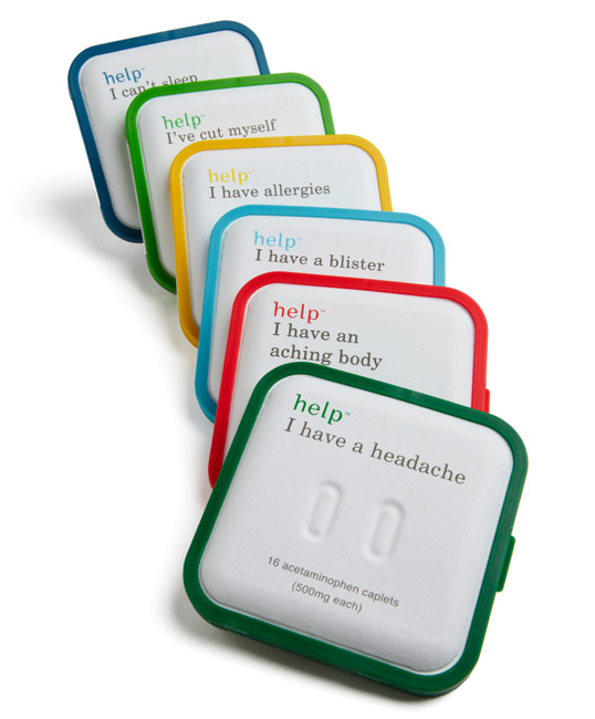
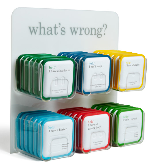
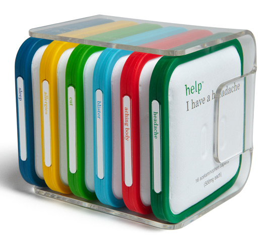
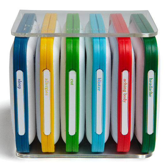
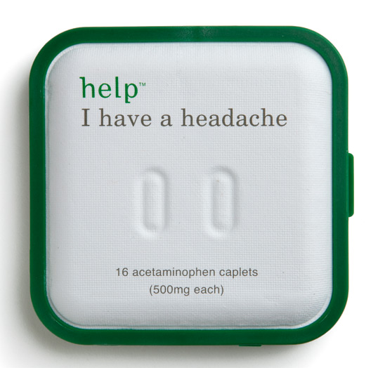
Help Remedies may be one of the first pharma brands to truly challenge this sector and move us from the pain to the gain. Help has stripped right back. The uniform white paper pulp based packs are boldly and simply differentiated with primary colour coding and one simple but forthright and personal ‘I have a …’ strapline. The embossed shape of the product is not necessarily for a visually impaired audience but another clever tactile and visual reinforcement of what the product is and what it is for. The overtly chatty and ‘matey’ tone of voice — particularly with inside pack copy — may be a step too far but is undoubtedly a refreshing breakthrough for this sector.
It’s not just about being functional and convenient but being aesthetically pleasing and emotionally connected. It’s about finding the balance and using design to impart selected information in a defined but personable way. And now is absolutely the right time for pharma to embrace and own a new visual rhetoric.
Help Remedies will soon be launching in NYC. Check out their clever website: www.helpineedhelp.com
