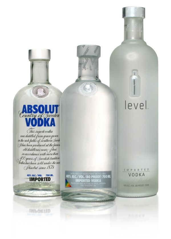
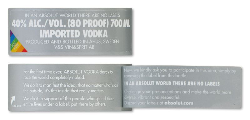
In a beautiful attempt to make the world a better place, Absolut recently launched a naked bottle. The small label containing the underlying message that it’s the inside that really matters is meant to be removed after being read.
Having invested for many years in its bottle as the true icon of its brand, Absolut is probably one of the few brands in the world being able to launch this kind of special edition: a bottle without any graphical cue to support the brand message.
However, it seems that even the Absolut bottle is not iconic enough to be truly without graphical cues, as the country-of-Sweden guarantee seal has still been preserved on the bottle’s chest.

This makes me question the power of structural design when it comes to iconisation. Taking Bacardi as an example, its graphical bat-icon has become a recognisable symbol. It expressed its power in many occasions, varying from advertising to the endorsement of line-extensions. Of course, the Absolut bottle is the absolute star in many advertising campaigns. But when it comes to other icon-qualities, the bottle is not strong enough. One can wonder how many consumers recognise the small bottle-icon on the Level presentation? In this particular case, the bottle is not supported by the graphical guarantee seal, nor by any specific 3D cue, and then what remains of the Absolut icon?
A closer look to the naked bottle in comparison with the dressed version sheds light on this matter. The absence of the Absolut logo and body text has quite some influence on the expression of the bottle. The transparency of the glass and the thin-thick structure are less/ not visible and therewith a unique structural characteristic has disappeared.
Concerning the impact of the branding, the strength of the well-known type face becomes scary obvious when it is not there. Using this font on the small front label supports brand recognition, but after removing this label, the bottle seems to become an Absolut Nobody.

Compared to structural design, a graphical brand icon is a flexible attribute well executed to do its job: creating instant brand recognition. A unique structural design supports brand identification, but even a well communicated bottle shape like Absolut’s is not powerful enough to sufficiently communicate the brand on its own.
So, looking at the naked bottle, I’m glad that this is only a temporary attempt to make the world a better place, and that Absolut has not lost sight on the necessity of utilising its holistic creative power yet!
About the Author
Lianne van den Berg-Weitzel is Strategy Consultant at CARTILS, an international brand design agency with offices in Amsterdam and London. Her responsibilities include translating developments in consumer behaviour, brands and branding into brand design strategies for international companies.

