…Yes, I think they are if they believe that they are adding value with a freebie, a prize, a collaboration, a competition…I have talked previously on Popsop about how careful you have to be to collaborate creatively—and credibly—but still so many brands seem to be looking for ways to add brand value by giving us an ‘added extra’.
In fact, this has almost become a given. And so, if we now think of it as a given, it’s not really adding value, is it? So what message is it really giving us? Maybe it does give some PR spin or make the brand more campaign’able but, in the majority of cases, it makes me think that these brands do not feel that their brand design alone is strong enough to sell their product. They are indulging in a short-term, knee-jerk sales initiative rather than looking at the value and power of brand design over the long term. It is obviously a kick in the teeth to the brand designer when you see your work not being allowed to sell itself and you wonder why the client has maybe signed off on it if they feel it is not strong enough or needs supporting…But, interestingly, if we take the same question—‘Are brands becoming more naïve?’— in a truly literal sense then the answer is also ‘yes’. There is a new wave of brands embracing what could be termed a naïve brand design approach—childlike, simple, direct and expressive —and it is this single-minded seduction that is resolutely cutting through the samey collaborative clutter and proving the stand-alone power of good brand design.
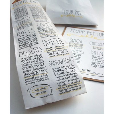
One of my current favourites is the identity and packaging for The Flour Pot Bakery (Florida). As Designer Sara Nicely explains, “The Flour Pot Bakery Pot strives for a healthy diet with high quality, natural ingredients and environmentally friendly practices. The bakery’s interior space is inviting and warm with natural lighting and eclectic funky displays advertising baked goods. This identity system was designed to convey the unique and handmade qualities of the bakery. The hand-drawn type was inspired by the wiry Christmas lights arranged throughout the dining area. I chose to design a menu that could be carried home without hassle. I placed all menu items on a baguette carry-out bag so that customers could carry the menu home easily while simultaneously being able to enjoy a Flour Pot baked good.”
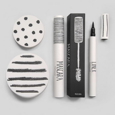
In the UK, Top Shop’s new make-up range has been much applauded by trade and consumers alike for its refreshing approach to product and design innovation. The look is stunningly direct and simple; taking premium cues with dots and stripes but made accessible and personal with hand-drawn details and type.
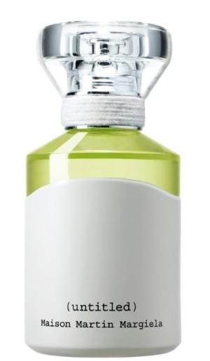
And, actually, if we look to the luxury sector and its heritage of embellishment and excess, we see a starkly contrasting picture. Whilst this approach is still ever present it is now being countered by a less is more (and what we have termed “discreet elite”) approach…Martin Margiela is a modern brand icon of minimalist luxury. His mantra of ‘no logo being the ultimate logo’ has been beautifully brought to life in the creation of his scent. The bottle, a simple logo-less and clean structure in keeping with all his other products, uses a simple Olivetti typeface and is marked only by his signature numerical line codes on an ‘M’ structure surrounded by a white world. It is unmarked but unmistakably his—and whilst maybe not hard to copy in theory, its exquisite yet harsh simplicity defines it as inimitable, intimate, individual and irreplaceable—and impactful.
Good design speaks for itself without the need for added justification.
About the Author
Jonathan Ford is a designer and co-founding partner of Pearlfisher. He oversees a portfolio of award-winning designs, including a high profile list of ethical, entrepreneurial and iconic brands. He is also a frequent speaker at high-profile international industry events and regular contributor and commentator in the design and brand press.
Jonathan can also be followed on Twitter — @Jforddesigns


