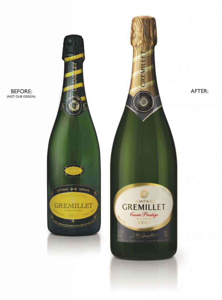
Award winning champagne house, MAISON GREMILLET has relaunched its range of champagnes with all new packaging created by design agency, Biles Inc.
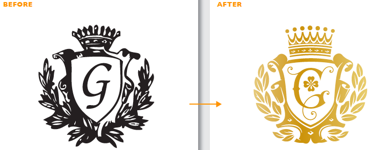
The range was redesigned to better reflect the quality of what was in the bottle, by a careful recrafting of the house mark, the logotype, the foil and the label, as well as an improved use of key category codes, making this premium champagne take a long overdue step into premium brand territory.
After the redesign we see:
• A hand crafted logo with a unique sophisticated personality and strong shelf standout.
• A house crest to be genuinely proud of, designed and refined with the same care as that taken with the wine.
• A more subtle and discerning colour palette.
• A graphic hierarchy giving primary graphic communication dominance over secondary elements.
• Introduction of reassuring category cues.
Anthony Biles, Founder and Creative Director at Biles Inc commented: “It is always interesting to work with heritage brands, due to the inherent equity they possess. When we were appointed to work with Gremillet it soon became apparent that the packaging bore no relationship with the quality product inside. However, being a family owned brand, it was likely that there would be a strong resistance to change, therefore we had to be artful in changing everything and yet appearing to change nothing. This was a strict evolution through craft, and the new packaging is appropriately coded and of suitable design quality to rub shoulders with the big boys. We look forward to hearing of the sales impact and commercial results later in the year.»
The range which includes Brut Selection, Grande Réserve, Cuvée Prestige, Cuvée Rosé, Cuvée des Dames, and Cuvée Evidence is currently rolling into independent wine shops, and the on-trade across France and the UK this month.


