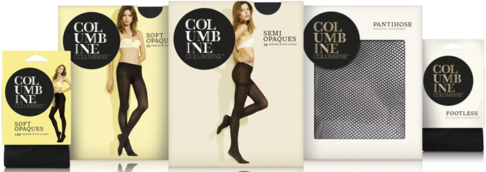
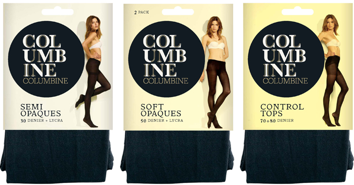
Columbine, the iconic hosiery brand, has been given a fashionable new look at the hands of brand design expert Dow Design. The new logo and branding modernises the Columbine image, positioning the brand as a quality product for the mainstream market and creating brand cohesion across the range.
“We wanted to communicate Columbine’s quality and stylishness while making an impact,” says Dow Design’s Creative Director Donna McCort. “Although a trusted brand, Columbine lacked the personality needed to properly stand-out and attract the attention of younger shoppers. By giving the brand a fashionable new look, the packaging reflects the modern quality product inside and keeps Columbine right up with its competition.”
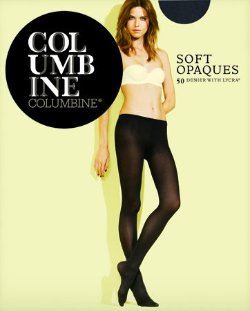
The new Columbine logo makes a dramatic statement in today’s fashion-focused market with an artistic and contemporary arrangement of the Columbine letters in a custom-built decorative typeface. Held within a strong black circle, this creates an eye catching symbol to cut through in the competitive hosiery market, capturing the brand’s unique sense of elegance and effortless beauty.
“We wanted to communicate that the Columbine lady is naturally chic with subtle sex appeal and the model’s face communicates an honesty to which customers can naturally relate,” says Dow’s Senior Designer on the project, Hannah Gordon.
Dow Design retained and reworked Columbine’s traditional black and gold colours, pairing them with a style of minimal photography that features the same model across the range. Unlike most hosiery imagery, which features just leg imagery, her face is seen and reinforces the natural beauty that Columbine so values.
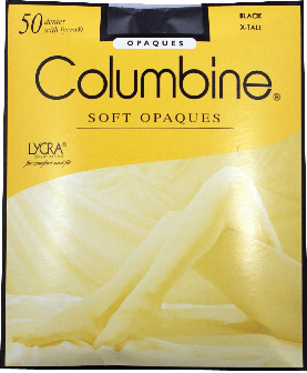
Columbine Old Look


