The great influence of color in branding is an open secret. According to researchers, a person receives from 80% to 90% of environmental information through a visual analyzer, and each color includes one or another association, they become stable and may not change for decades. In general, the eyes and the entire visual system are closely connected with the brain.
And therefore, when creating a new brand or rebranding, several factors must be taken into account. You evaluate the competitive environment in the color circle, check the set of associations the current colors contain (if the brand already exists) and how relevant they are today. This is the minimum checklist for selecting the color scheme for the brand. We will analyze each of these factors in detail.
Associations and competitors` choice
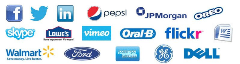
Categorical colours mean that you can find brands of the same colours in one category of goods, it is an important concept in branding. Because color works just like any other element of style, it solves the problem of creating a certain impression or association. For example, banks prefer the blue color, which is traditionally associated with reliability and stability — these are the properties that the largest banks in the world want to emphasise and represent.
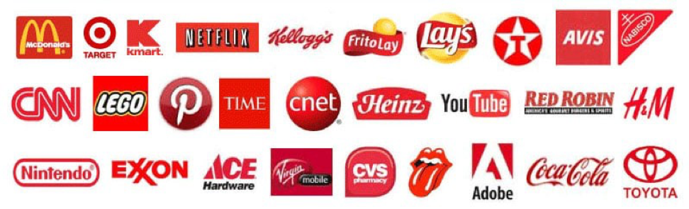
But red, in addition to association with leadership and activity, is also the color of appetite, therefore all the largest fast food companies use it in the logo (McDonalds, Burger king, KFC, etc).
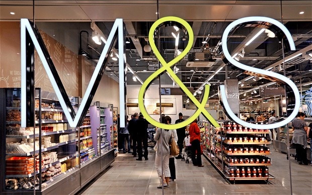
Green is associated with freshness and healthy lifestyle. It goes without saying that brands that want to emphasise how useful and good for health their ingredients are use it as a basis. The tendency to use green can be overseen in retail — Spar, Mark & Spencer, Mercato, and among dairy producers — Danone products, as well as in products from the healthy lifestyle section.
As part of a 2018 study of the top 100 global brands about which colors are most often used in identity, it turned out that blue is the most popular. It is found in branding with 33% of companies. The second place goes to red, and it is used by 29% of companies. The third is black or grey in 28% of companies.
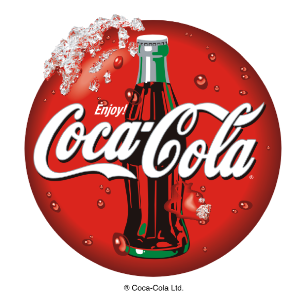
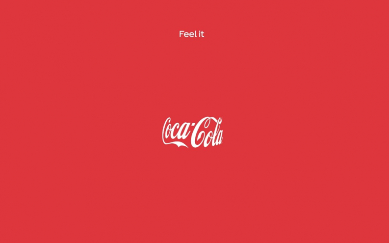
A good example is Coca-Cola red and Ferrari red, while the reds have different shades and meanings. The Coca-Cola choice of red is due to several facts. Firstly, this color was chosen because of the historical curcumstances: the barrels with bottles were initially painted red so that tax agents could distinguish them from alcohol during transportation. The second reason is that red provokes appetite and stimulates impulse buying, which was crucial for the emerging category of soft carbonated drinks that just appeared.
Ferrari is named after its founder, Enzo Ferrari, the famous Italian race car driver. But the choice fell to the red not according to his personal desire — in the early 1920s, red was the color that all riders of the Italian Grand Prix had to use by order of the International Automobile Federation (FIA). Thus, Ferrari cars were painted in Rosso Corsa, which directly translates as “racing red”. Now Ferrari red is directly associated with speed (and the category of race cars), energy, passion and style.
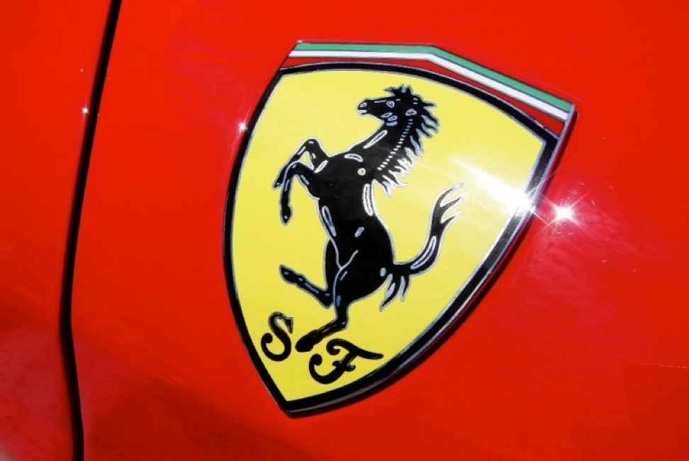
These reds have different shades, but each of them is categorical in its field, and other players in these categories cannot use these tones.
Another example is the use of several colours that “play” and gradually, over the years, become associated with a category. For example, UPS, which uses branded brown with gold.  The brown is to emphasise reliability, safety, integrity of delivery, responsibility for the cargo. Before UPS only black and white colours were used in the category.
Brown in various shades and modifications has been used since 1916 and in order to further emphasise the company’s slogan was for many years — “What can brown do for you?” .
So, over many years of use, the UPS brand color code has become categorical (before FedEx and other companies).
Depending on which market strategy the brand adheres to, it will either use categorical colours or vice versa, choose those that are not associated with the industry. For example, the once traditional color of coffee and coffee houses — brown seems to us quite logical, because we are used to see it in this category.
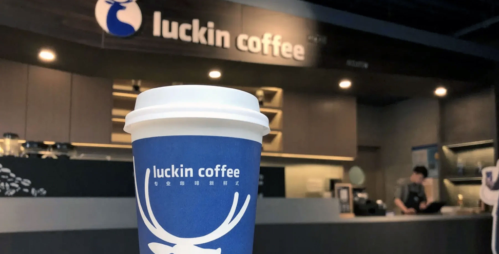
But the Luckin coffee chain, which appeared in 2017 in China, chose saturated blue as its main color, which, it would seem, has never been regarded as meaning something delicious, but since the brand’s DNA has a strong IT component, for which the use of different shades of blue is quite typical, then the choice becomes evident.
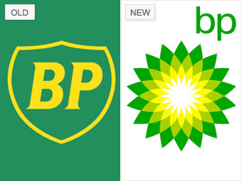
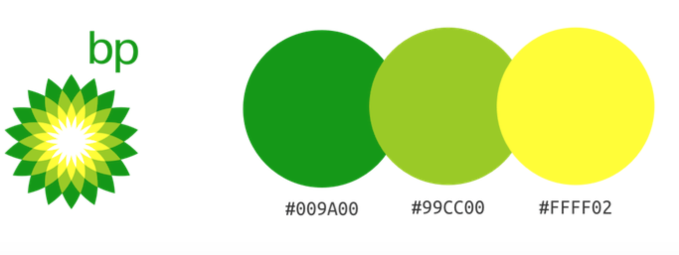
Or the British Petroleum rebranding that has already become an examplary, which in 2000 changed the logo and corporate identity choosing green, yellow and white as the basis. Oil production and refining are among the most dirty industries that harm the environment a lot. The change of logo served as a message to the audience that the company is responsible for the issue and plans to innovate: for example, the transfer of BP sections to partial solar power through solar panels that form a transparent dome above the pumps.
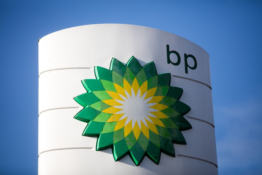
In the communications of those years, the company emphasises the importance of taking care for the environment.
 As a result, about 40% of the company’s business is currently focused on natural gas, and its solar business is one of the largest in the world.
So the color underlined the global changes in the company and also allowed to stand out from the category.
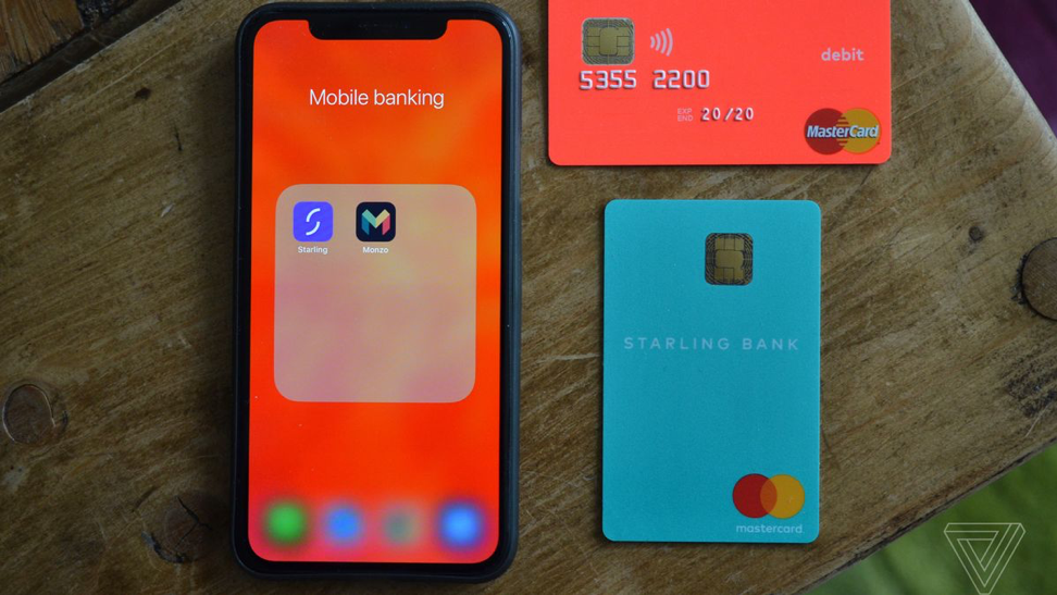
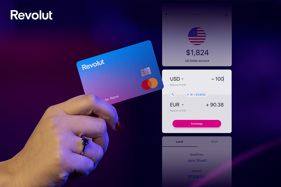
Brands that have chosen the strategy of standing out strongly from the cluster use fundamentally different colours. For example, just 5 years ago the banking industry in the UK was a line of top conservative players, many of them have over 100 years history. Banks such as HSBC, Barclays, Santander, Lloyds, the oldest players in the market use the classic colors — blue, red, green. And all the procedures for interacting with such banks were also lagging behind other markets: receiving cards via mail, hourly queues at branches, lack of modern mobile applications with an intuitive design and functions, a large set of documents needed for opening an account and receiving your first card.
However, five years ago the situation changed, a group of challenging banks appeared on the market: Monzo, Revolut, N26, Starling. Their work is carried out through a mobile application and eliminates most of the inconvenience of their conservative older comrades. This group of banks instantly won the hearts of young Brits and the EU residents for a smart, quick and customer-oriented solution to the problems that have existed in the industry for decades.
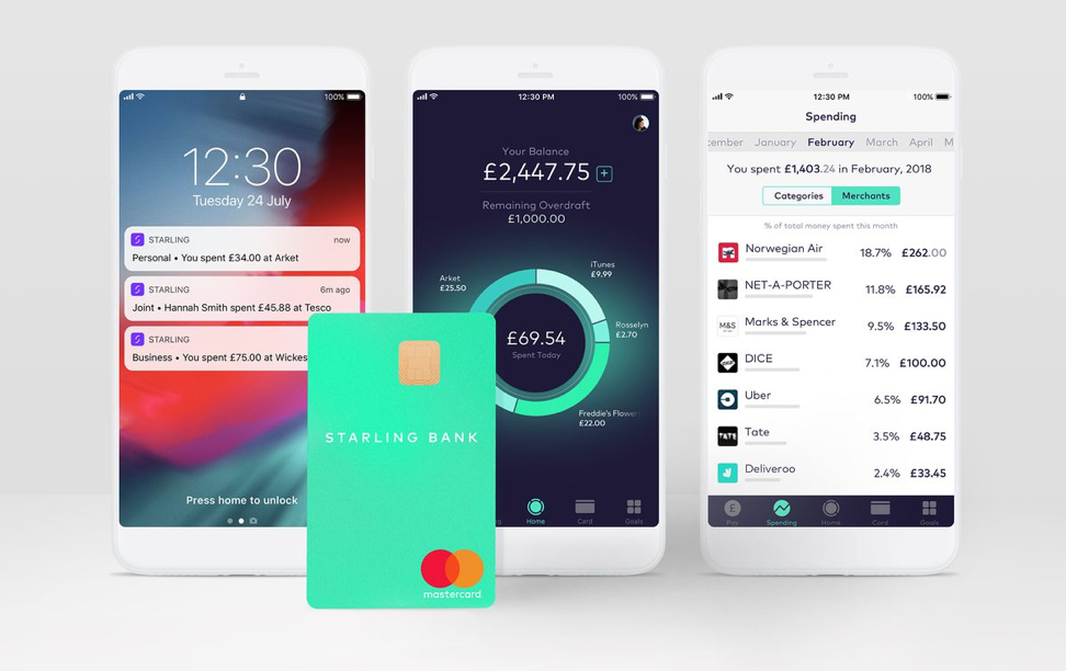
Therefore the colors that banks have chosen for their corporate identity are knocking out of the usual category palette: Monzo has a bright coral, Starling has a neon turquoise, Revolut has a gradient palette from blue to fuchsia, N26 has a minimalistic monochrome (black-white-gray).
Another way to stand out from the category is to use and actively promote your own unique shade.
For example, the well-known Tiffany color is mint or light turquoise. It appeared in the distant 1845 and subsequently underwent only minor changes. It was no coincidence that it was chosen: the turquoise color was extremely popular in the jewelry industry of the 19th century. Thus, Victorian brides have traditionally chosen turquoise brooches in the shape of a dove as a wedding gift for guests. Tiffany only patented their color in 1998 after more than 100 years of use.
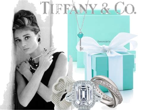
Now Tiffany & Co and its signature color are symbols of wealth, luxury, style and elegance.
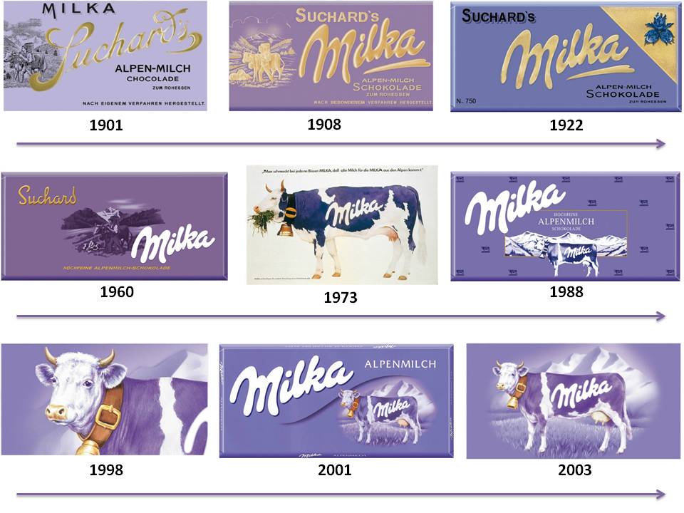
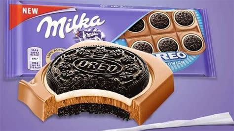
Another vivid example is Milka chocolate, which has chosen purple as its color. In its style there is no catchy logo or mascot, only a color that is so highlighting product on the shelf so well that it is impossible to forget. Usually this color is used to emphasise innovation or magic. Milka chose it in 1901, when the Swiss chocolatier Philip Souchard produced milk chocolate, wrapping it in a lilac-colored wrapper, which distinguished the Sushard product from other manufacturers. In the 1960s, the company registered its trademark and patented the brand purple color in its category.
Sometimes funny incidents happen: for example, the German telecom operator T-mobile sued an American startup that used their «brand color magenta» in their communications. They did not invent this color, but after prescription of years of use they naturally appropriated it.
In February 2020 the Publicis Italy advertising agency created an outdoor advertisement for Coca-Cola using only the color and logo of the brand, and everyone “sees” the outline of the bottle. But such a technique is possible only when color has been directly associated with the brand for many years.
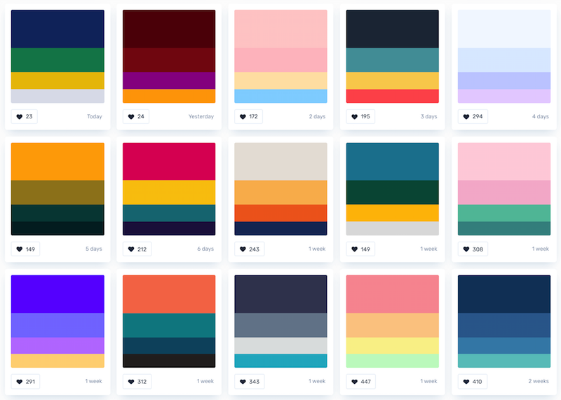
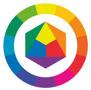
Categorical colors are easy to see by placing competitors’ logo on a twelve-part color wheel. This will help you to understand the basic color schemes of key players in your industry.
Relevance
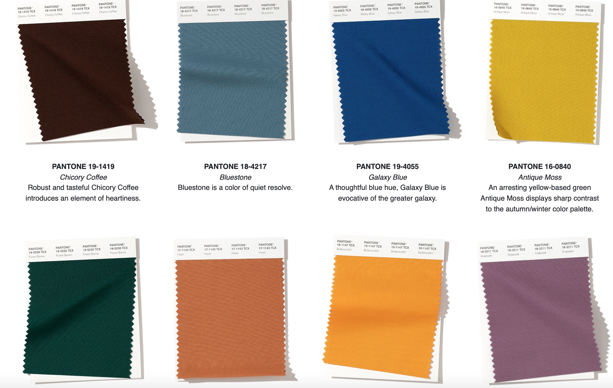
The next item in the checklist for color selection for a brand is being up-to-date. To do this you can check which color of the year and the color scheme of the year was determined by the Pantone Color Institute. The Color Institute, or Pantone Color Institute, was created in 1986 and conducts research on the influence of colors in society, determines color trends annually for more than 20 years. The Institute of Color cooperates with several consulting agencies in the field of trendwatching, its specialists receive data from scouts that track various “signals” in society, science, art, culture.
Having obtained this data, the Institute employees determine which color will best reflect people’s moods in current political, economical situation and social trends. For example, if tension and feelings are felt in society — the color palette will be of such shades that soothe, if on the contrary it is necessary to inspire new achievements — the shades are selected the brightest and most juicy.

That is, behind the choice of the color of the year and several palettes of the year lies the great work of the integrated team. This year, “classic blue” was chosen as the color of 2020 — a shade of confidence and calm. “Causing associations with the sky at dusk, inspiring hope and stimulating the work of thought, PANTONE 19-4052 Classic Blue underlines our need for a reliable and stable foundation on which we can build, entering a new era.
Traditionally perceived as calming, PANTONE 19-4052 brings a sense of peace and tranquility, offering a kind of refuge. Helping to concentrate and giving clarity, the PANTONE 19-4052 Classic Blue re-arranges our thoughts. The thoughtful blue shade of Classic Blue gives us stability”, according to the representatives of the Color Institute. It is noteworthy that this color was chosen in December 2019, a couple of months before the global pandemic and economic crisis.
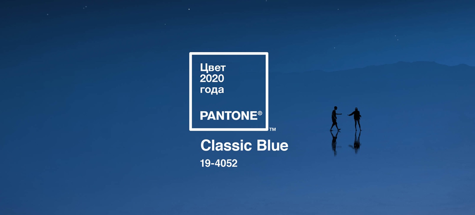
This year the company presented not just the color and palette of the year, but teamed with several partners to create a multi-sensory experience that would be associated with classic blue. You can listen to the color, touch it and even taste it to get a multi-sensory experience. For example, Firmenich developed a candle with a scent of color, the Tealeaves brand created a tea blend, and Audio UX created an audio track.
Check list
Thus you need to look and evaluate the colours that already exist in the category, determine which associations with the selected color arise and how much the gamma corresponds to time and trends. And you can start a heated discussion with colleagues about new corporate colors for your brand.