Today we publish the top 10 design works that caught our attention in March 2015.
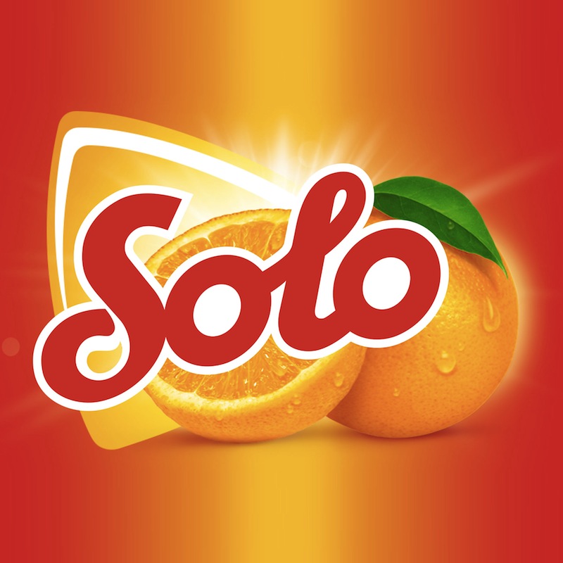
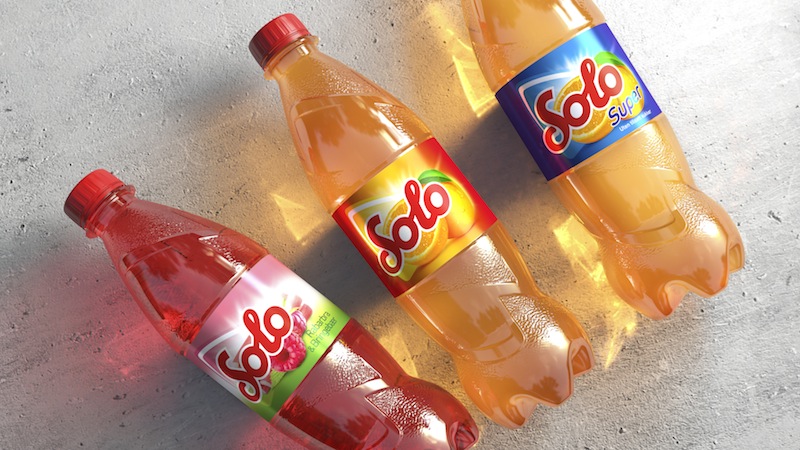
1. JDO has burst with three projects this month. One of them is for Carlsberg-owned Ringnes, the largest shareholder of the Norwegian drinks brand Solo. The agency has created a new PET icon structure and range as part of the bigger brand portfolio review.
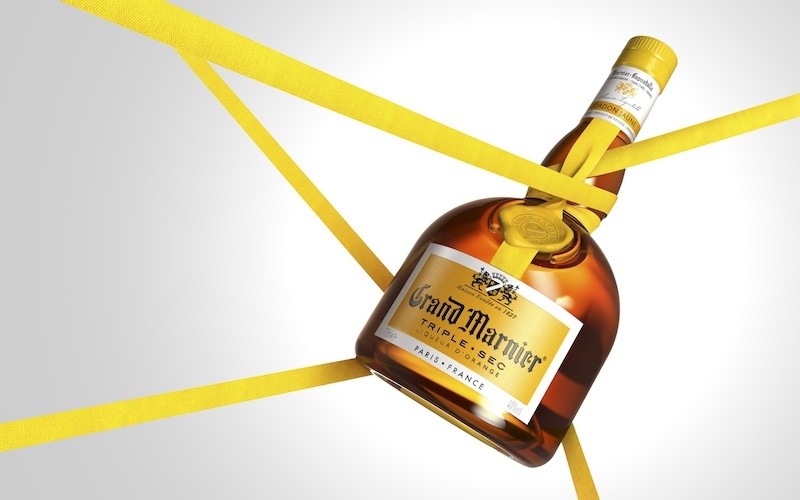
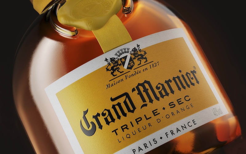
The next project has been done for the premium French spirits company, the house of GRAND MARNIER, to update its Cordon Jaune triple sec variant. The creative challenge was to make this subbrand the key entry point for new consumers into the Grand Marnier brand.
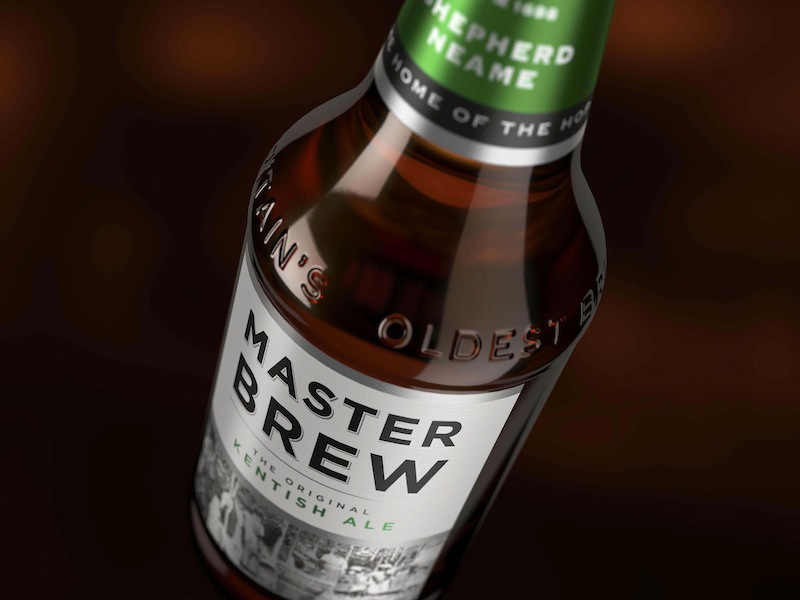
The third JDO’s design project this March was for Shepherd Neame, the Kent based UK brewery—the redesign of their Master Brew ale brand. The new design celebrates the brand’s heritage as The Original Kentish Ale: the only UK beer style protected by the EU.
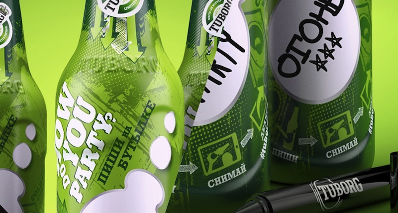
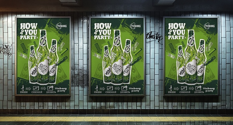
2. Taxi Studio has created a limited-edition bottle for Tuborg in Russia, the brand’s key market. The objective was to engage with consumers in a way that traditional media legally can’t. The agency was briefed to create a design that makes consumers feel that Tuborg is the home party starter.
3. BrandOpus has created the brand design for Rhythm, non-dairy kefir culture drink, currently sold in Wholefoods Market, As Nature Intended and Holland & Barrett in the UK.
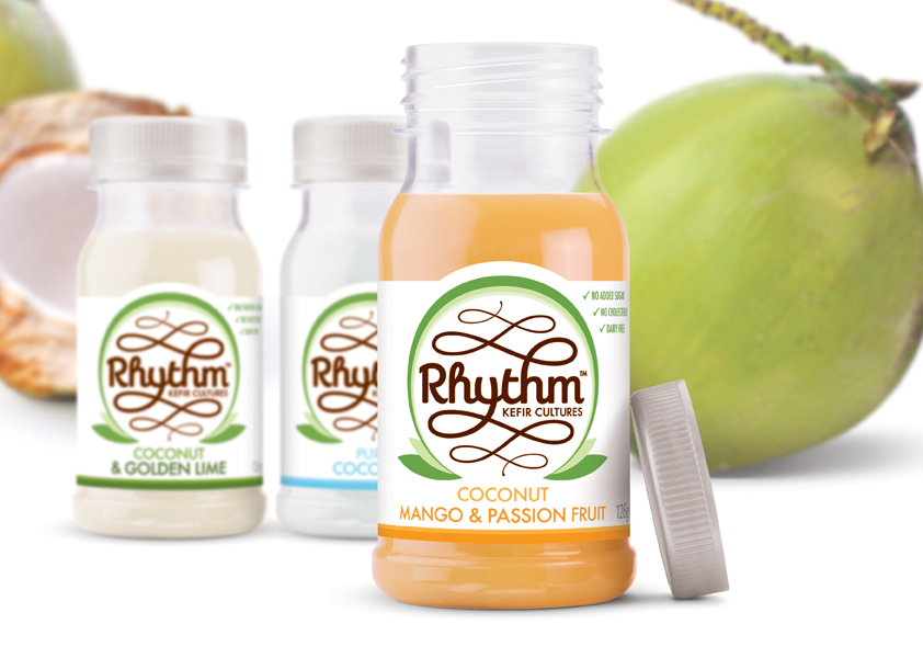
The identity features a flowing typeface and device indicating the natural inner rhythm that Rhythm offers the consumer. The identity is wrapped in a green leafy device, reflective of the young coconut water, Rhythm’s signature ingredient.
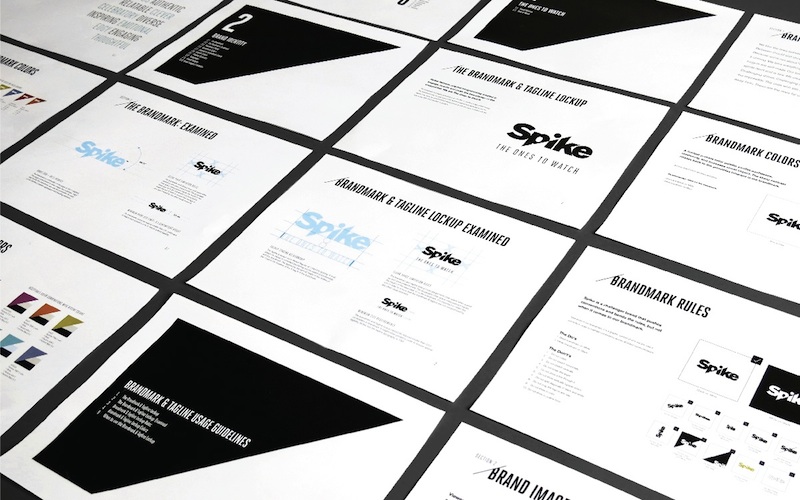
4. Bluemarlin has created the new identity for the Viacom-owned entertainment network Spike. The design transformation under the motto “Broad with Edge” is visually represented as approachable edginess. The new brand mark features clean, classic typography that appeals to a broader audience, not just men.
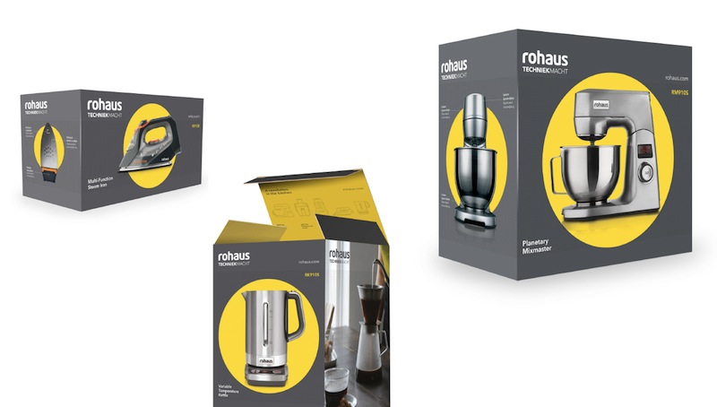
5. Identica has redesigned the Dutch household appliance brand Rohaus to emphasize its technological advancement combined with impeccable style. The agency has created the outer packaging as well as collateral marketing materials for the brand.
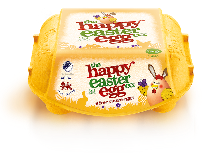
6. London-based Springetts have designed limited edition Easter packaging for The Happy Egg Co. The iconic sunshine yellow packs feature the brand’s hen mascot, Freda Roam, with bunny ears and the brand’s name replaced with «the happy easter egg co.»
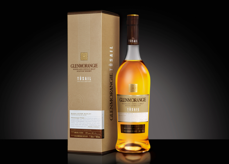
7. ButterflyCannon has created packaging design for Tùsail, Glenmorangie’s latest Private Edition release. The packaging’s layout and typography are reminiscent of the Malt House’s inventory books. The agency’s task was to balance an overtly rustic and craft brewing story with a rare prestige malt whisky one.
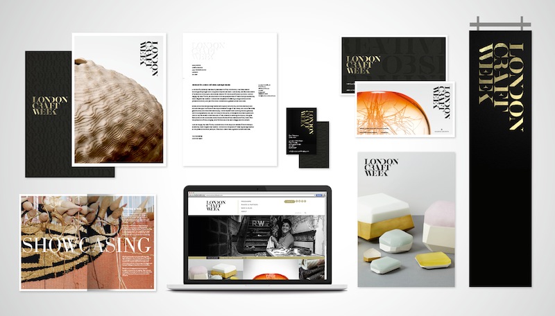
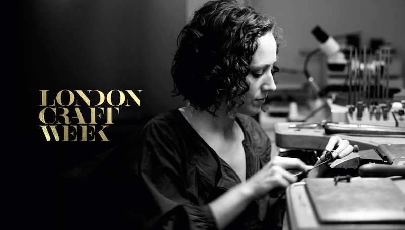
8. The Partners have created a new brand for London Craft Week, a new annual even that will introduce British and international craftsmanship to a wider audience in London on May 6-10th, 2015.
The agency focused the brand on the personality of the maker, a true artist that creates exquisite masterpieces with passion, dedication and pride, with each piece relentlessly refined to achieve its purest ultimate form.
