In order to keep up with fast-changing design trends and expectations of the technological era, Nokia has rolled out a new typeface it will be using in all of its future models and in digital environment.
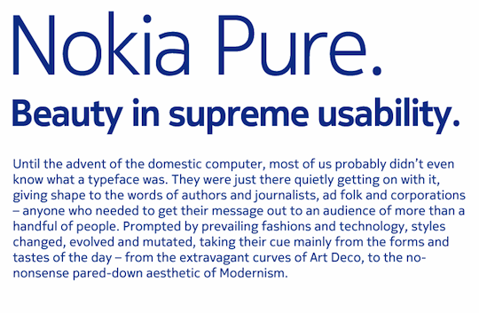
The newly-created typeface is entitled Nokia Pure and is said to represent «the idea of seamless, fluid motion» by Nokia experts who were faced with a really challenging task as long as they had to create the typefont that would capture the Nokia spirit and look readable in Greek, Cyrillic, Arabic and Japanese alphabets.
Speaking of the graphical side, the designers tried to reveal organic and natural forms that are very easily perceived with a human eye and had to keep away from everything too trendy and machine-like. What they’ve unveiled looks very eye-pleasing and features a reference to natural calligraphic handwriting, but at the same type looks pretty modern and readable.
Below is a sample of Nokia Pure. Click to enlarge the picture.

Image: www.brandbook.nokia.com

Image: www.conversations.nokia.com
Bruno Maag who was responsible for designing Nokia Pure, comments on his creation, “It was a balancing act. An elegantly simple typeface that doesn’t draw attention to itself, but is still distinctive and different. For me, it’s the rhythm of the typeface and the relationship between characters that’s critical. After all, when it’s set in Arabic, you still need to know that it’s Nokia, and this is achieved by creating a recognisable rhythm.”
“First and foremost, the typeface is extremely legible wherever you happen to see it. Nokia Pure is contemporary without being fashionable, which should give it longevity. It’s one thing drawing a beautiful letter, but another making a whole set work to a high quality. A coherent typeface is an essential part of a coherent branding strategy”, he adds.
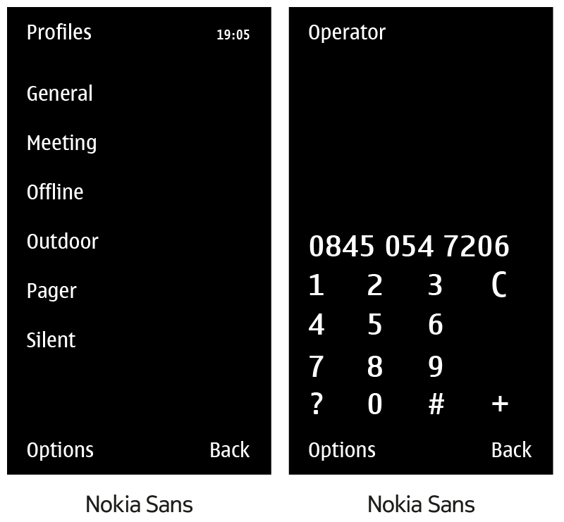
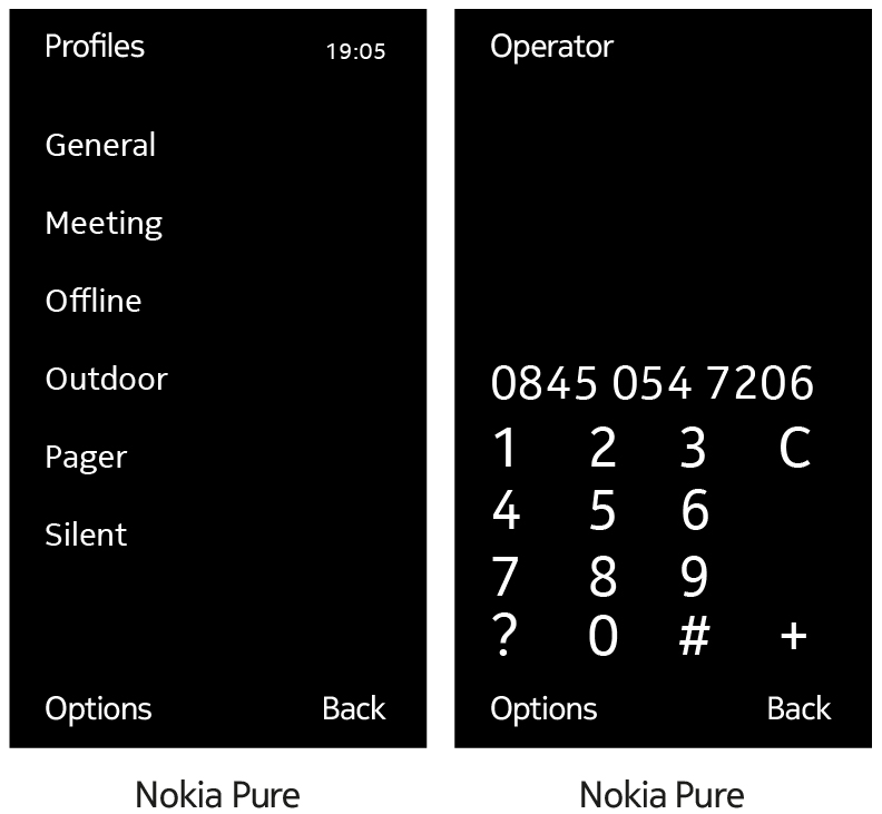
Also, in its blog at conversations.nokia.com, the brand has provided a sneak peak into what Nokia Pure might look on the device and on the phone screen. According to Nokia, the images below are just to give you an idea of what the font MIGHT look like since it may still be re-worked prior to the final release.

