The sporting season inevitably gets you thinking about form—not just in a horse-racing sense but when we think of the furore that erupted over the different shapes of the football balls being used in the World Cup. And whilst we all judge the tennis outfits—and particularly those of the Williams’ sisters—from a fashion viewpoint, these outfits are again structured for ease of movement and performance of the game.
From a brand design point of view, we tend to focus on graphics, colour and copy whilst structure is perhaps not getting the air-time it deserves. We (at Pearlfisher) are currently being briefed on far more challenging structural projects and should not underestimate the power and significance of an innovative and powerful structural design solution, an iconic form or silhouette—from the sensual curves of Marilyn Monroe to the famous curves of the Coke bottle…
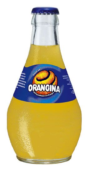
Shape and structure can convey just as much personality as chatty copy or quirky graphics. Think of the classic Orangina bottle—an easy and fun name but most revered as a design icon — with universal appeal that has stood the test of time—due to its textured, fit in the hand bottle that looks and feels just like an orange.
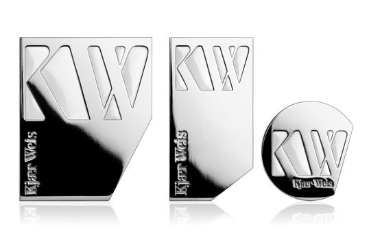
There are a couple of new launches that are firmly and bravely putting the focus back on the power of the structure. The first is Kjaer Weis—a new line of cosmetics packaging which distils the fundamentals of women’s makeup to its three essential areas of application: lips, cheeks and eyes.
The compacts are shaped to mirror the features they will be used to enhance: slim and long for the lips, large and square for the cheeks, small and round for the eyes. The compacts also swivel open with an innovative lateral movement which we are just starting to see creep into this market and which is ease of movement, space saving, slimline to more easily fit into bags etc
And this is also where structure can really come into its own…The opening experience of packaging and the bond that this can forge with the consumer to heighten the holistic brand experience should never be underestimated and we are looking for this clever sense of reveal and anticipation (combined with superb functionality) across all market sectors…and, in nearly every case, it will be structure that is now truly making the most significant difference…(think the original white iPod packaging).
The second launch which caught my eye is a range of t-shirt design and packaging from Here Sod! that takes design cues from food packaging found in supermarkets. For example, a ‘pork’ t-shirt is sold in the Styrofoam deli packaging used in the butcher’s section of a supermarket.
You may say that t-shirts don’t really need secondary packaging, you may say that it is only innovative in its ‘adoption’ of another category structure cue… True, but you can’t deny that they have succeeded in creating a novel design, shopping and opening experience and one which is totally disproportionate to expectation…
The t-shirt packaging is also a very good example of just how important subliminal structural cues are to the consumer…by and large chutneys and fine preserves are in short, squat glass jars whilst ketchups are in tall-necked and plastic squeezy bottles. Putting a ketchup in a squat jar not only disrupts the look of the category and makes you take notice but makes you question the composition of the product, firmly placing it as a gourmet accompaniment rather than day-to-day sauce as per the strategy behind the launch of new gourmet ketchup called ‘Sir Kensington’s Gourmet Scooping Ketchup’—a structural design which says so much about the product aside from the old-fashioned font and script descriptors, top-hatted English eccentric character etc.
We don’t know the exact shape of things to come but, suffice to say, structural brand design is the foundation for all the other brand design components and we need to watch this space/think about just how we make our mark on this space… We’re often asked by clients, ‘ how frequently should we redesign our structural packaging. ?’ There is no hard and fast rule, as you can’t take a brand out of its context, in terms of what the market is doing and its competitors and to a degree this will always dictate change and the pace of it. But ultimately the question that will decide when change is vital will always be one of, ‘how desirable your brand is and how it is touching its consumer at that moment in time’. Only then can degrees of change be explored and within this structure must always be a conscious consideration.
About the Author
Jonathan Ford is a designer and co-founding partner of Pearlfisher. He oversees a portfolio of award-winning designs, including a high profile list of ethical, entrepreneurial and iconic brands. He is also a frequent speaker at high-profile international industry events and regular contributor and commentator in the design and brand press.
Jonathan can also be followed on Twitter — @Jforddesigns


