What does a Western design agency working with Russian brands need to know? David Rogers, founder and Creative Director of brand & packaging design company Pure, looks at the emergence of packaging design in Russia that blends East with West.
For me the beginning of the story goes back over 20 years. When the communist party granted permission for McDonald’s to open a restaurant in Moscow back in 1990 there was a certain hysteria surrounding its launch, with a reported 30,000 people through the doors on the first day. And news of Muscovites queuing for up to 3 hours to get a taste of the West carried on for weeks after the opening. This was an indicator that Russians associated kudos with Western things, which is still conspicuous today.
Russia is an emerging market and in my eight years of business dealings in the country there are signs of a new class that positively crave Western goods. Pure works with many Russian companies looking to capitalise on this by giving their brands Western flavour.
Another factor at work could be that with no school of commercial and industrial design in Russia, the country now openly gravitates towards Western standards and sees UK design as the benchmark.
But for foreign design expertise looking to tap into the market a note of caution, it’s not a clear-cut as simply over-laying Western design onto Russia brands. Russian people still have fundamentally different cultural design references. And it’s important to remember people like familiarity too.
Western packaging design focuses on brand communication and easing the consumer through the navigation of messages, centred round ‘less is more’. Whereas Russian design is characteristically much fussier with the addition of lots of layers to packaging like embossing, use of foils and silver. Which we in the UK may see as ostentatious but Russian consumers read as a sign of quality.
In terms of imagery, typical Russian packaging often draws on traditional roots, such as folklore, for its inspiration. As opposed to a Western approach where imagery is brand centric, around the message, product delivery, with the overall impression heavily influenced by quality or price point.
Today, the successful brands in Russia are combining the best of both worlds. Here are a few examples:
Wild Siberica
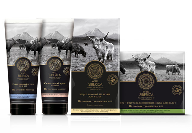
This design for Wild Siberica, one of Natura Siberica’s many product ranges, typifies the modern Russian brand. The design is built around a highly detailed, ornate stamp that is characteristically Russian, which also gives the impression of a traditional company. But with clear Western design traits seen in the way the image and text block is split 50/50 across the packaging, the use of colour markers for consumer navigation and the ordered, carefully weighted communication of product information.
Slavyanka
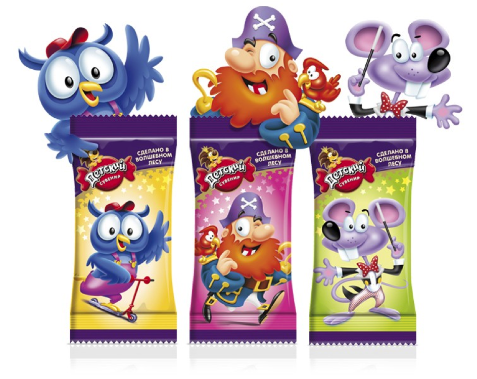
To engage children, quite logically this design for Slavyanka focuses on visual appeal first. The influence of Western design can be seen in the enticing imagery and understanding of ‘pester-power’, using characters that could easily have appeared in the latest animated feature from Hollywood. In this case, the design achieves a blend through its layout and choice of fonts, which are widely used across Russia.
Krokha
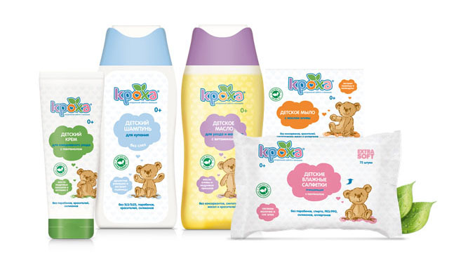
For mother and baby brand Krokha the strong Western design influence can be seen right through to the creation of the logo. Where the Russian name has been softened with handcrafted, rounded type befitting the market. So the logo epitomises the brand’s values of caring and warm. And Krokha took Western brand thinking a stage further by putting the illustrated bear on their packaging into production as a soft toy, so parents and babies could connect with the brand at the next level. But, there’s something distinctly Russian about the design too, in the cute, traditional representation of the bear.
From a design perspective you can see how the pull of the West blended with familiar elements that ease acceptance draws in the consumer. And for Western agencies looking to establish a foothold in the market this presents obvious opportunities. But another note of caution, even with eight years experience, there are many things I wouldn’t profess to understand about Russian business. The country is vast and there are regional differences to navigate too. So my advice is to employ someone on the ground to assist you with day-to-day matters and guide you on differences in business expectations and etiquette. So your client servicing matches your design approach—a blend of East and West.
About the Author

David Rogers is the owner and Creative Director of Nottingham-based brand & packaging design agency Pure, which works with some major names in the UK such as Unilever, Wilkinson, and Greencore, as well as many international/local brands, specifically in Russia.