I was recently presenting some brand design capabilities to a new client. After one case study I was asked “Why did you retain the brand color blue, was it ownable to the brand?”
The truthful answer was short, “No”. But the explanation was more complicated. And what I wish I had the time to say in that meeting, I decided to capture here.
In almost 20 years in this business, I have heard marketers request that creative develop something ownable. I have also heard creative describe ideas as more/less ownable than another. To be honest, if they invented Creative Brief Bingo, ownable would definitely be on the game card. So here is my humble opinion and a bit of rationale as to why I think ownable—a buzzword that has lots of fans on both sides of the conference room table—is often misused and misunderstood.
1. If you can’t sue or stop someone else from using it, it’s not really ‘ownable’.
This is an important point in terms of managing expectations. In the case of the blue color mentioned earlier, it was not ownable per se. Anyone else could have used it without consequence. Yet in that particular category where most brands had migrated to a primarily white palette, it was differentiated. In addition to that, blue created an attractive backdrop for our product photography. When you read between the lines of that question, I suspect that the client was recognizing something in his brand color palette that he felt was either 1. important to keep or 2. may have held it back from true transformation. He was just looking for rationale and ammunition for his upcoming project.
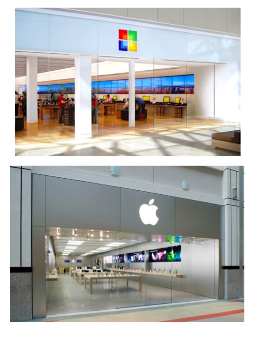
Microsoft attempted to capture Apple’s success with a store design that is extremely similar. All that Apple could really do was rest assured that it’s product design and cultural appeal would not be compromised just by a similarly looking retail environment at Microsoft.
2. Even if you have trademarked a brand element, it may not be the secret to your success with consumers.
This opinion may feel a bit like tough love to some, but hear me out.
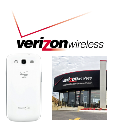
Verizon was #1 in the wireless industry until AT&T claimed the i-phone first, and I guarantee it had nothing to do with that ‘identity crisis’ of a logo. There are actually consumer complaints in social media by people who purchase a much-loved shiny new device and then realize the ugly Verizon logo is etched on it. The Verizon success story is about network reliability. And at the risk of further offending the team behind it, would anyone else want to emulate that logo anyway…even if it was not registered?
We see ™’s and ®’s and have legal teams advise us as to how to protect these assets. And mostly these are defensive moves to make sure no one else can emulate (steal) them from us. The majority of the strategic and creative handcuffs in branding are based on lawyers making sure we do not dilute trademarked or copyrighted elements. In a nutshell the advice usually sounds a bit like “If we allow ourselves to do XYZ to our brand, then we open the door for other brands to rip us off” etc etc.
My advice moving as you approach your next project:
Do not hijack and/or mis-use the word ownable in a meeting just because it helps sell your strategy or your creative.
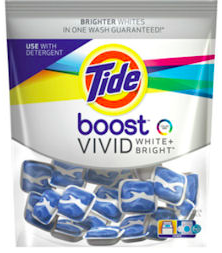
All equities need to matter emotionally to your audience, not just your legal department. Take Tide as an example. Tide owns orange right? And yet every private label detergent “borrows” the orange in the hopes that you will see their brand as equal in quality. That’s because Tide has an enviable position, but legally it is not an ownable color. Most importantly, when it came time for an innovation in whitening, P&G let the orange go.
Hindsight is 20/20. Take it one step at a time.
How comfortable do you think the lawyers were with Apple Computer as a trademarked name in the seventies? That must have been a fun meeting. A common name having nothing to do with technology? Not even misspelled as ‘Appull’ to make it ownable (don’t get me started on that). How long until the lawyers were okay dropping the qualifier ‘Computer’? And the same goes for other envied brands like Target and Starbucks. We want their business success now but would we have bet on a generic bullseye icon or thought a green mermaid embodied premium coffee? The creative briefs of today seek way too much in my opinion: unique names that instantly explain the idea, iconic imagery, ownable colors and typefaces, all within a few months of a typical project timeline. That’s a tall order! It takes many years and billions of dollars invested to be identified by a singular element of your brand.
To sum up, it’s great to actually BE ownable, but it’s just as good to be enviable. And the creative team cannot force upon a client the commitment and passion needed to realize a long-term ownable vision. They can only give you inspiration and a roadmap. The rest is up to the brand team.
About the Author

Renée Whitworth is a strategic partner at Flood Creative in New York. Over the last 15 years she has developed a reputation for providing unique insights that help every facet of design come together with a singular, shared focus.