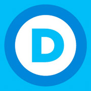
Ok, before you jump all over me, let me clarify that there is plenty of beautiful design out there and plenty of designers working hard to bring relevant, thoughtfully designed brands to the masses. And then there is the democratic national committee’s new logo. I’m speechless.
It pretty much embodies all of the emotionless, «modern» design that is popping up in the most peculiar places—from my morning coffee to several aisles of the neighborhood drug store. Is this really what we consider to be contemporary design? Does modern design mean you have to strip all character out of the work? What are all the great illustrators, photographers, and typographers to do?
While we’re on type, let me go out on a limb and say that Helvetica Neue and other sans serif fonts are useful but overused. There are thousands of gorgeous fonts out there, more than we as designers will ever be able to use or experience. Look beyond the obvious, embrace words like kerning and leading, and before you think about lowercasing everything on your business card, think again.
Yes, there is something to be said for design that allows the consumer to make it their own and interpret it for themselves, but brands have personalities just like people. Consumers buy and support brands for myriad reasons—they are a good value, they differentiate on shelf, they are ‘green’, but ultimately brands that stand the test of time are those that create an emotional connection with people. And it’s pretty tough to be passionate about white bread. The exception of course being Wonder bread which makes an excellent grilled cheese sandwich, but I digress.
It appears that my fellow Dems have decided to hang with their twitter and facebook friends from the looks of things. Recently DNC National Press Secretary Hari Sevugan said, “We are a grassroots party. We are the party that fights for everyday people.” And that is communicated where in the new identity? Maybe he meant to say that it’s a party for subway riders or Krispy Kreme enthusiasts. It just seems a desperate attempt to be something they are not, grabbing blindly for some relevance with today’s youth, and giving the finger to everyone else. Where’s that damn donkey when you need him?
After a far amount of thought, I’m prepared to go out on a limb and provide my opinion that one of three things happened in the creative process, 1) the fear of doing something truly historic paralyzed whoever created this, 2) this thing was over-strategized and sterilized to death, 3) Bob’s son who’s studying graphic design at junior college got his hands on a free font website.
I guess from now on you can call me a Dunkin’ democrat. And if someone asks if the Democratic Party really missed the boat on this one, of course your response should be, «Yes they did.»
About the Author
John founded Little Big Brands in 2001. He’s a veteran of the design and branding world, working for industry leaders such as Sterling Group and Landor since 1992.
Over the years, John has been instrumental in creating unique packaging, identity, and brand platforms for a blue chip list of clients, including: Burger King, Coca-Cola, Gillette, Johnson & Johnson, Novartis, Pfizer, Unilever, Salomon Smith Barney, and Louis Vuitton.

