It is undoubtedly already heading for iconic status as it becomes one of the most talked about adverts of the decade. And although the GBP6 million price tag would usually be a big talking point, the cost is not the issue.
Seemingly, the reason we are all talking about the new John Lewis ‘Always a woman’ ad is that whilst our head is telling us that we should find this leap through life schmaltzy and somewhat nauseating, we are actually genuinely moved by the straight to the heart sentiment of the ad – a sentiment that perfectly reflects the John Lewis ‘our lifelong commitment to you’ strapline.
Yes, of course, we already felt warm and friendly towards this great British brand and institution of quality and reliability but the beauty of the ad is in the fact that it is about more than the John Lewis products. It is about the products that punctuate moments in our life rather than buying products to make a life and this gives us even greater respect for JL and tells us that they really do care.
Marc Gobe’s bestselling book ‘Emotional Branding’ coined a phrase that we have all quite literally taken to our hearts as we try to find new ways to creatively foster a more intimate and meaningful connection with our consumers. To me, this new ad is a perfect example of not emotional but rather emotion-led branding and got me thinking about the challenges for packaging design as the bar continues to be raised.
Once again, I am not trying to open up the whole advertising v design debate but we expect ads to create a fictitious story over and above the brand offer – there can be a certain amount of artistic licence and ‘smoke and mirrors’ with visual effects and tear-jerking soundtracks at their disposal. Packaging design is about the product, the key touchpoint and the tangible power of the brand in the hand. But, in this increasingly emotive culture, we now face the challenge of having to look at ways to successfully create an idea that is about the product but so much bigger than the product…how does packaging pull at the heartstrings? How can packaging show it really cares?
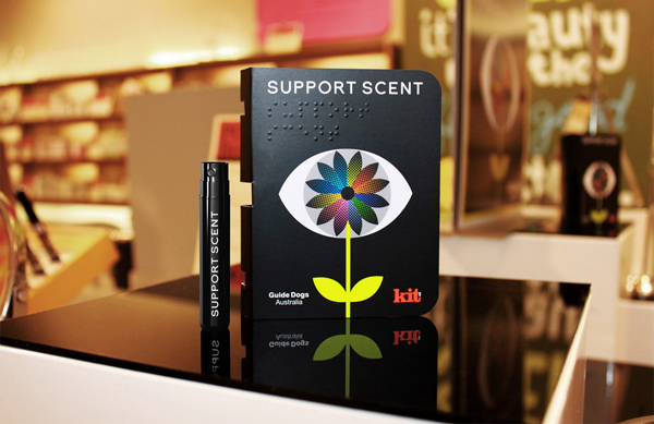
Working on a new charity marketing campaign for Guide Dogs Australia, Clemenger BBDO was tasked with developing something that would be easy to notice by all people including the blind and vision impaired. It was agreed that smell would be the focus of the campaign and, with the help of Kit Cosmetics, Clemenger BBDO created a bespoke fragrance called ‘Support Scent’. The packaging has the name of the product printed in Braille and infused with the fragrance, so that it is easy for blind people to determine the scent among other products. A bold but sensitive innovation perfectly complemented by the simple yet striking graphic icon that expertly melds a flower and an eye to reinforce the message that it is a fragrance — a smell that is about sight.
The packaging makes us not just appreciate products – and their packaging — in a different way but appreciate just what limitations the visually impaired face as part of the community in day to day life. This is not just a charity/product link-up looking for an easy and saleable route by slapping a logo or charity message on a product to present a caring face.
But, rather, it is a completely innovative packaging design answer that gets to the very soul of the brand to successfully create the bigger picture head — and emotional – space that has traditionally been the domain of the ad world. This does not prescriptively manipulate our emotions in the same way as an ad but is more open to interpretation and the full spectrum of emotions, allowing us to empathise with, admire, applaud our blind and visually impaired counterparts or, conversely, to feel saddened and sympathetic…
It’s not easy when we are trying to creatively answer so many new moral and cultural needs but it’s time to open up our hearts and our design approach. Don’t be afraid to display some emotion.
Jonathan Ford, Creative Partner Pearlfisher
