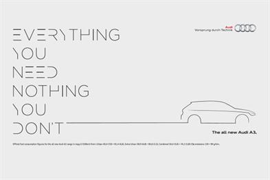
Audi highlights simplicity and a neat approach in designing cars. A new campaign, developed by BBH, celebrates the “uncluttered” style the brand has used in creating its A3 sedan and in an indirect way takes on rivals of the model. The new promotion, which is set to be launched in the UK next month, revolves around the idea of using minimum visual resources to reach maximum effect in performance.
Photo: Audi A3 in a print from the campaign by BBH
“Other cars in the premium compact sector are overwrought with cluttered technologies and styling. By paring the design back and starting with a blank sheet of paper, Audi has designed an elegant new model with improved fuel consumption, extra space and a sleek user interface. The new A3 will redefine its sector, and this campaign allows us to convey that message in a similarly clear succinct manner,” commented Dominic Chambers, head of marketing at Audi.
The team behind the campaign chose light grey background, simple graphics (which just outline the A3, not pictures it) and clear cryptic type to deliver the message of “less design elements, more effect”. The outdoor ads will also feature slogans, which support the idea and add a pinch of philosophy: the messages include “You don’t need everything to have everything,” “Now with less,” “We’ve cut fuel consumption yet added power” and “Good design isn’t just what you add, it’s what you take away.”
According to BrandRebublic, the teaser stage of the promotion launches on September 1, when Audi will preview the ad pieces to be rolled out in two weeks, on September 15. The “uncluttered” campaign will include prints as well as digital ads.
