One of the lead stories on Popsop this week has been the results from the IKEA Playreport — an international, research-driven project investigating play and its affects on family life. It is the largest global survey ever conducted on the topic and reveals that many parents feel that they have forgotten how to play with their children.
I am not going to focus on the ramifications of this particular study but do believe that — whether or not we claim to have forgotten how to play — the recent downturn and our increasingly pressured lives, means that we are actually hungry to inject our lives with a sense of the carefree and fun and that brands could start to take some (more) responsibility for helping us indulge in and enjoy the lighter side of life.
The YouTube phenomenon pays testament to the power of the funny ads and viral campaigns with this week’s star turn being the Coca-Cola and Wayne Rooney ‘goal dance’. It is, of course, undoubtedly harder to successfully convey a playful side to brands without being gimmicky or just trend-led in our brand design and packaging.
But that does not mean that we should not take a bold step and show a different side to our brand personalities. With food, in particular, we have become far more specific and serious about the source and delivery of our food but this message does not have to be conveyed in a stuffy, strait-laced or uber-sophisticated way.
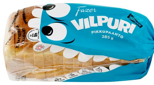
The GLORIOUS! range of soups and pasta sauces (Lambie Nairn/ilovedust) uses an iconic illustration style for each letter of the alphabet with its bold ‘A to Z of Global Flavours’. GLORIOUS! has a fresh simplicity with individual and collective Alphabet Chart naming and labelling which we all understand and feel emotionally attached to. And, the Fazer Vilpuri bread and bagel range — with open-mouthed fish and animals dominating the packaging by taking big bites out of the products — by Finland based Hasan & Partners is not just a range for kids but surely has that certain something to make the whole family smile…
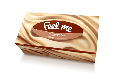
Kleenex recently took a very bold move, replacing their logo with the words ‘Feel me’ — and strapline ‘I’m Gorgeous’. The corresponding new packaging was designed to convey the softness of the tissues by flooding the box with a luxurious texture. The name and design are not only aesthetically pleasing (and teasing) but drive home the softness of the product and create different — and more edgy — stand-out on shelf.
And Cocoon Branding’s Oi Sofa — a modular sofa that ships in a cardboard box — has totally shaken up the look and feel of the furniture category. Oi is comprised of modular seating pods and can create an infinite amount of configurations by adding pods together. A fun and unique way of creating your own seating arrangements and the superb packaging is created with the intention that the product has all the attitude. The name Oi is a way to say “hello” in many languages and the “talking sofa” gives you quirky messages as you interact with the packaging. These messages were also designed to emphasize the key product benefits.
By and large we are more visually driven and more creative in our day-to-day lives and whilst we tread a fine line to retain brand value and trust, there is maybe scope for brands to find more clever and arresting ways to enhance our lives – and our day-to-day purchases — in a more playful and quirkily humorous way.


