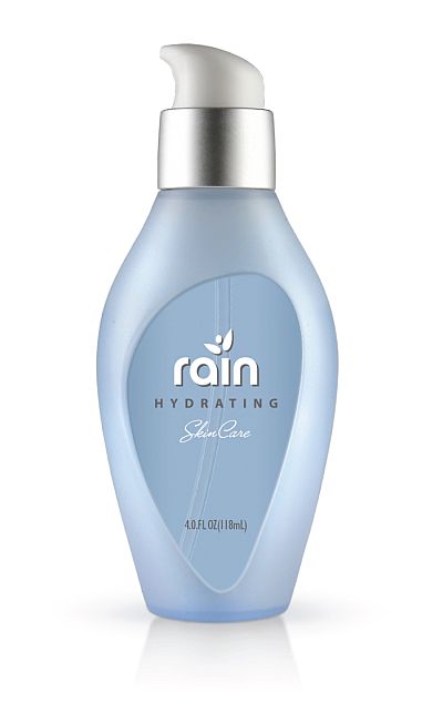
Product Ventures, an American renowned creative agency, recently designed this high-end, ultra feminine skin care packaging — which captures the essence of hydration via the brand name RAIN and the use of the water droplet metaphor reflected in the structure.
The package design for RAIN clearly illustrates how an elegant structural shape works to complement the brand communication. CEO and Founder Peter Clarke explains that he challenged Wendy Church, Creative Director, Strategic Branding to design the graphics to visually communicate the natural hydration of the product. “We chose to create very simple graphics which highlight the beautiful aesthetics of the bottle and celebrate the functional efficacy of the structure,” stated Wendy Church.
Structurally, materials such as sea glass, a frosted finish and natural contours were used to create the distinctive premium packaging with a “pick me up” look and feel. Graphically, the simple text and organic leaf design imply that it is derived from nature. The packaging overall both structurally and graphically reflect the elegance and sophistication of the brand with its graceful curves and subtle hint of femininity.
