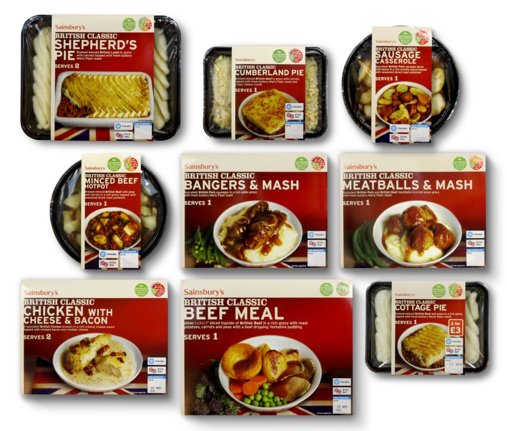
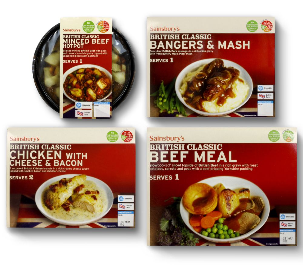
Blue Marlin has created fresh new packaging for Sainsbury’s range of classic British dishes that will roll out this month. The new design gives the meals a modern, upbeat look without watering down the traditional elements that are known to be very important to brand loyalists.
Classics has an extremely loyal older customer base, which Sainsbury’s is intent on keeping, while broadening the range’s appeal to younger audiences. «Imagine a cross between Guy Ritchie and Paul Smith they are both quintessentially English with a contemporary twist. We’ve taken those sorts of expressions of Britishness and applied them in a foodie way,» says Blue Marlin executive creative director Martin Grimer. The new livery features beautifully shot product on white porcelain with an understated Union Jack background.
«We’ve taken traditional ingredients and updated them,» Grimer adds. The packaging uses a chunky slab serif typeface that adds a further element of modernity. The new look also reduces the amount of packaging by up to 25 per cent as packaging reduction is an increasing concern for retailers, manufacturers and designers alike.

