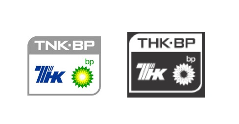
British Petroleum has silently made changes to its logo on the website of its Russian company TNK BP, www.brandchannel.com reports.
As you visit the official website at www.tnk-bp.ru, you will notice that the website logo which previously had white background and featured the bright-green BP sunburst, is now completely black. As far as British Petroleum sunbirst symbol is concerned, its radiant colour has been removed and is now white.
There has been an ongoing debate among the brand experts on what should that mean. According to brandchannel.com, most of them defend BP, saying: «For an oil company, website branding is about communicating with investors. The new design where the black is immediately associated with oil, signals that TNK-BP is moving back to something that is believable and defendable with the industry.»
BP’s spokesman told in an interview to Reuters that by redesigning the logo, the company aimed «to bring [the brand] more closer in line with modern website functionality and current design trends.»
However, such statement doesn’t sound very persuasive, since a colour of logo is unlikely to have any impact upon the wesbite functionality. So, that brings the experts to thinking whether this move was aimed at admitting the mistakes of the Mexican Gulf, abandoning the false image of the green company and going back to its roots (BP used to have black-and-white logo in the first half of the 20th centuries).
Image: www.bp.com
So, at this point, opinions differ. However, reporter at www.branchannel.com makes an assumption that «…maybe there is more going on than meets the eye. Recent reports of a failure of BP directors to appear at a TNK-BP meeting demonstrates a growing rift between the companies, with at least a few even accusing BP of «sabotage.» That’s a charge that a court of law would definitely want to see spelled out in black and white».

