When the most iconic brand teams up with the great artists and designers for the biggest sport event on Earth, results of this collaboration can be truly amazing.
For this year’s Summer Olympics in London the timeless sponsor of the Games, Coca-Cola, surprised its fans with new arty bottles, cans, and overall festive visual identity developed in collaboration with the UK design firm ATTIK and American-born (now France-based) graphic artist Matt W. Moore, known as MWM.


Matt comments on this exciting project: «My role was to create a robust graphic asset library that the good folks at Attik then refined into a visual identity system (VIS). This VIS was then passed along to agencies around the world to work with for their regional campaigns.»
The work encompasses two graphic design disciplines/techniques that MWM is so famous for: vectorfunk and typography.
It is a good tradition and part of communication strategy to launch arty series of bottles and packs in line with the Olympic campaigns each 4 years for the Summer Games.
Back in 2008, Coca-Cola launched another art project called WE8 («West-East 8») to support its global pre-Olympics marketing campaign “Coke Side of Life”, symbolically uniting East with West.
Eight bestest Asian designers and artists along with European and US djs and music producers created their own conceptual meaningful designs for the iconic Coke contour bottle.
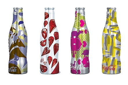
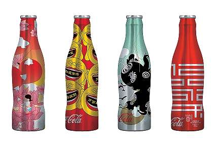
Photo: Coke arty cans as part of WE8 project for the Beijing Olympics 2008
Later in 2008 another creative collection of Coca-Cola cans was launched as a tribute to peace, globalization and multiculturalism — a series of 8 cans with the wordmark «Coca-Cola» written in 8 world’s languages.

Photo: multilingual Coke cans, Beijing Olympics 2008