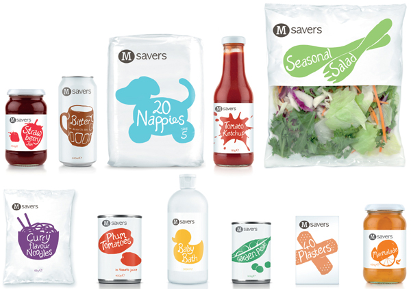
Brand design agency Coley Porter Bell has rebranded Morrisons’ entry level ‘value’ range as part of the retailer’s strategic overhaul of its own-brand offering.
The rebrand is part of the biggest design brief in the UK this year. The aim is to strengthen the Morrisons brand and increase the share of its own products bought by customers by transforming Morrisons’ own label into a coherent own-brand. The redesign will roll out over the next 18 months.
Photo: Morrisons’ Value Range packaging rebranded by Coley Porter Bell
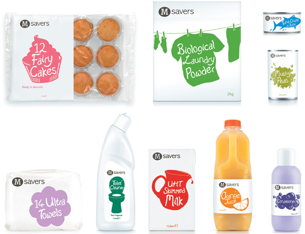
The ‘Morrisons Value’ line has been renamed ‘M Savers’ to reflect its consumer benefit. The new designs confidently express the Morrisons brand with an iconic charcoal grey roundel bearing the letter M in white.
This core logo is accompanied by hand-crafted product illustrations of product silhouettes and shapes in a naivist style. Backgrounds are all white but the illustrations are in a range of bright foody colours. Within the illustrations, simple product descriptors are written in a bespoke type-face created by senior Coley Porter Bell designer Craig Barnes.
Photo: Morrisons’ Value Range packaging rebranded by Coley Porter Bell
So far 350 skus have been redesigned. The new designs and branding will be rolled out to cover the entire range a within the next 2 months.
Stephen Bell, creative director of Coley Porter Bell, said the redesign aims to inject real brand values into Morrisons’ entry level products. “This is value for the times we live in. Value ranges tend to be somewhat utilitarian , using template designs and basic corporate colours. Research shows that consumers are often ashamed to be seen with them. But with the economy stalled for the foreseeable future, value ranges will be competing on more than just price. We wondered why shouldn’t entry level products have some charm and engagement?”
He said that the new designs reflect a change in Morrisons’ entire brand architecture. “Morrisons’ new positioning is all about food culture and a human touch. These designs, which look handcrafted and quirky, contribute to the feeling that even Morrisons’ most humble products have been cared for by people. We’d like people to raise a little smile when they see these designs.”
Carol Turner Head of Design for Morrisons said that the changes were not simply cosmetic. “Our ambition is to be the brand worth crossing the road for and for the M Savers range the best quality possible at an affordable price. We’ve upped quality and altered the range based on genuine customer feedback through brand panelsand now we are injectingreal personality into our products through design too. These designs are engaging and completely unique.”

