Our long-standing «agencies of choice» and merely friends— Elmwood, jrk, Pearlfisher, and bluemarlin— have shared with Popsop their latest design projects this week.
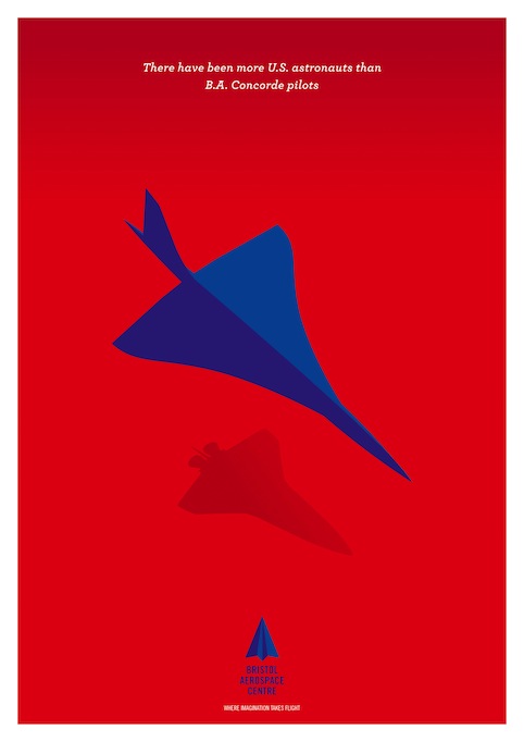
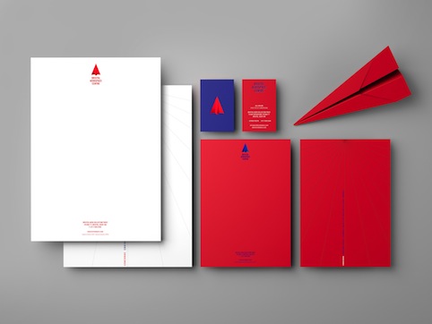
1. Elmwood have created the modern identity for Bristol Aerospace Centre, new aviation heritage museum. The use of the paper plane in the logo highlights the possibilities and potential of an idea and the simplicity of a thought and the personal effort behind every feat of engineering. The colour ways—red, white and blue in the branding—are a nod to the transatlantic nature of the museum, connecting UK, France and America.
![]()
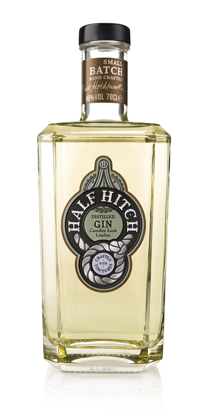
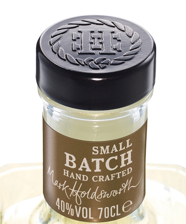
2. Jkr have designed packaging for the truly London gin HALF HITCH, inspired by the heritage of Camden’s industrious past. «The heft and wrought iron cues were expressed through the use of a metal label and finished in a mix of oloured lacquers and monochrome to capture both the craft and the beauty of the product itself,» commented Daniela Nunzi-Mihranian, Creative Director, jkr.
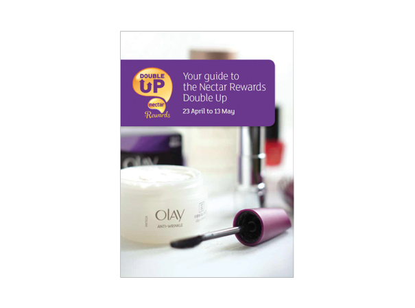
3. Pearlfisher have created a new name and identity for the special redemption programme and a flagship campaign of the UK’s largest loyalty programme Nectar. The scope of work included brand strategy, naming and identity design. The new design evolves Nectar brand from transactional to emotional, linking it back to the rewarding promise of Nectar’s name and better communicating the values of the brand.

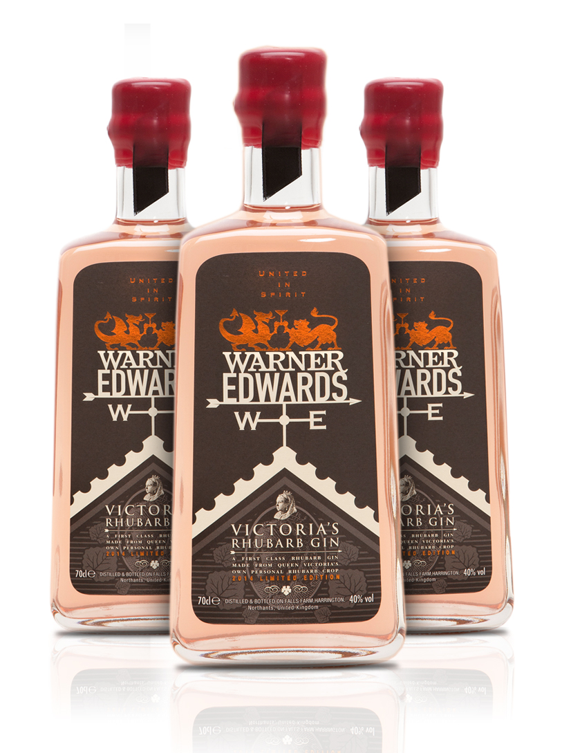
4. Bluemarlin have designed packaging for the limited-edition, artisan gin Victoria’s Rhubarb, a Warner Edwards-owned brand that launches this September exclusively at Fortnum & Masons. The agency’s task was to create a design that told the regal story behind the gin. It takes inspiration from the Penny Black, the world’s first adhesive postal stamp, which features the profile of Queen Victoria as it was first issued in 1840. The design also includes a portrait of Her Royal Highness surrounded by the leaves of her rhubarb plant.