The UK food brand Red Lion has been revived with a new positioning and package design by London-based consultancy Dragon Rouge, appointed for the project back in January 2011.

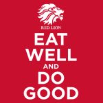
Pic. The new logo reflecting the revived brand positioning, image on a preview from www.designweek.co.uk
The studio’s aim was to significantly increase stand out, and to rival branded competition by distinctively communicating the quality and taste messages alongside the charity associations. Our packaging designs are based on the infamous Keep Calm and Carry On poster campaign, forging an explicit but lighthearted link between the Red Lion brand and the forces. The poster copy line ‘Eat Well and Do Good’ has been created with the intention of intrinsically linking the forces message, food quality and taste, the charity message and the Red Lion brand—encapsulating all elements in a format that is both striking and distinctive.
The imagery on a new packaging and in communications is based on the idea of quintessentially British culinary combinations.
The new Red Lion package design will be rolled out nationally across all products in 2012.