The US office of Dragon Rouge and Shelf Impact! magazine will conduct a special survey on packaging designs of the new launches in packaged goods category, resulting the metrics for successful package design.
On 16 September at HBA Global Expo in New York, Marcus Hewitt, Chief Creative Officer at Dragon Rouge, introduced some talking points previewing the results of the survey.
Among them:
- Send a cohesive message that marries graphics and structure.
- Daring packaging structure pays off in increased sales and brand recognition.
- More can be less in designing packages for today’s consumer.
He took 10 latest packages from key market segments including beverage, food, health/beauty, household products, and over-the counter drugs.
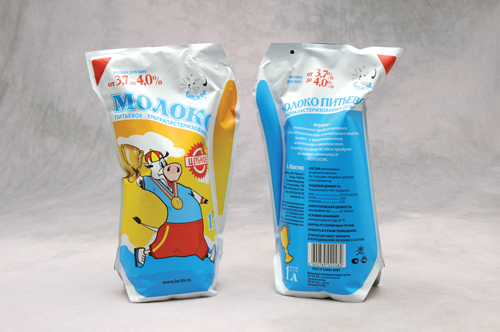
1. Ecolean milk containers reduce material use, weight;
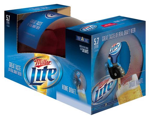
2. MillerCoors 1.5-gallon Home Draft beer dispencer;
3. Anderson’s Maple Syrup’s new injection-molded, polypropylene custom burgundy closure — Teardrop-shaped closure;
4. Nestle Purina PetCare introduced a custom-made carrying case for a cat food;
5. ConAgra’s thermoformed frozen-food trays are now made from PET;
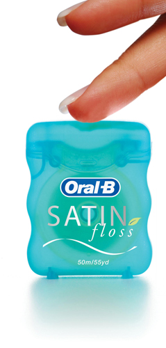
6. Procter & Gamble’s new container for its Oral-B Satin Floss;
7. L’Oreal Demaq’ Expert Makeup — Distinctive tube sports transparent window;
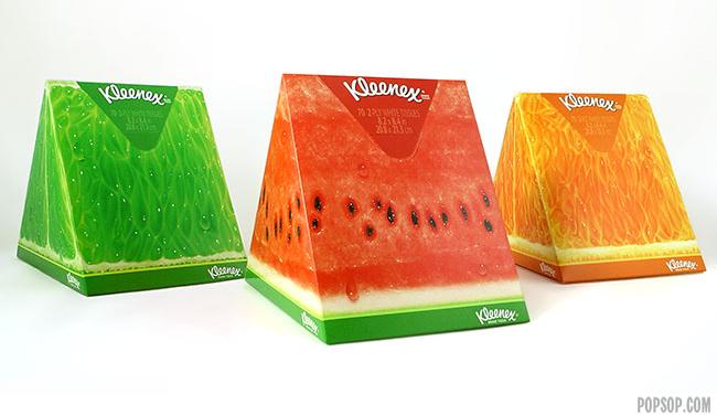
8. Wedge-shaped tissue boxes for Kleenex from Kimberly-Clark;
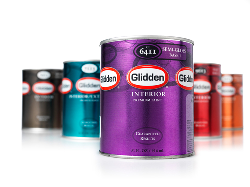
9. Glidden Paint emphasizes the brand logo three times on the label;
10. Vivitas Woman Mom to Be, from Purity Life Health Products — Intuitive package shape supports product inside.
Результаты с рейтингами и аналитическим обзором будут опубликованы в последнем в этом году квартальном выпуске Shelf Impact!.
The results of the survey will be published at the last quarterly printed edition of this year’s Shelf Impact! You can answer the question and complete the survey online here.
via Packaging World
