The article has been written by Ted Mininni, President of Design Force Inc, USA
“Design is in everything we make, but it’s also between those things. It’s a mix of craft, science, storytelling, propaganda, and philosophy.”—Erik Adigard
Licensed brands achieve greatness by design. Consistent brand management, a clear strategy, implementable tactics, as well as stellar design that fully leverage these brands make superstars among a sea of licensed properties that often fail to live up to expectations.
Design is a crucial component of the marketing mix. It represents both art and science as it analyzes, interprets and gives visual expression to the brand and its core assets. Uncovering those assets associated most strongly with the licensed property; those that are indicative of the brand and elicit emotion among fan devotees, are the starting point. The unique brand story can then be captured and told by utilizing visual design elements.
By deconstructing the brand down to its DNA, its visual cues can be examined. Licensed properties benefit hugely from a unique, highly differentiated visual strategy that is consistently employed. It has the power to connect the brand story to consumers on products and packaging quickly. It works to extend the licensed property’s story, eliciting emotion from consumers. What is marketing? Storytelling. What does storytelling mean to consumers? Especially to children?
Obviously, some product categories present more challenges since they have minimal or no packaging. Think apparel like t-shirts, caps, sneakers and kids’ room décor. By making sure a style guide demonstrates ingenious examples of incorporating a strong visual strategy in a variety of ways, licensees will see how limitless the possibilities are. Instead of feeling limited by their product categories, they will find ways to effectively leverage the licensed property utilizing more than the brand identity.
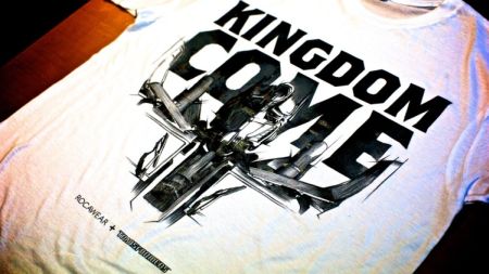
The recent “Transformers: Dark of the Moon” blockbuster film is a perfect example. Hasbro and Rocawear collaborated on a hot new t-shirt collection features key JAY-Z quotes and song titles combined with pencil illustrations of characters from “Transformers: Dark of the Moon” as well as stylized illustrations of the classic Gen 1 Transformers. The pencil illustrations depicting characters from the new movie feature instantly recognizable key characters in a style similar to technical concept drawings. A traditionally illustrated take on computer-generated character imagery, this is striking, fresh and memorable. We can see the power these illustrations will have on packaged consumer products, as well.
Photo: Transformer branded t-shirt
Here’s the Transformers’ story contemporized for a new generation of fans, while retaining their heritage for past generations of fans—the parents of today’s young brand devotees. JAY-Z and the Transformers: the merger of two hot entertainment properties.
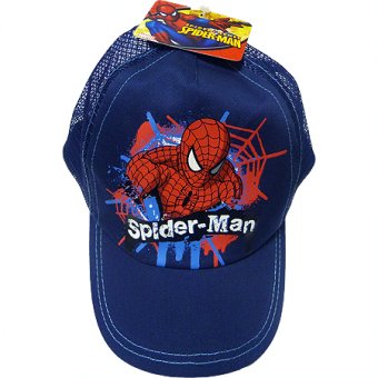
How about packaged products? Think about what it means to legions of Spider-Man fans when they see merchandise and packaging prominently featuring Spidey’s web. Licensed consumer products incorporate it as an iconic representation of the character. Added into patterns and borders; even embossed into the thermoform component of toy packaging, no brand but Marvel’s Spider-Man is personified by a web. Even before consumers get close enough to identify the brand identity, they identify the property due to its powerful visual, recall its special characteristics and reply with an emotional response.
Photo: Transformer branded t-shirt
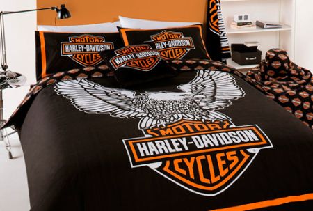
How about the Harley Davidson’s eagle? Symbolic of one brand of motorcycles and no other, the eagle represents America, freedom, the lure of the open road. Whether a full image of the eagle is utilized as imagery or simply the outstretched wings in a symmetrical manner, this icon says “Harley Davidson”. What’s important is that since no specific piece of “eagle” art is standardized, or how it is to be used, many creative interpretations can be designed, lending itself to limitless categories of consumer products.
Photo: Harley Davidson Eagle Branded linen
All that can be done to assist licensees by providing them with a visual strategy they can apply in a creative manner necessarily implies more success for the licensed brand. Otherwise, licensing partners have to rely heavily on the brand identity alone or develop artwork that may not be consistently representative of the brand.
By building in flexibility within a style guide, licensees are less likely to ad lib freely which can lead to brand dilution. It is obviously desirable to encourage the development of great artwork within the parameters of the style guide. In that way, the look and feel of product and packaging are cohesive and true to the licensed brand.
The beauty of such a visual creative strategy: it remains fresh and relevant, yet it is consistent and true to the brand. It has the power to become iconic to legions of fans. Consumers will actively seek it out and they’ll be surprised and delighted by the inventive ways in which the visual strategy is presented. This is especially true for kids and their favorite licensed character brands. When branded products appeal at such a cognitive and emotional level, they prompt consumer purchases. Furthermore, they create anticipation for more from their audience.
Generating excitement around licensed properties, and keeping a consumer audience hungry for more—that’s how great licensed products are created.
About the Author

Ted Mininni is President of Design Force, Inc., a leading package and licensing program design consultancy to the consumer product and entertainment industries. He can be reached at 856-810-2277.


