There’s a curious movement happening in brand design at the moment. When it comes to logos, the traditional logic has always been ‘bigger is better’; bigger is louder, more branded, better advertising.
But over the last year or so, that approach has been completely upended. Today the thinking among big brands is often quite the opposite—the best brand design has a delicate footprint, and in some cases there’s not even a logo.
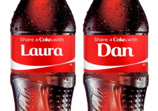
Coca-Cola’s recent ‘Share a Coke’ campaign is possibly the most prominent example of this. In a move that would probably have given brand managers of times past an aneurism, the Coca-Cola logo was stripped off packs and replaced with everyday names to encourage sharing.

Other examples keep cropping up, from the likes of Starbucks, Apple and Stella. Starbucks are stripping several stores back to largely logo-less spaces, while Apple’s latest ad hardly featured a product, and only mentioned the brand right at the end. Meanwhile Stella recently ran a campaign offering personalised glasses, with no logo in sight.
So what’s changing?
This so-called ‘debranding’ trend is partly a response to a common problem facing big brands: success brings omnipotence, which can be incredibly restricting. If everyone knows what your brand stands for, it can be something of a straightjacket when you want to engage your consumers with something a bit different. Not only that, but big logos are shouty—and consumers aren’t likely to feel a connection with a brand when they’re being shouted at.
‘Debranding’ gives brands freedom. For Coke, that freedom allows them to invoke a quieter, more personal connection with their consumers, encouraging interaction with (and between) their buyers. For Starbucks, it’s a means of shrugging off the big brand baggage to give their stores more character and make them feel more human, and individual, like the local coffee shops they compete against.
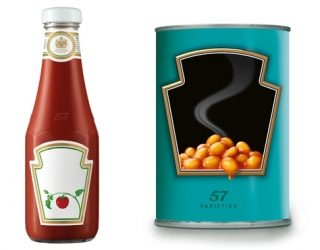
In truth, this isn’t ‘debranding’ at all. Brands are made up of much more than a name and logo—their equity can extend across colour, shape, font, personality, tone of voice and much more besides. So while Heinz might produce a tin of beans that doesn’t have the word ‘Heinz’ on, it’s far from ‘debranded’. On the contrary, the retention of so many familiar brand visual equities triggers recognition, despite the name’s absence.

Both Coca-Cola and Starbucks, retain enough of their visual equities in these new manifestations of their brands, without having to rely on the comparatively vulgar act of shoving the logo itself in consumers’ faces. They establish the right level of branding—enough to reassure that this is still the ‘real deal’, but not so much that it’s weighed down with too many of the brand’s pre-existing associations.
It’s a smart way of engaging consumers, but not all brands can do it. Both Coca-Cola and Starbucks can because they’ve invested in developing a strong Visual Brand Language (VBL)—a portfolio of visual assets to use in lieu of a logo. In our design research work, we’ve helped many brands develop and enrich their VBL, so that they have the flexibility to adapt their appearance across touchpoints, without relying so heavily on the logo for recognition.
We’ll see this trend continue. As well as offering the flexibility to ‘debrand’, a strong VBL can also have strategic benefits—making the brand harder to copy and more transferrable between markets. So, if brands have paid attention to the detail, sometimes it pays to be quiet.
About the Author
Stuart Chapman is Associate Director at The Big Picture, design research. After completing his degree in Architecture and working in practice for four years, Stuart turned his attention from building buildings, to building brands.
