![]()
You are welcome to share your thoughts on this article written by Darren Foley, Managing Director at Pearlfisher, London
Well, we’re slap bang in the middle of the peak holiday season and whilst it’s the one time of the year when many of us try to completely switch off, the reality is that now, for many of us, work comes with us. The FT’s Lucy Kellaway has coined this new part work/part holiday a ‘worliday’ as we continue to access work through mobiles, laptops and smartphones. In and out of work, we crave being kept up to date with information but most of us have problems assimilating such a constant stream…Hitting the bulls-eye of information is a difficult challenge. Providing the right information, in the right way, in the right order and in the right place is the key challenge of our information overloaded age. But there is an already existing solution: information design.
Think about the journey to your holiday destination…From the signage in the train station or airport, to the safety card in the plane seat to street/travel system maps…Information design is everywhere. Much of it has been there forever and a day (think Harry Beck’s famous London Underground topological map) so we very much take it for granted—or even disregard it—as we unconsciously process it and continue to focus on our hand-held gadgets as our preferred primary information source.
But, of course, what many of us overlook now that we can navigate ourselves around the world at the touch of a button, is that this only really works because of the establishment and existence of an already comprehensive information design system. The advances of technology—and our new existence in a largely digital world—has maybe created a perception that traditional information is somehow outmoded, outdated or unnecessary. But, actually, as we become a bigger social and global society, information design—with its ability to transcend, for example, language constraints—is vital to the successful communication of messages and ideas. Good information design enables us to tap into information via technology—not the other way around.
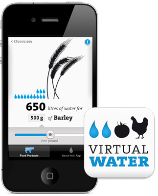
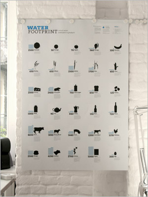
The widely acclaimed Virtual Water project shows just how successfully information design for the modern world can work with a poster and iPhone App detailing how much fresh water is used to produce selected products.
Information design has, of course, always played a part when it comes to public spaces and services, but now with so much choice offered by so many mediums and so many competitors, the brand world is in danger of missing out and being left behind if it does not buy (back) into the power of information design as part of the brand design process. Designers are tasked with working out how to design a correct hierarchy of information—on everything from packaging to environment to Apps—to create the biggest impact and meet both the information needs and emotional desires of the consumer.
Photo: Virtual Water iPhone app
Photo: Virtual Water poster
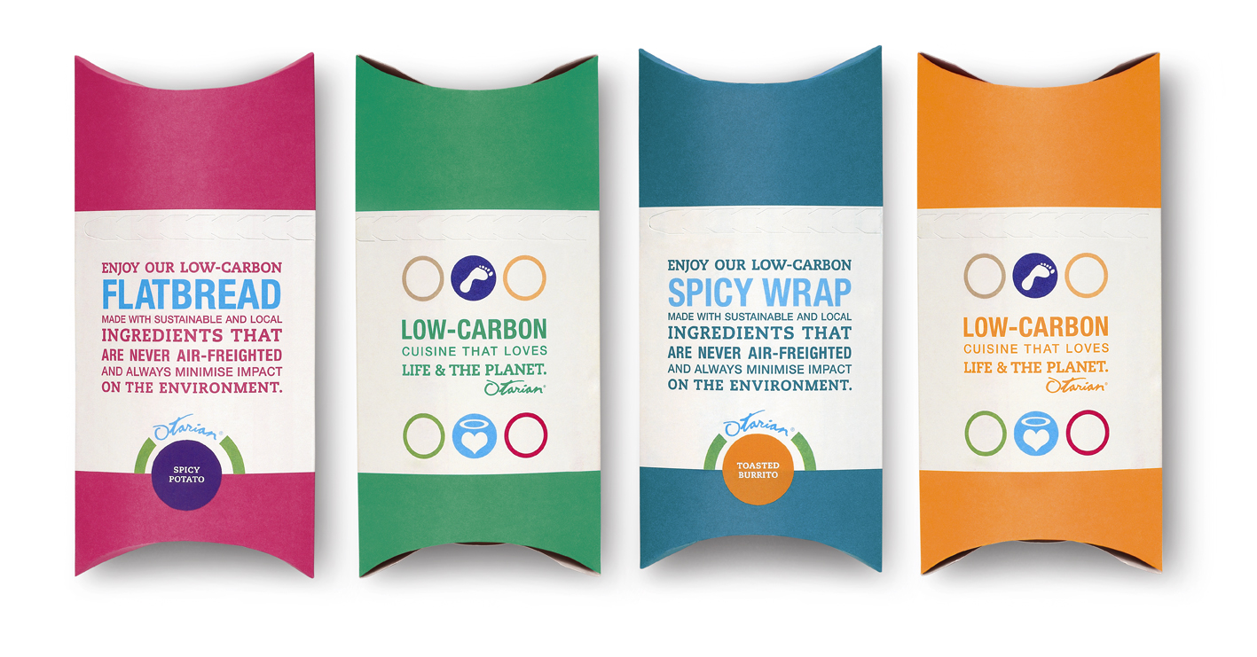
Otarian, like Virtual Water, is championing the drain on the planet’s resources with its positioning as the world’s first low-carbon restaurant chain. It has implemented a simple, but bold and colour-coded, visual language, to comprehensively carbon footprint every item on its vegetarian menu and has carried and unified this design system across all restaurant collateral, marketing and eating/retail space.
Photo: Otarian Packs, designed by Pearlfisher
But the same is also true for our social media brands. The reason that, for example, Facebook continues year on year to top the polls of social media brand leaders is because the brand focuses on a communication strategy that is about utility and facilitation rather than self-expression. It has been widely reported that 2011 is a year of re-focusing on brand and system design development for the Facebook brand as it continues to develop the tools to continue to better connect users and create experience.
Ultimately, the role of information design is to enhance user experience. It comes down to making the incredibly complex, incredibly simple—and, in turn, making the consumer feel enlightened, understood and happier in their choices.
There is a huge design opportunity opening up before us and we need to understand that embracing information design is not a step backwards but a necessary step forward. Smart brands will start to challenge and make new and bold statements through information design as they create new—and benchmark—navigation systems to inform and guide. The really smart brands will then integrate this information so closely into entertainment and great user experience that the two are all but indistinguishable.
About the Author
Darren Foley, Managing Director at Pearlfisher, London, joined the company in 2002 as Realisation Director, inventing the concept of realisation and advocating a design process in which our technical and creative teams work in harmony from the beginning. He has worked in the design industry for close to 25 years, starting out as a junior production artist, and amassing an unparalleled depth of knowledge for the discipline.


