The article was first published on SCG London’s site on August 14th, 2012
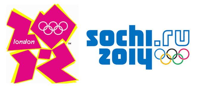
I was in Moscow for a few days two weeks ago, and with Olympic fervour reaching unprecedented heights back here at home, I managed to spend two or three hours one night in a bar near my hotel, catching up on some of the action. The teaser campaign for the forthcoming Sochi 2014 Winter Olympics marked the beginning and end of each advertising break in the coverage and I couldn’t help but compare the Sochi logo and the London 2012 logo.

Pic: London Olympics 2012 logo, designed by Wolff Olins in 2007, compared with Sochi Olympics 2014 logo, designed by Interbrand Russia in 2009
Although a Londoner born and raised, I was living in Auckland NZ when the London 2012 identity was launched. Unlike what seems like a majority of my colleagues and peers I loved it immediately. I loved it because it was simply so undeniably London—and I don’t believe that any other city could have got away with such an audacious departure from the conventions of previous Olympic identities. The logo was jarring, challenging, brash, vibrant, spiky, confrontational, fun, noisy, contemporary, controversial, ugly and beautiful—all combining to scream its’ London-ness. Over the past few months and weeks the extended identity has spread irrepressibly across our city like fragments of stained glass, and has revealed a complementary graphic language which has tempered some of the roughness of the logo itself and provided dynamic and energetic, less edgy but no less contemporary backdrop for the games themselves.
By comparison to the London 2012 identity, the Sochi 2014 logo is predictable almost to the point of blandness—there’s nothing really wrong with it, it appears to be a testament to meeting expectations rather than pushing boundaries.
It is built around a bold, solid, muscular logotype (well it is Russia, you know), prominently features the Olympic rings in their standard colours (well it is the Olympics, you know) alongside its own rather conservative blue and white colour palette (well it is the WINTER Olympics, you know). It’s all very slickly put together, and there’s that nice little mirroring touch of the “hi” of Sochi and the “14″ of 2014, and it is the first Olympic logo to include a web domain reference within its’ actual logo, but does that really count as innovation.
But ignoring the Sochi logo itself, it’s what comes next that promises to become interesting…
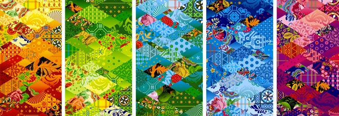
Because the supporting graphics for the identity suddenly take it in a different direction altogether. Where the London 2012 identity seemed to be all about throwing out conventions, rejecting the past, the shock of the new, the Sochi 2014 extended identity positively revels in tradition and heritage. It draws on traditional craft and folk design elements from across Russia, combining them into a patchwork motif that is visually rich, stimulating and intriguing.
Pic. Patchwork motifs, supporting the Sochi 2014 logo and visual language
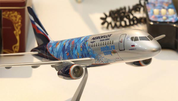
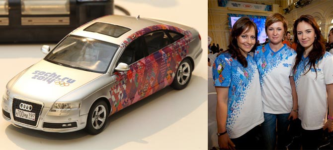
Where London 2012 focussed on invention and revolution, Sochi 2014 has looked to discovery and revelation—bringing together diverse visual heritages from the far-flung regions of this vast country and showcasing them to the rest of the world. I haven’t yet seen many examples of how this graphic language will roll out to the many applications required for this type of event—the examples that I have seen have been beautiful, vibrant and fascinating, but but I find myself wondering how it will adapt to different scenarios, and how it will work as a background to the sporting action.
Pic. Branded aircraft livery, transport and clothing
The strength and versatility of the extended graphic identity for the 2012 graphic applications across environmental graphics, signage and wayfinding, vehicle livery, uniforms etc have already been discussed on this blog. Having surprised myself by becoming a born-again sports fan after the excitement of the past couple of weeks, I can’t wait to see the action in Sochi—and witness how successfully (or otherwise!) this fascinating approach to creating a national graphic language will frame it.
About the Author
Simon Cohen is SCG London’s Creative Director and a graphic designer with over 25 years of international professional experience.
His experience spans a wide range of design disciplines including Identity Creation, Packaging, Print and Corporate Literature, Digital and Online, Advertising, Environmental and Spatial Graphics.


