A few years ago downmarket British frozen food retailer Iceland went all organic. It converted all its own brand vegetables to organic and promised to do the same for meat. Commentators sniggered. Mums go to Iceland to buy lorry loads of convenience food for next to nothing; they do not pop in to stock up on organic petit pois. Worthy though it was the organic initiative lasted just six months because it was fundamentally wrong for Iceland’s customer base.
Iceland’s heart was in the right place, but, sadly, its marketing strategy wasn’t.

Can the same thing be said of McDonalds new green corporate identity? The scourge of health lobbyists and eco-warriors alike is doing everything it can to improve its image, from introducing fresh fruit and organic milk to its children’s menu, to overhauling the composition and reducing the amount of its packaging.
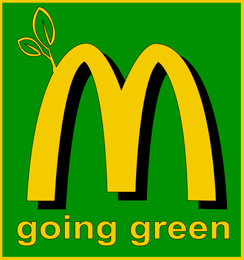
Now it has gone one step further and adopted a green logo in a bid to be seen to respect the environment. The new look is being rolled out across Germany and has already started to appear in some areas of the UK and France. It was reported here on Popsop that it was the first ‘real’ step towards ‘sustainable and eco-friendly’ positioning.
But is it? Or is it just a bit of green sheen, designed to appease but destined to backfire? After all, taking pot shots at McDonalds is a bit like criticising Gordon Brown for his lack of charisma - all too easy. And Germany, the market in which the new look has started, is a darker shade of green than most.
The green fascia that McDonalds has introduced in the UK doesn’t feel too jarring. It might even make it a bit easier for middle class mummies to give in to pester power and allow their offspring the odd Happy Meal. The new fascia works well with the combination of cafe style seating and revamped menu. But a green logo is a step too far.
The McDonalds logo is an immensely valuable property and it is hard to believe that such smart marketers would be willing to compromise it. Sticking the iconic golden arches on a green background is bad enough, but adding a cutsey little twig is criminal. It’s McDonalds we are talking about, not Yeo Valley. Not only does it smack of greenwashing, it is a shockingly bad execution. If you are going to mess with one of the world’s most valuable identities, for heaven’s sake do it well. Or better yet, don’t do it all.
By Martin Grimer, Executive Creative Director at Blue Marlin