
POPSOP Collections: Local package design from. Part 3 — China.
I. A piece of lovely cake (different series)


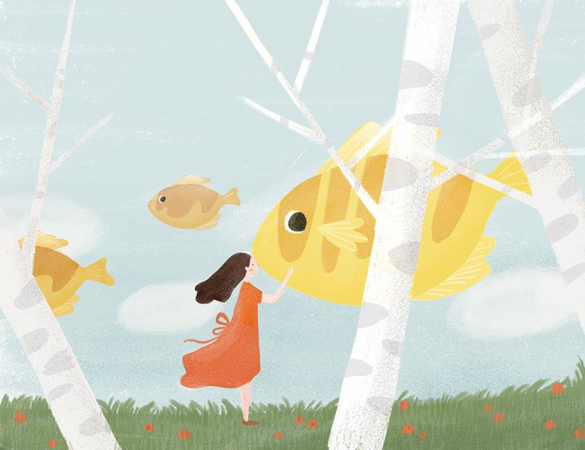


«The most beautiful scenery I have ever seen is your little smile»

Brand comment:
Hello, I am a love letter (Mandarin pronunciation for sweet pastry).
I collected every sweet memories that happened in Xiamen with you in this box of delicious pancakes.
I hope you can enjoy it for yourself or give it to your loved one in the future.
Even today we will not write a love letter again,
We can still use «a letter of love» to convey feelings;
Even if we do not talk about love again,
We still can this delicious entrance.
Therefore, the uncomfortable, crisp to you.
Designed by Step Design, Xiamen, China.
II. Daohuaxiang rice


Brand comment:
Customers are from their own rice, paddy field, past the home population, the field also, young people are out of work, home land shortage, Rongxin natural (boss) to see the situation, give up Beijing’s high paying jobs, with the family business back to their fields. The cooperation mainly designed two products, one is Rong Xin family, one is your «Mi» growth. We have chosen this expression style by comparing a large number of competing products, expressing the love of rice produced in our own rice paddies with the most simple pictures. The action figures, to our consumers in a field and enjoy the natural feeling.
Designed by Paisha, Xi’an, China.
III. Qi Yuan Nuts


Brand comment:
Nutrition and health food, and now has been gradually accepted by the public, has become the mainstream of casual food. «Qi Yuan» as the industry new brand, will face direct encounters industries such as «Mrs. Yao», exotic flavor and other mature brands. We focus on people, how to generate brand interest and how to form the core brand strength.
Visual and packaging, dual pull brand appeal:
We use «Celebrity + culture» elements, illustrated into a cartoon image to further activate the brand spread appeal.
In the main creative direction of Qi dynasty culture, the logo exhibit a kind of modern, stylish, simple, fresh visual expression, and to strengthen the brand’s regional reach and the popularity of the brand image.
Designed for company Qi Yuan Foods, China.
IV. Zhen Han Socks


Brand comment:
Project Introduction:
Zhejiang Zhen Han Hosiery Co., Ltd. with an annual output of 100 million pairs of socks, 500 million yuan output value of the scale of production, assets amounted to 300 million yuan. In brand promotion, we invited Hong Kong film star Louis Koo and the popular actress Li Bingbing as the company’s brand image spokesman, products throughout the country and exported to Europe and the United States, Southeast Asia and other countries and regions.
Solution:
E-commerce for different consumer characteristics, the use of watercolor and traditional patterns style performance, abandon the old packaging star endorsement
Designed by Cordal, Xi’an, China.
V. Dou Lai Mi honey and fruit juice


Agency comment:
Sweet things often make people feel happy. Nothing is more sweet than honey and fruit juice.
In order to make the consumer feel the product more intuitively, we designed an unique honey bee nest shape.
Designed by Xian Gao Peng, Xi’an, China.
VI. Nongfu Spring mineral water


Agency comment:
The new product, aimed at the youth market, includes a bottle design with a patented leak free cap and illustrations from renowned artist Brett Ryder.
Horse commissioned Ryder to create a set of fantastical illustrations reflecting the four seasons and depicting the wild species that inhabit the nature reserve where the water is sourced.
«The label design imaginatively brings the natural world of the water source to life in a way that appeals to young people,» says Sarah Pidgeon, creative partner at Horse.
«Both the Chairman of Nongfu Spring and our team have always been particularly big fans of Brett’s work, we really admire the ideas and thought process he applies to each commission. We knew he would perfectly capture the essence of the source in a way that resonates with the younger generation.»
The water comes from Moya Spring, located at the northern edge of Changbai Mountain in Lushuihe National Forest Park, a region densely covered by coniferous forest and habitat to an array of wild species.
Earlier this year the UK-based studio also created the packaging for a new premium water which comes from the same region.
The 535ml bottles are rolling out in China this month, with more sizes entering the market later this year.
Designed by Horse.