POPSOP Collections: Local package design. Part 2 — Brazil.
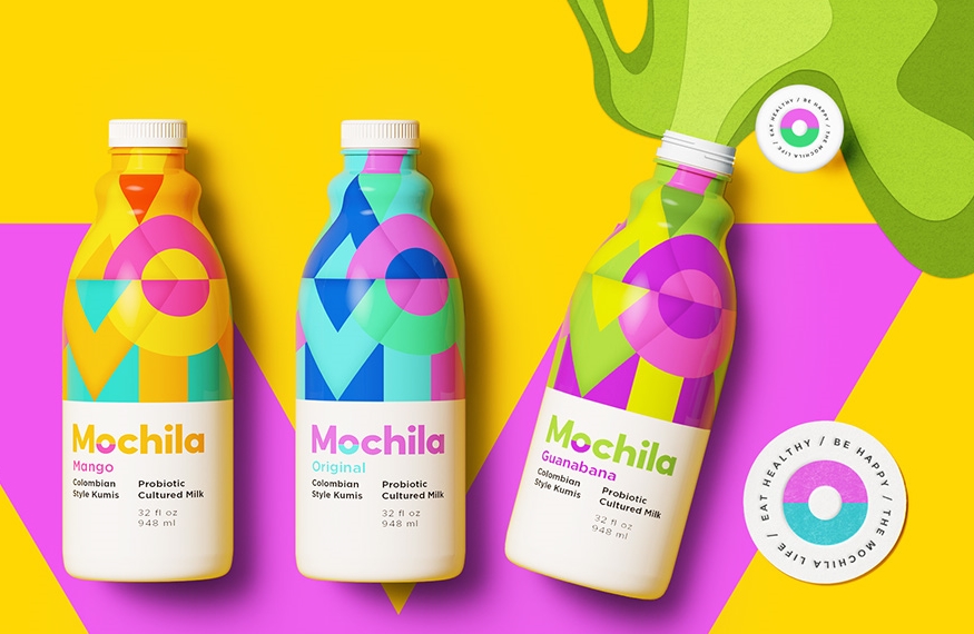
I. Mochila yogurt
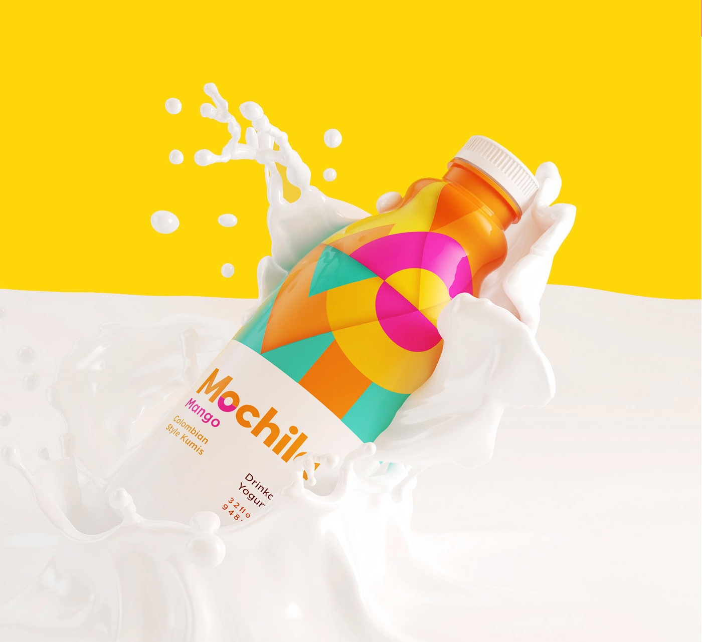

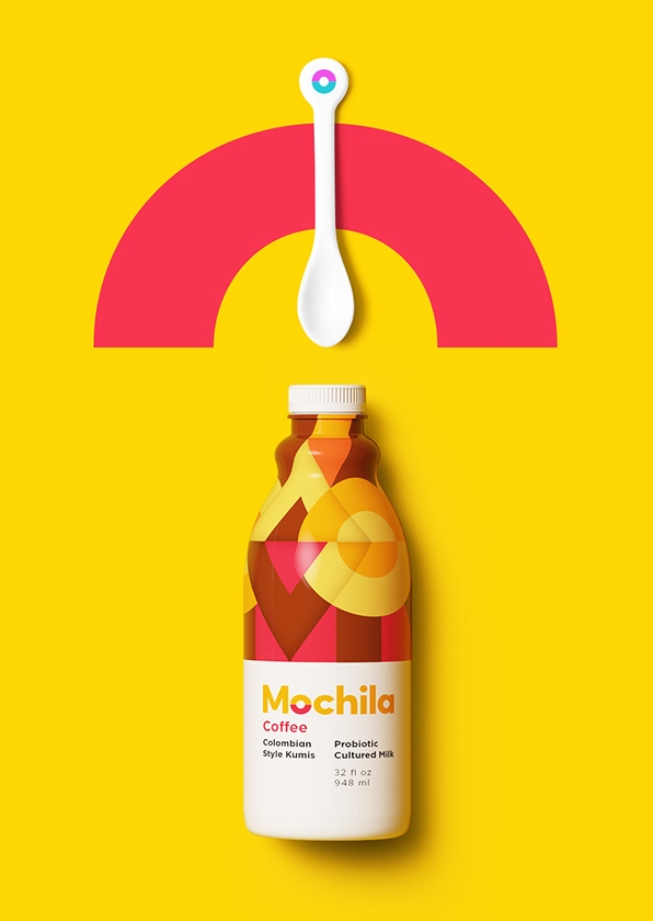
Agency comment:
Mochila is free, spontaneous, original and has a Latin soul. The product aims to be different among other yogurt brands, focusing on happiness with a sophisticated design: the packaging must be colorful and vibrant, clean and not busy.
Designed by Sweety & Co., Brazil.
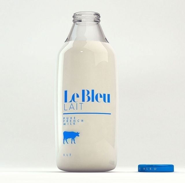
II. Le Bleu Lait («Blue Milk»)
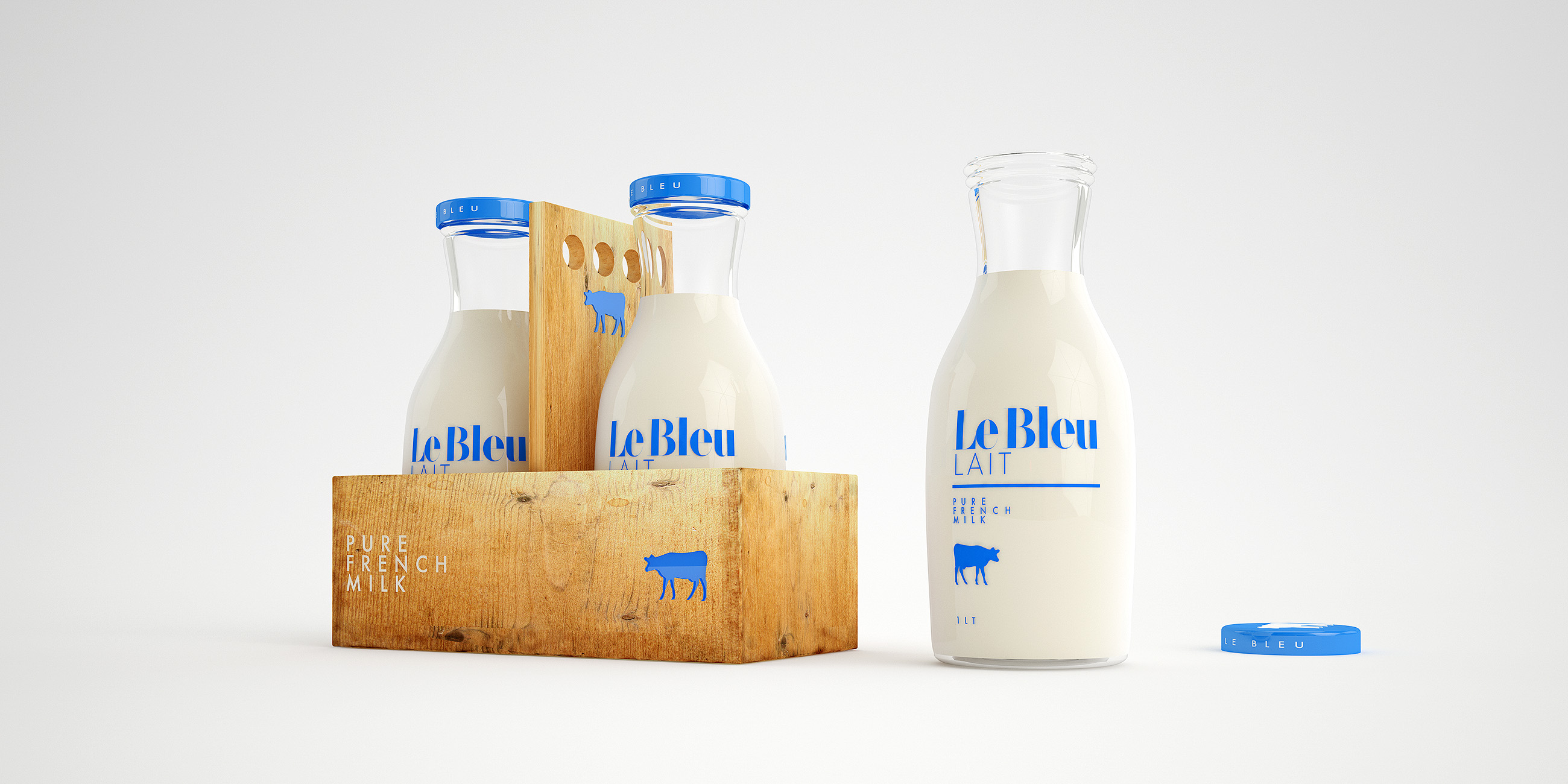
Agency comment:
Le Bleu is a delicious fresh milk lovingly manufactured in small quantities.
Designed by Sweety & Co., Brazil.
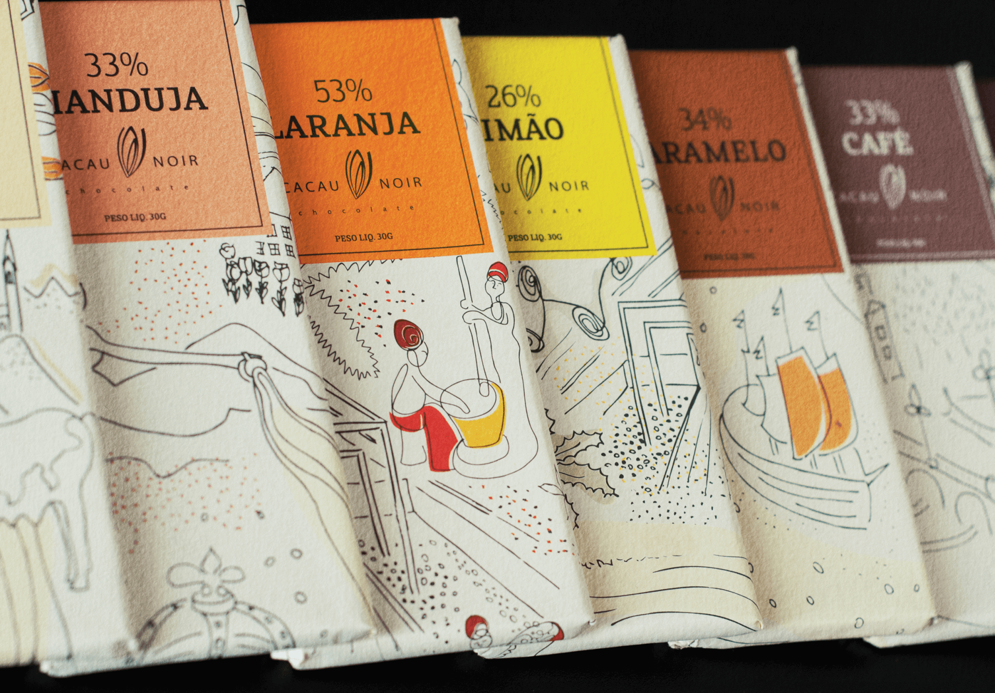
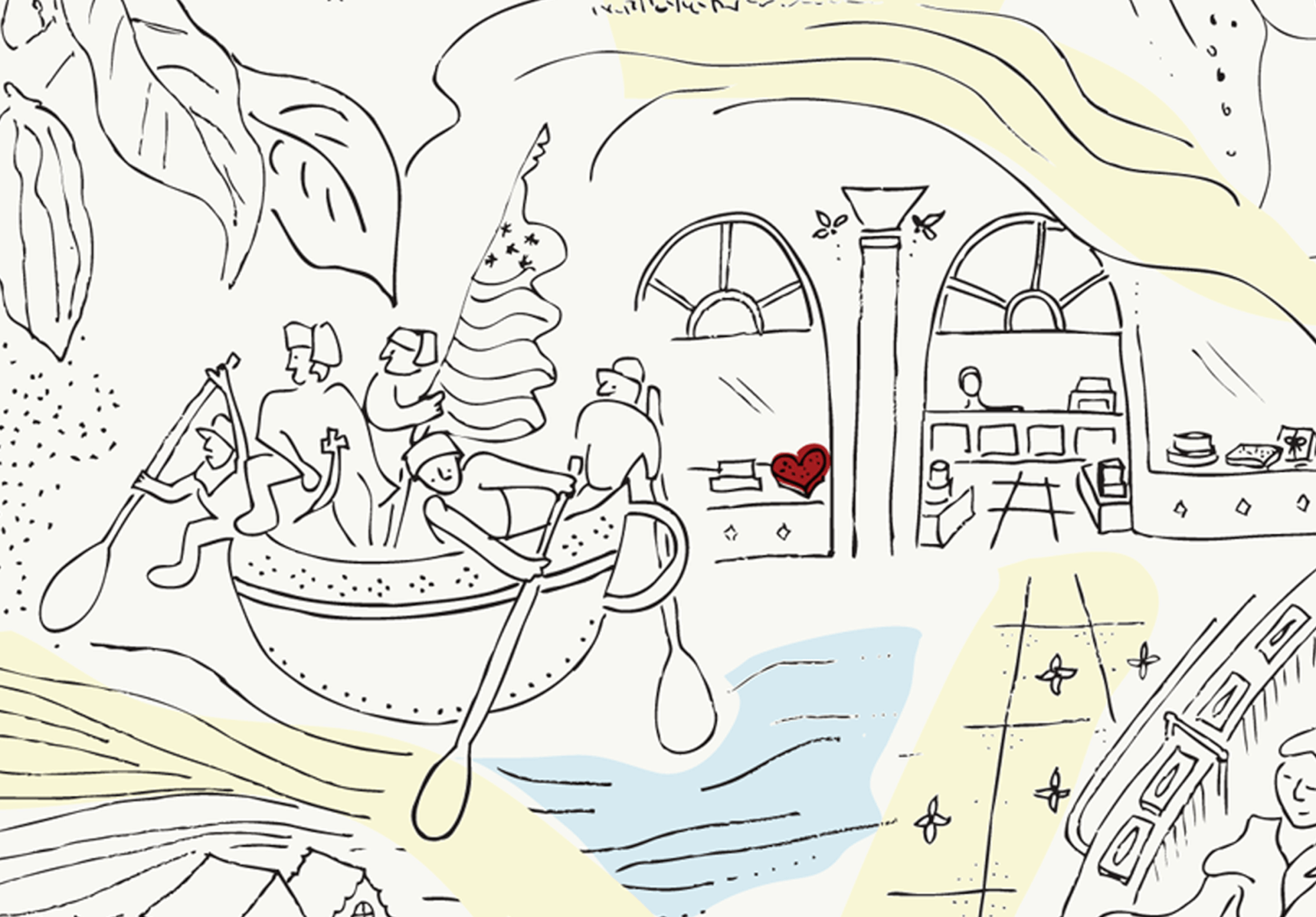
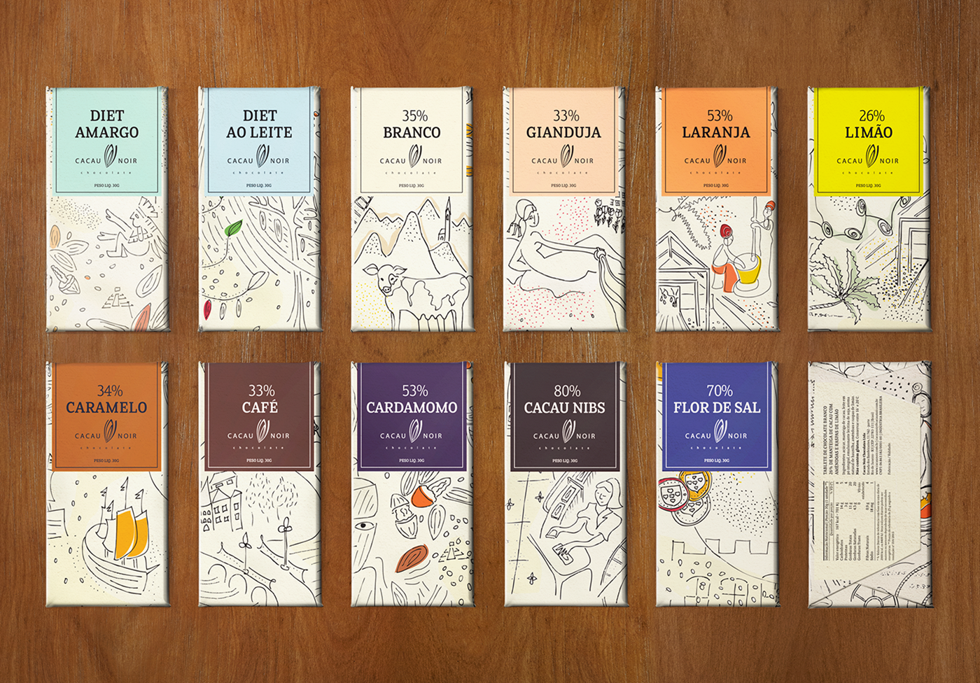
III. Cacau Noir chocolate
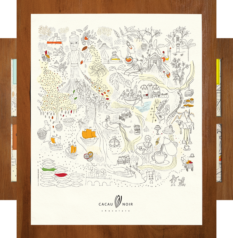
Agency comment:
Cacau Noir chain has exotic flavors from around the world and is known for their quality and special homemade style chocolates. The rich and curious history of chocolate was used as inspiration for a poster illustration for Cacau Noir. The same illustration was then used, to wrap a packaging series for delicious chocolate bars.
Designed by Studio Fernanda Schmidt, Brazil.
IV. Unna vegetable oil and vinegar
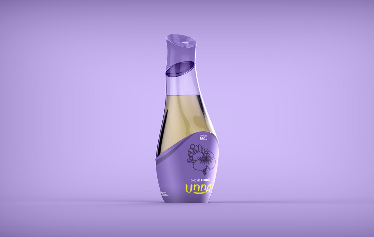
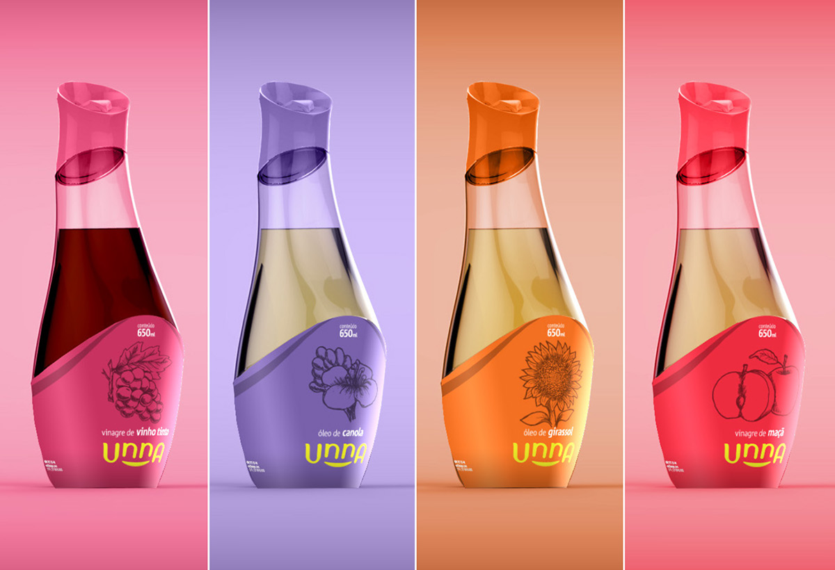
Designers’ comment:
The idea is to design an innovative packaging in the vegetable oil and vinegar sector for class C. The differentiation contemplates the practicality and functionality, as well as the perfect aesthetic compatibility of its presence in a table of a meal, maintaining its market price before the competition.
Thus, Unna breaks with the negative perception of traditional packaging marketed in the market, which is dirty and is stored in the cabinets. Unna’s packaging brings the attributes of an object that unites, groups people around a cheerful motif, provided with life, health and flavor. In this way, it should be perceived as light, friendly and intuitive in its formal and functional attributes. It is the product that arouses the desire of your company next to the table in the meals.
Designed by Ricardo Drehmer and Guilherme Cardoso, Brazil.
V. Wone gourmet water
Note the agency name on the package, very unusual solution in branding.
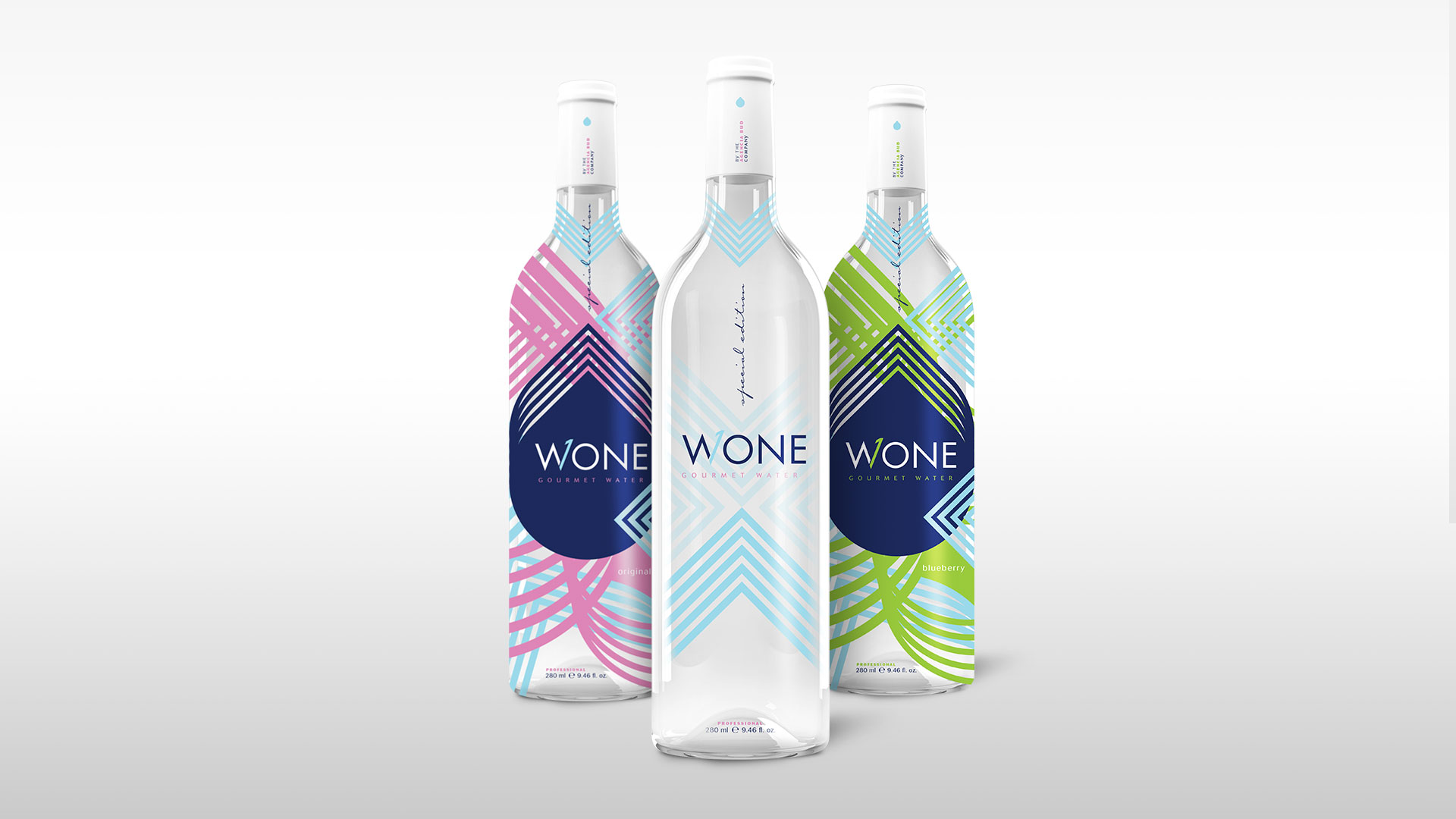
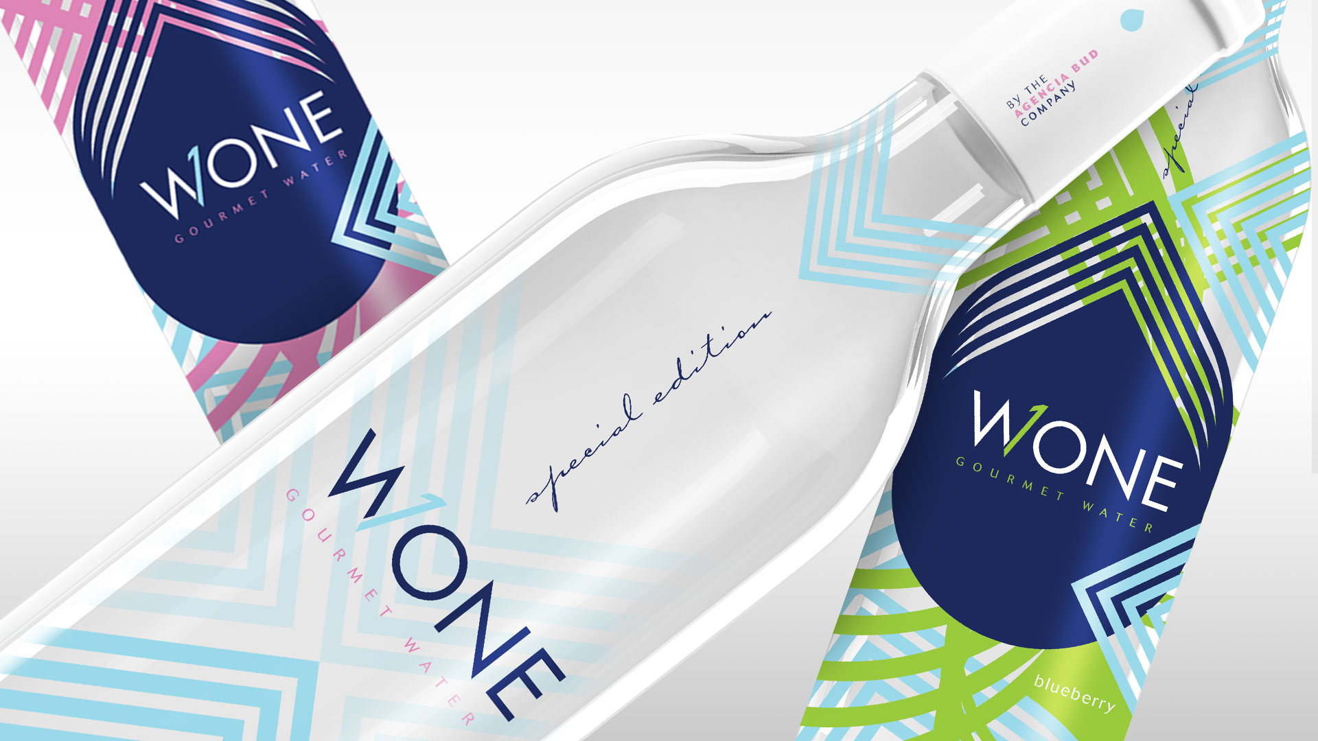
Agency comment:
With the new concept of gourmet water, Wone line is designed to be the number 1 in this segment. Its strong and contrasting colors, in addition to its sophisticated packaging, convey the clean and modern concept of this product.
Designed by Agência BUD, Brazil.
VI.Wild Leaf tea
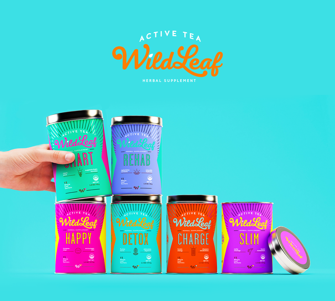
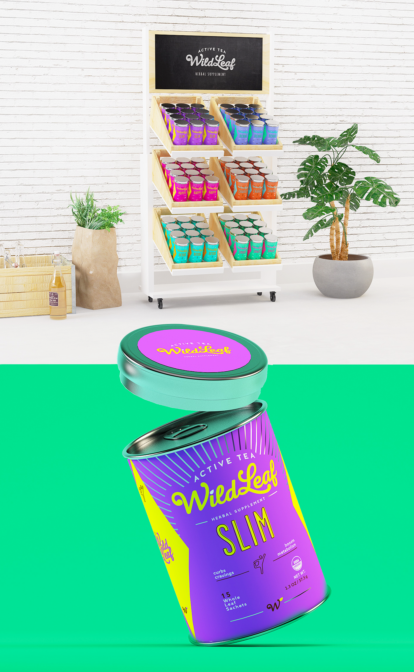
Agency comment:
Wild Leaf was created with the mission of offering Active Teas capable of providing different benefits for both body and mind. As a way of attracting the younger audience and making it replace sodas with a healthier diet, we’ve created a fun, strong and bold line of products. The result is a color explosion in a packaging as dynamic as its audience is.
Designed by Sweety & Co., Brazil.