Today we are publishing the latest package design projects that landed in our editorial inbox during the past month.
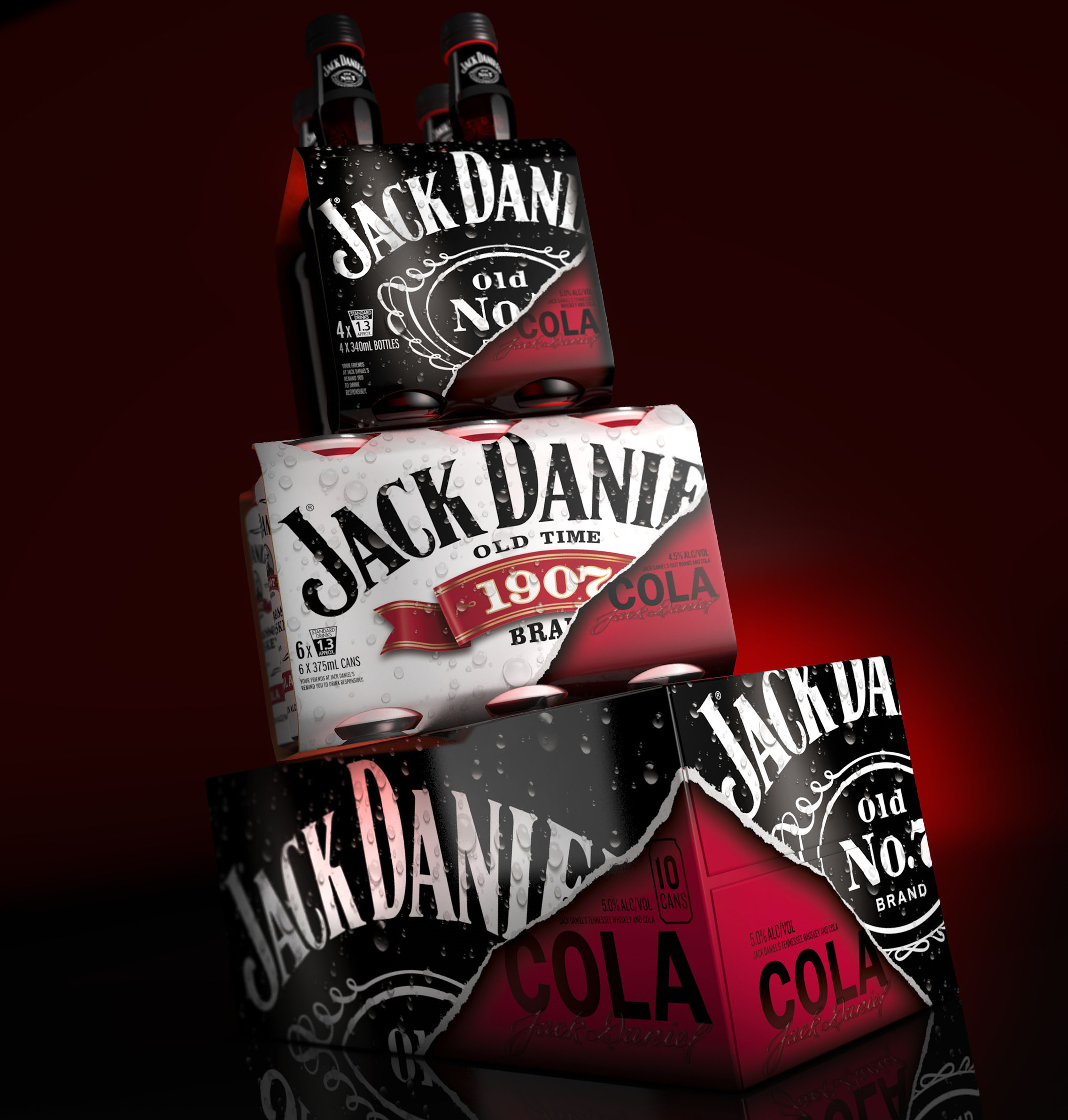
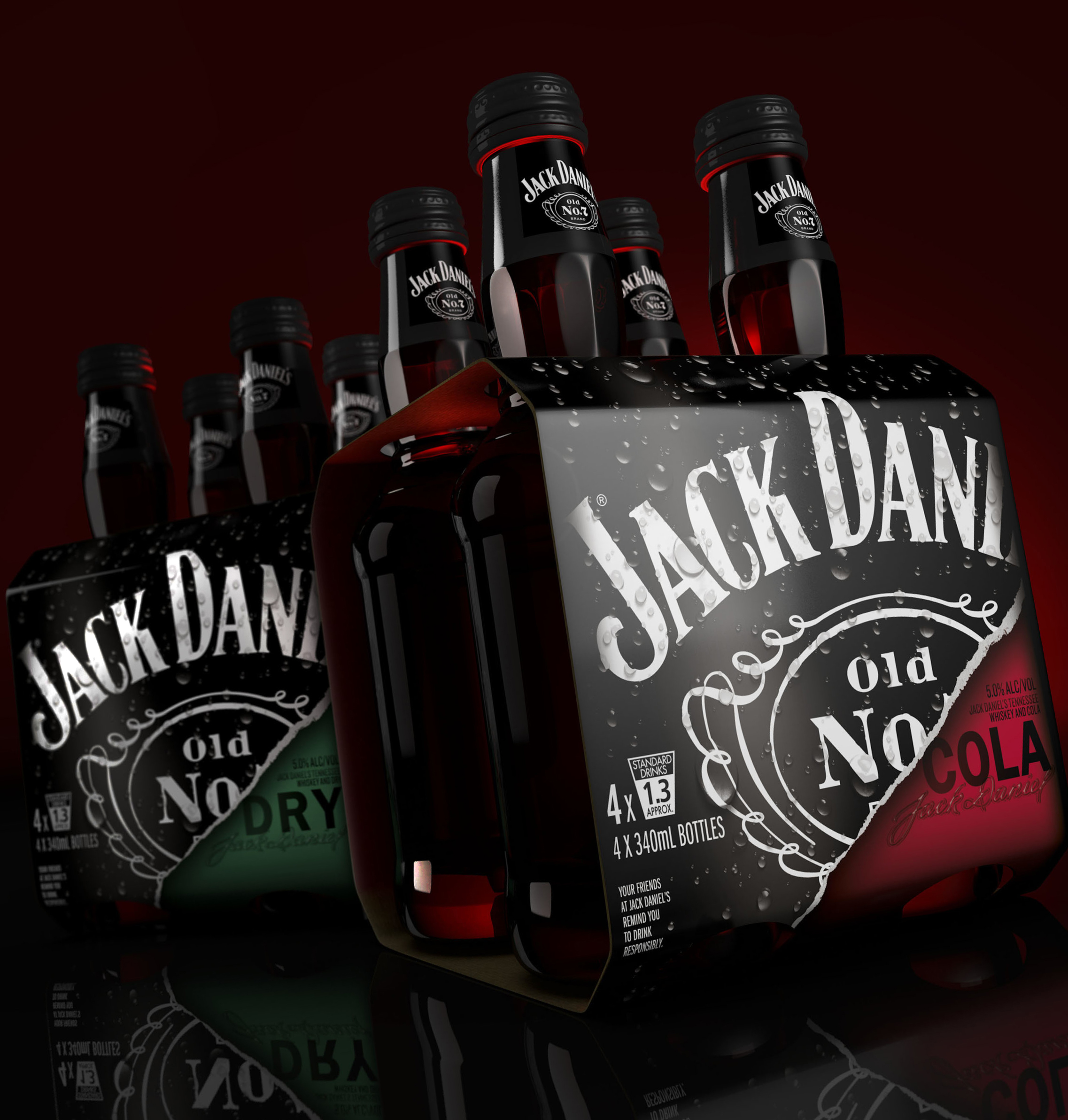
1. JDO Brand Design & Innovation have designed secondary packaging for Jack Daniel’s ready to drink cocktails for the Australian market. The cocktails are a mix of the whiskey and a choice of three different flavour variants: cola, ginger and lemonade. The new JDO design direction features angled brand crops with disruptive ‘rips’ revealing the mix variant on the canvas below.
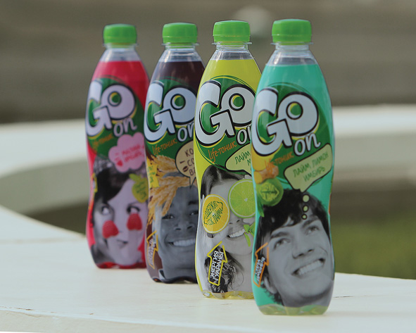
2. Russian brand and design agency Getbrand have developed branding and packaging for a new brand of non-alcoholic tonic drinks GO, made of fruit juices and extracts. Black-and-white images of people interacting with colorful ingredients set a playful mood, as well as communicate delicate irony, openness and spontaneity.
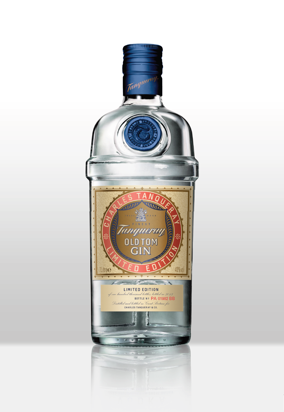
3. Design agency Sedley Place have refreshed Diageo’s Tanqueray Old Tom for limited edition. The pack treads a fine balance in retaining the hallmarks of the original and introducing new devices to refresh it for the 2014 edition.
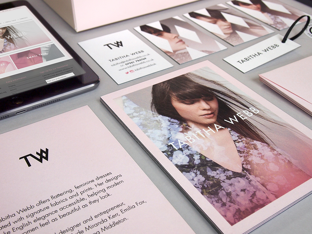
4. Aesop agency have created a new identity, an e-commerce site and packaging for Tabitha Webb—the eponymous label of acclaimed designer and entrepreneur Tabitha Somerset Webb. Set against a contrasting soft-pink backdrop, the identity mirrors the easy elegance of Tabitha Webb’s classic designs.

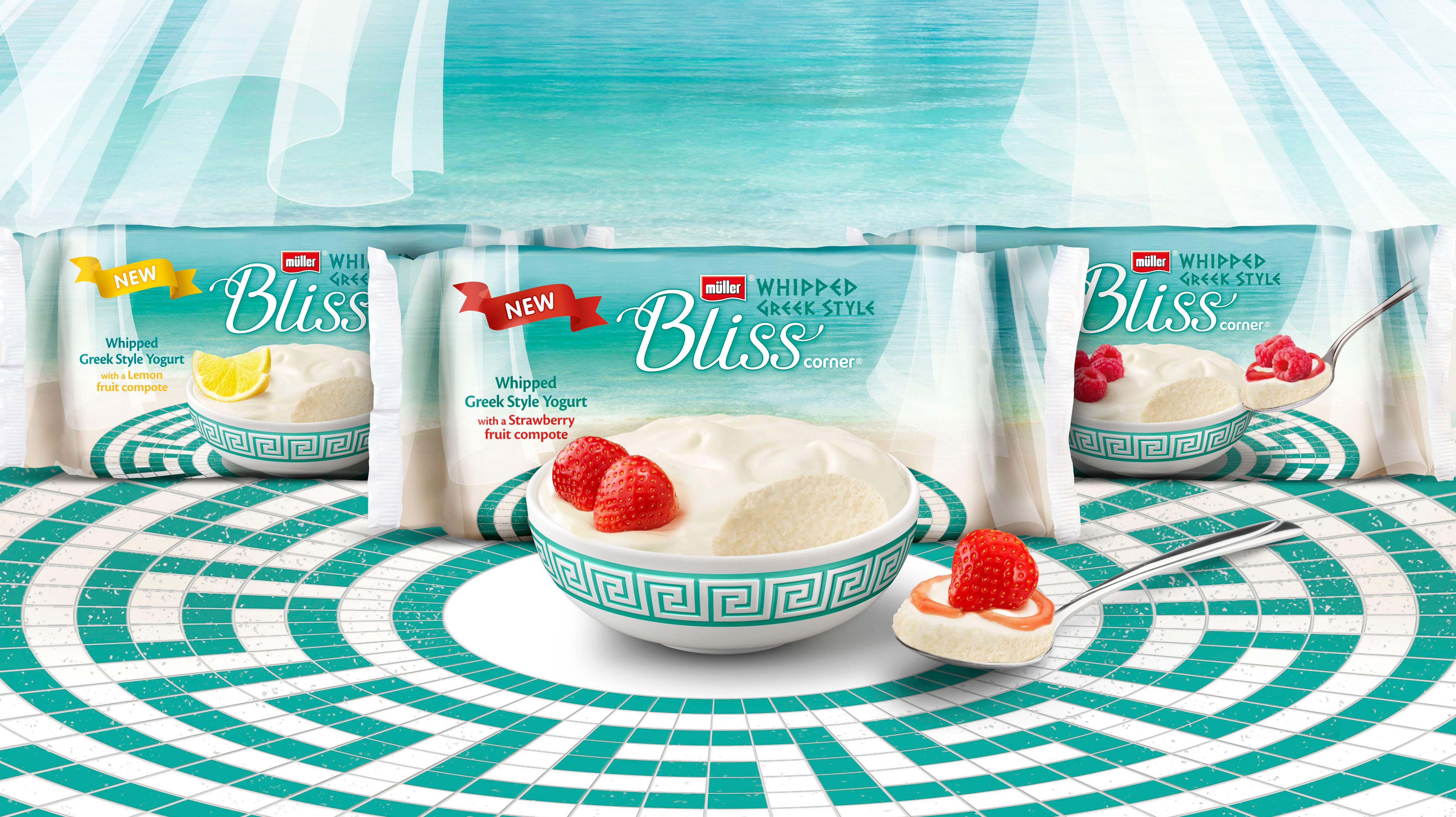
5. Coley Porter Bell have developed brand identity and packaging for Müller Bliss Corner, a revolutionary addition to Müller’s Greek Style product range. Tasked with changing people’s perceptions of Greek yogurt, the new branding is supposed to communicate that «this is a revolution in Greek yogurt.»
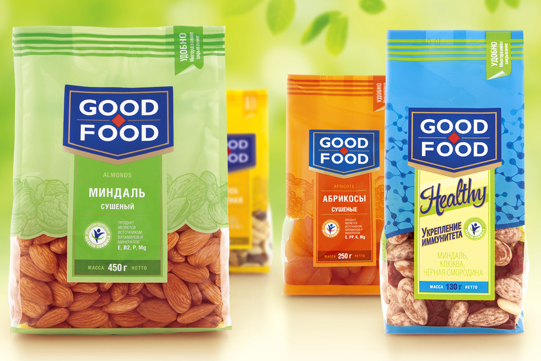
6. Leading Russia’s branding agency Depot WPF have rebranded the packaged nut and dried fruit company Good Food. The new package design is supposed to position the company as a «market expert.»
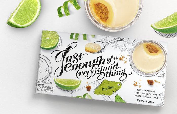
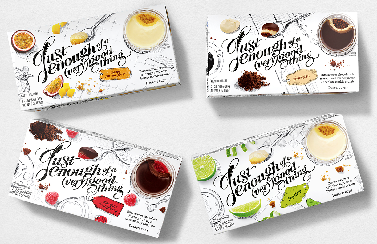
7. Pearlfisher New York has created the brand strategy, identity, packaging and web design for new single serving dessert brand, Just Enough of a (Very) Good Thing. In a category where the design aesthetic is traditionally over indulgent and uses dark, sensual cues, the design for Just Enough of a (Very) Good Thing is purposefully light, imaginative and ingredient-focused.
