We recently attended a technical packaging seminar where a diverse group of industry representatives gave a 20 minute presentation on the virtues of packaging specific to their individual areas of expertise. The focus for the night was the role of Packaging Design. It was a broad topic, which I had anticipated speakers across areas such as structural form, material innovation, print technology and brand identity. I was disappointed.
During the course of the evening, sometime after dinner and before dessert, the fourth speaker began his presentation on the topic of ‘packaging design’ relating to the visual graphics applied to the surface of his FMCG product—which in this instance was butter. This speaker was a well educated and a highly experienced marketer employed by a major food manufacturer and at my estimation, had been working with design agencies for well over two decades. You can imagine my surprise when the nature of his presentation was focused on design as decoration! He spoke of hiring “designy type people” to perform the very functional task of decorating the outer package with “colourful pictures and nice fonts”—a presentation I found challenging to endure. When referencing the creative professionals he worked with, the “designy type people”, I noted a change in his body language and tone—at this point he began to wave his arms around and make gestures not dissimilar to that of a clown at a children’s party. I believe his intent was to infer that designers are in some way visual pranksters—completely undisciplined and to be approached with caution! This speaker’s view on packaging design was naive and simple—he didn’t discuss the importance of building brand identity, strategy or the value of packaging design to his brand health. He didn’t get it, or “designy type people” he engaged didn’t get!
Packaging is the voice and heart of a product brand. It should express its values, intent and personality in an aesthetic relevant to its individual function. Packaging has the opportunity to be a 5D sensory experience, and for consumers (in an FMCG environment), it has approximately 3-5 seconds to speak to them and make a persuasive connection that results in sales. It sounds cold, but it’s not.
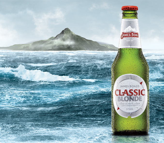
James Boag’s Classic Blonde
Packaging is a canvas for brand identity storytelling. It plays a critical role in helping people make informed choices that satisfy their rational and emotional needs. Therefore, the value of design in this environment is to communicate the brand’s (products) reason for existence—and present a glimpse into a deeper narrative, which is anchored in a place of truth (an important detail). When this is understood, packaging is a powerful and persuasive tool for building deeper connections with people and is a primary communication touch-point for any FMCG brand owner.
James Boag’s Classic Blonde family

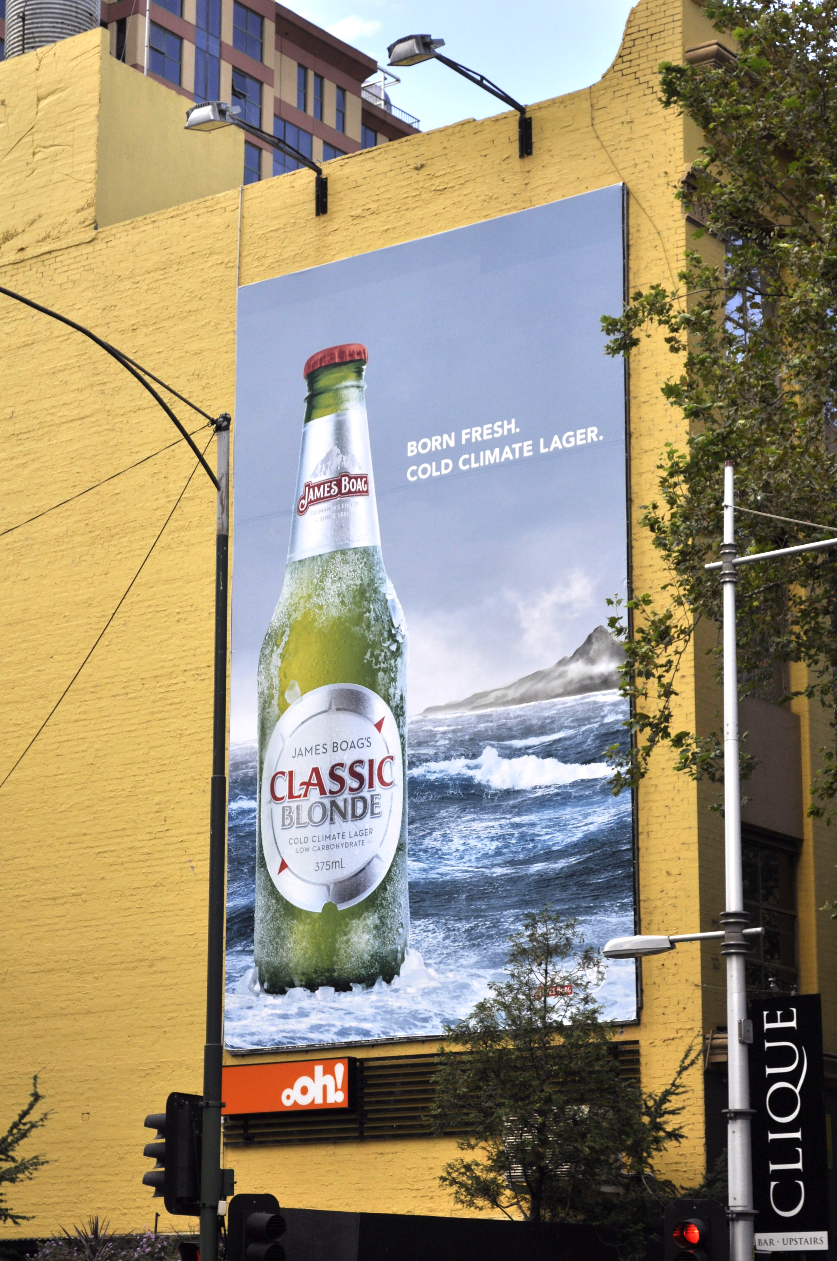
James Boag’s Classic Blonde Billboard
Upon reflection, I now understand this speaker’s position and feel a certain sense of duty to help him. To join the dots and support him in understanding, respecting and appreciating the commercial value packaging design inherently possesses. If this senior Marketer employed by a reputable food manufacturer didn’t get it, and had never had it explained to him convincingly, then how many others are out there like him? This isn’t his fault. This is mine, and ours, as creative professionals. We haven’t succeeded in articulating the value of design within our industry. We have failed in presenting our work as ‘pretty pictures’ (perception is reality) and not educating our clients on the economic value packaging design can yield. We haven’t worked together, as one voice, to really showcase design (across all visual communications) and its commercial value in building robust, innovative and sustainable brands. In Australia, the industry is relatively small and young and we have a long way to go in growing our partners, the industry and the future generation of design leaders. I offer the guest speaker these insights.
Transformative packaging is intelligent, sensory, relevant, cohesive and an authentic expression of self—its identity.
Written by Amber Bonney, General Manager – Design
Contributions by Tony Di Donato, Managing Director
Case Study Examples
Client: Lion Nathan Australia, 2010.
Brand Manager: Sanchia Stafford-Gaffney
Marketing Manager: Raniero Miccoli
Project: James Boag’s Classic Blonde Identity and Packaging Program.
Brand Identity: DiDONATO Partners
Packaging: DiDONATO Partners
Production: Energi
Advertising: Publicis Mojo – Sydney (outdoor)
About the Author:
Tony is the Managing Director of Di Donato Partners, which he founded in 1989. DiDONATO is leading the design world with its revolutionary Business Design model, which holistically brings together culture, identity and design.


