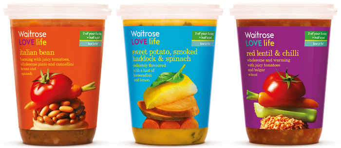
Pearlfisher has created the design strategy, brand identity, naming and design expression for Waitrose LOVE life—a new range of delicious and nutritionally balanced foods launching in Waitrose stores nationwide from June 30.
The range is the grocer’s largest sub-brand launch since essential Waitrose, with over 270 products, and answers a demand from over half of Waitrose customers to help them include a wider range of wholefood ingredients and avoid saturated fats in their diets. In addition, the Waitrose LOVE life logo will start to be further used on products and ingredients across the retailer’s entire offer, highlighting nutritional benefits to customers.
Pearlfisher Creative Director, Natalie Chung, comments, “Waitrose is an experience—an experience that is rooted in food but that goes well beyond food.The bright, bold packs and vibrancy of colour reflect the variety, choice and nutritionally balanced offer and will also ensure stand out on shelf. The naming and design expression is also about bringing taste and vitality together to create an experience of freedom and pleasure.”
Waitrose Marketing Director, Rupert Thomas, comments, “Waitrose LOVE life gives people a new and unrestricted approach to eating a wide variety of the right thing. The new identity effectively works to indicate the nutritional value of the range and the design reflects its energy, vitality and positivity. We are thrilled with the work that Pearlfisher has done.”

