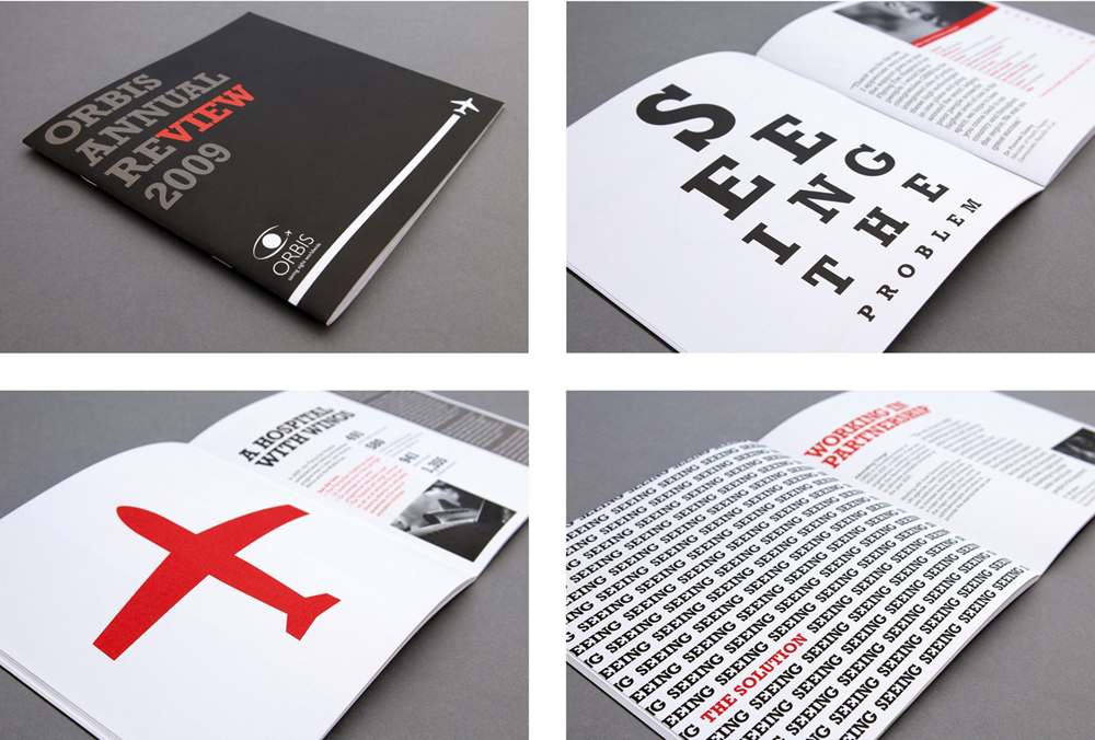
Pearlfisher has designed this year’s Annual Review for ORBIS—a charity dedicated to ‘saving sight worldwide’ and eliminating avoidable blindness.The Annual Review promotes the work of the organisation and—alongside the website—is the key marketing communication for targeting new corporate sponsors and for profile raising with both professional and consumer donors.
Pearlfisher Creative Director Natalie Chung said, “Many charity brochures and marketing materials are photo led. This does tug at the heart-strings but also means that the work of one charity can easily become interchangeable with that of another. However, for this charity in particular, the focus had to be on ‘seeing the story’ and using visual expression to emotionally demonstrate the power of the work.”
She continues, “Therefore, although we have used some scaled down photographic images, each page contains one dominant and impactful graphic device to reflect the written information and facts contained within. For example, writing the words ‘Seeing the problem’ in the format of an eye test chart…The adoption of this visual language for the Review continues to express the charity’s commitment to visibility in everything they do.”
“We were thrilled to work with Pearlfisher,” said Krishani Ranaweera, Communications Manager for ORBIS. “They brought a fresh approach to representing our work and we are really pleased with the result. An agency like this would be beyond our financial means, so we were delighted o forge a partnership and produce a modern, informative Annual Review.”
