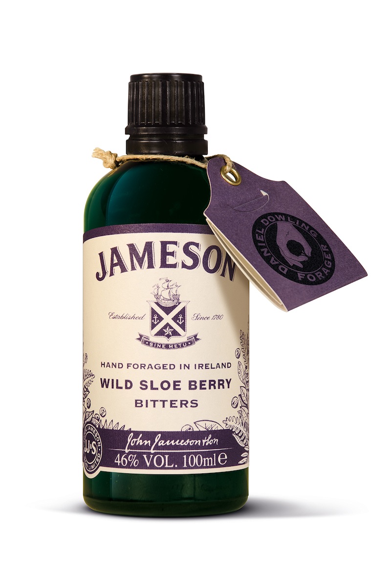
Pearlfisher has created the brand and packaging design for the new Wild Sloe Berry Bitters, by Jameson. This is a new, beautifully crafted and locally sourced Bitters brand from Jameson that delves into the brand’s Irish roots and flavours, and is designed to give influential bartenders and drink enthusiasts new ways to enjoy and experience the iconic whiskey brand.
With the rapid growth in Bitters brands, a certain “type” of Bitters language is quickly saturating the category. Pearlfisher’s task was to create a visually distinctive look and feel for Jameson Bitters, whilst ensuring we complement, respect and become a great companion to the Jameson master brand.
«The Jameson hierarchy is maintained but the label encapsulates the idea of stepping into the wild, and the journey of the forager, by using natural stock, hand illustrated and hand written detailing with a single-minded and simple use of colour representing the natural and seasonal ingredient,” commented Sarah Cattle, Pearlfisher Creative Director.