Just before the long Easter break, we wanted to share with you the most noteworthy design projects that came to our attention over the past week.
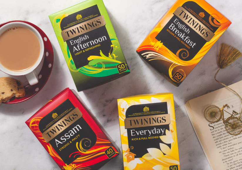
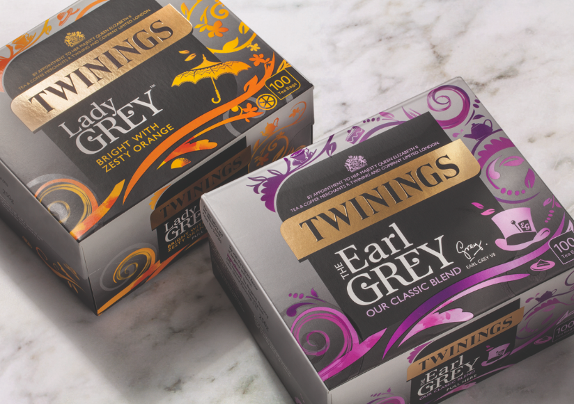
1. BrandOpus has worked with the long-standing client Twinings to redesign their range of classic blends and Earl Greys, reflecting the positioning of ‘premium teas for every day’.
Across the Earl Grey and Lady Grey packs, the agency makes reference to the quirky nature of the teas through tea-party inspired illustrations, and a distinctive grey colour to differentiate the range. The redesigned teas are rolling out on to shelves in the UK now.
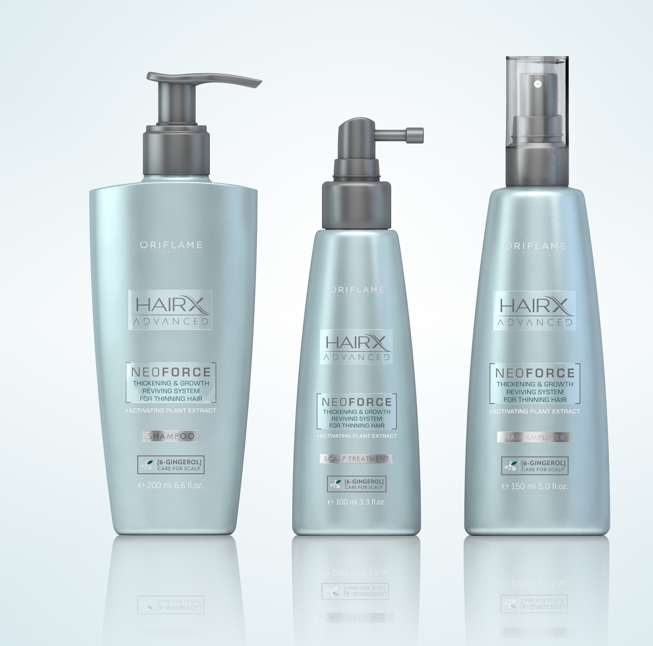
2. ButterflyCannon has updated the branding and packaging for Oriflame Cosmetics’ Advanced hair care range, HairX NeoForce, a collection of treatments that stimulate hair growth. The identity illustrates the clinical nature of the product and it’s scientific background.
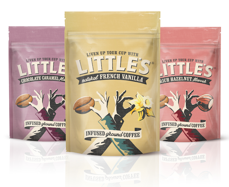
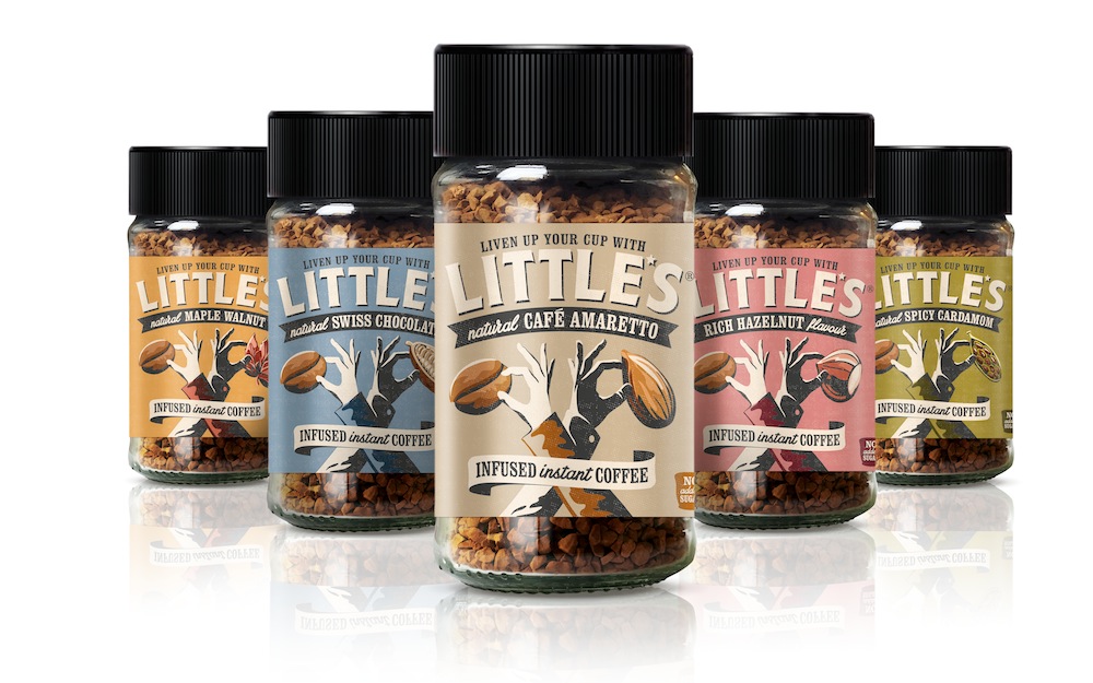
3. The package design agency This Way Up has rebranded a UK coffee brand Little’s Flavoured Coffee.
The rebrand captures the story of the 1st Generation founders, the wife Leila, who is Finnish, and the husband Henry, Californian, and the influence of their backgrounds on the products themselves. Little’s is available through the UK food retailers including Waitrose and will be relaunched on shelf in April 2015.
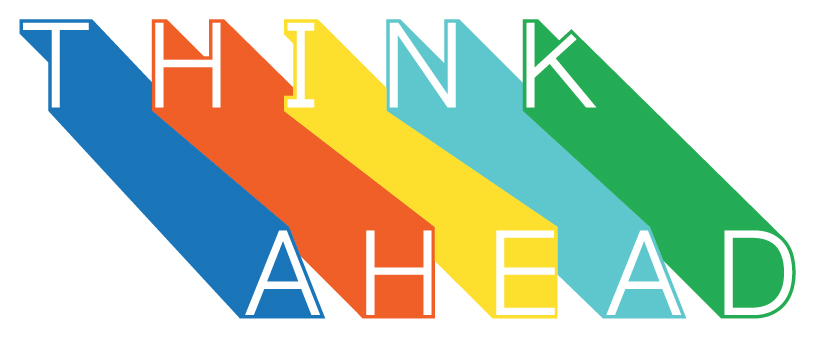
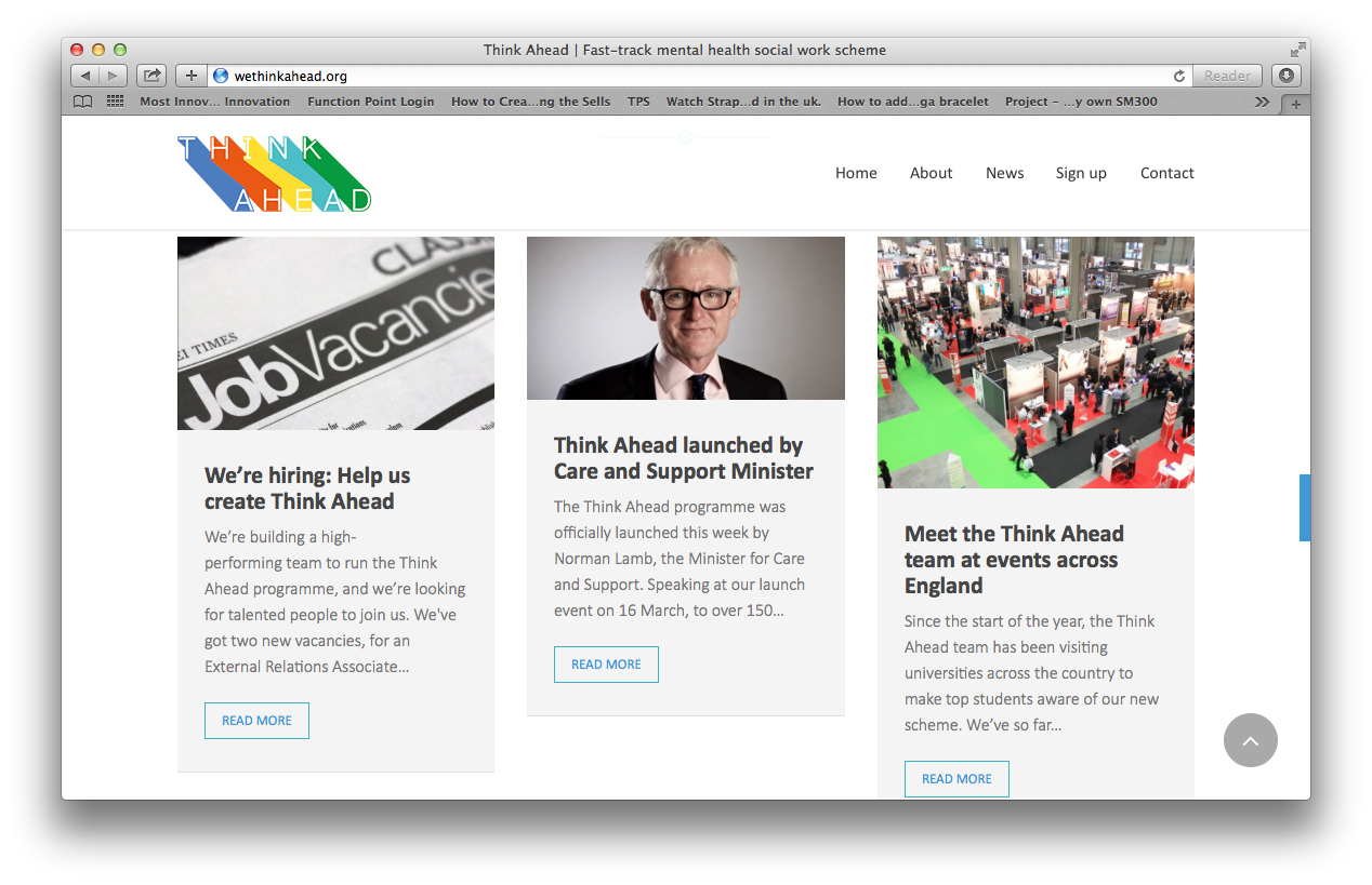
4. Dragon Rouge has worked with the UK’s Department of Health and Institute for Public Policy Research (IPPR) to design an innovative new two-year fast track graduate scheme, that would attract graduates and career changers from top tier universities into a career in mental health social work.
The agency has developed the name for this course—Think Ahead, as well as clear brand positioning and visual identity.
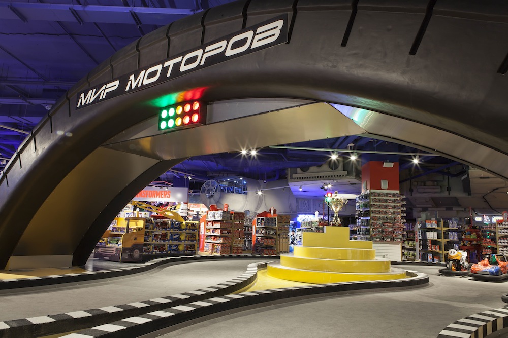
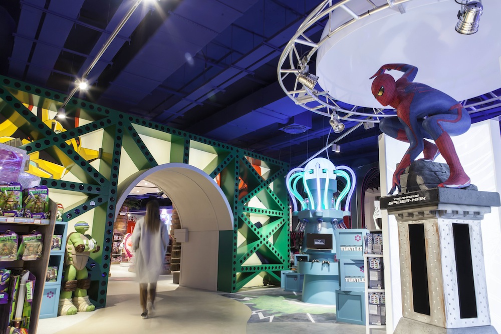
5. FITCH has developed retail design for the Europe’s largest 7,000-square meter toy store —Hamleys Moscow. The focus has been made on nine interactive zones, such as Enchanted Forest, Safari, or Space, which offer customers and their children fully engaging brand experience.
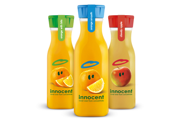
6. Pearlfisher London has re-designed innocent’s on-the-go juice range. The project scope spans creative strategy, as well as graphic and structural packaging design.
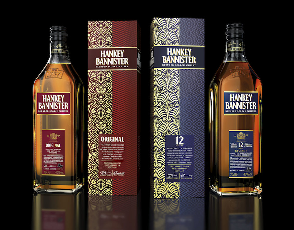
7. JDO has re-launched Hankey Bannister whisky brand owned by International Beverage Holdings Ltd UK, as part of their ongoing global brand repositioning strategy.
The team at JDO was briefed to simplify and find an engaging way to communicate the story and history of the brand, founded by Beaumont Hankey, a socialite and Hugh Bannister, an astute businessman. Their paradoxical personalities needed to be communicated simply and clearly and JDO also wanted to evoke a sense of the era in which they lived, while ensuring this was done in a contemporary way that would stand the test of time.
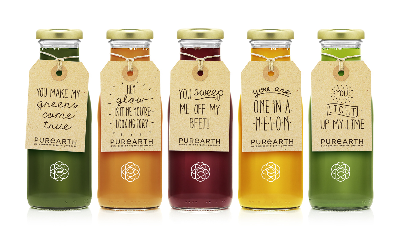
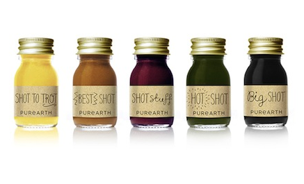
8. The UK agency After Hours Design has developed the strategy, branding, packaging, tone of voice and communications for Purearth Cleanse, a two-year-old functional juice and detox brand in London.
The new identity elevates their bottle tags from a functional packaging feature to a brand asset with loving messages such as ‘gift from the earth’. The whole concept is designed to cause maximum disruption and engagement, as the authors themselves describe it.