Whilst we have seen many female focused skincare brands bring out men’s ranges, we have not seen a truly unique and unisex skincare offer. However, Absolution (from Paris) is not just unisex but is also bespoke and certified organic. And, from a design viewpoint, ticks all the boxes to meet today’s need for both style and substance.
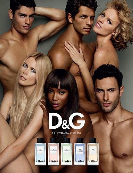
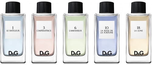
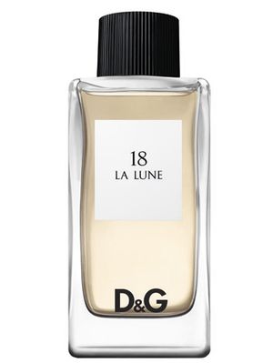
A sense of individual style is an important design consideration but nobody wants to be faced with row upon row of over stylized products that don’t really tell – or sell – you anything. The new unisex fragrance collection by D&G has tried and, in my view, failed to provide a new design iteration by using identical packaging differentiated only by colour and number. And, in the end, it sadly over-relies on the supermodel advertising to convey it’s supposed premium and unisex message. It also seems to have diverted huge budgets away from all important packaging design and finishing, leaving us with a shallow, empty feeling and a package and brand to match.
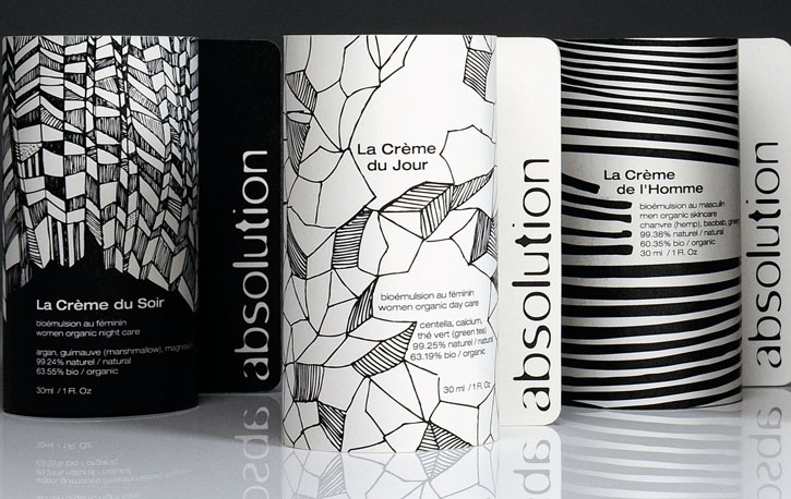
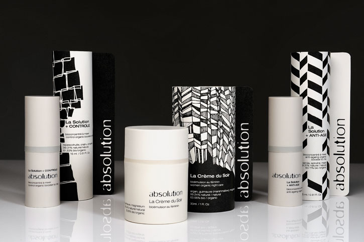
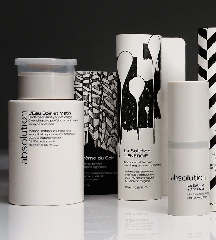
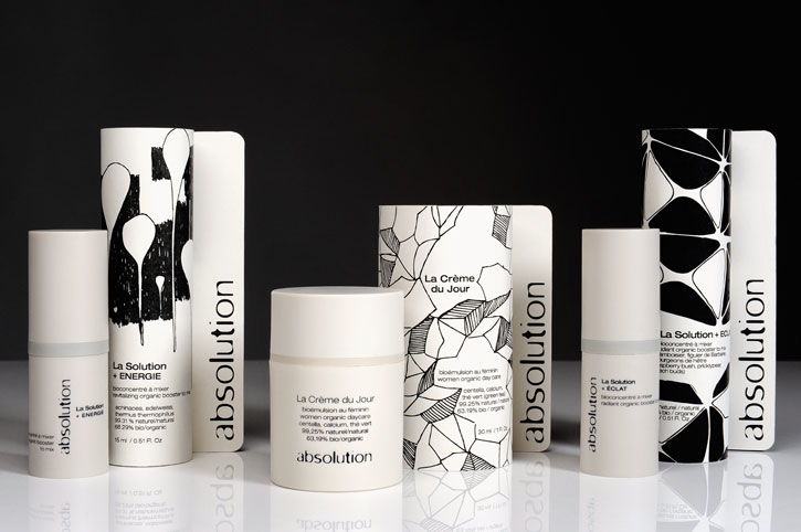
Absolution, in contrast, gets it absolutely right by starting with the brand in the hand and focusing on the packaging. Structurally, the focus is on a uniform and simple practicality, with each product providing a cream and a solution to be mixed together on the jar’s innovative plate dispenser for a truly bespoke skin preparation. The monochrome packaging perfectly sums up the targeting of opposites — and the overall ‘absolution’ and no excess message — whilst the highly individual sketchbook-style etchings relate to the target and composition of each product; the distinctive drawing style highlighting both the individual and collective nature of the products in the range.
Absolution completely embraces the ethos that all brand design today needs to heed: substance does not have to be at the expense of style. We need to see a move away from over-the-top and abstract packaging to a promotion of the individual (brand and product) through pertinent and simple but uniquely beautiful design. If you can successfully combine and balance both, and use your own visual rhetoric to tell your story, then your brand should stand strong and liberated on shelf and really be able to speak to both the boys and the girls in the crowd. Whether your brand is unisex or not.