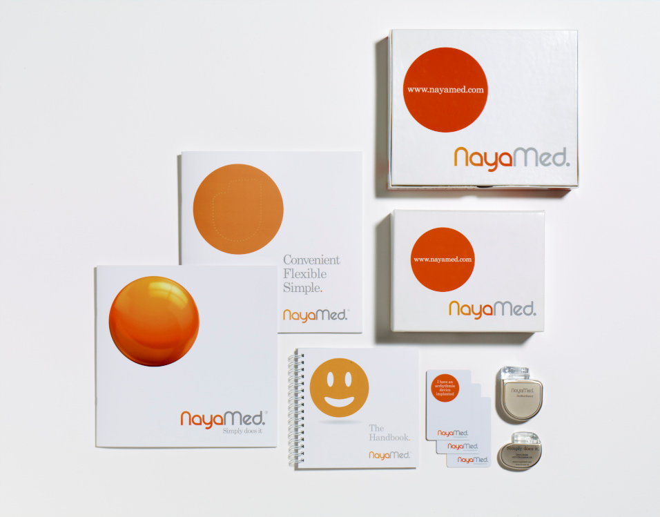
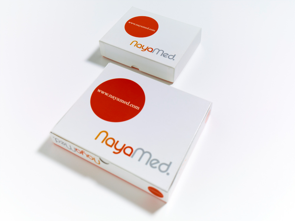
UK brand consultancy Webb deVlam developed visual identity system, package design, digital and print as well as integrated RFID technology for a new medical device brand NayaMed. Simple visual language featuring an orange dot goes in line with the company’s strapline ‘Simply does it’, which captures the essence of the brand’s ethos.
John-Paul Hunter, Webb deVlam’s creative director explains: “Simple and intuitive, like their products and positioning, the identity is immediate and consistent within a busy market-place. In use, cardiologists and administrative staff appreciate the direct and uncomplicated visual language”.

