You are welcome to share your thoughts on this article written by Dave Timothy, Senior Account Director at strategic packaging and design consultancy Anthem Worldwide.
As you may have read, Starbucks celebrated its 40th birthday last month with a new stripped back logo which focuses on its trademark mermaid and does away with its word mark. It’s a brave brand that feels confident enough to make such a move. What’s it all about?
There are many reasons brand choose to change their brand identity, be it pre-emptive (quitting while ahead—a courageous move!) or, as in the majority, a re-active approach; that terrible moment when you realise that your brand mark is looking a little tired and that new kid on the block is so much cooler..
However, the best brand re-imaginations have always managed to not throw the baby out with the bath water. That’s because brands spend millions of pounds to ensure consumer know what they look like and what they stand for. The simplicity of a logo and it’s time in market are the key factors in recall. Playing with such equitable elements can be very dangerous and can cause genuine confusion and even anger amongst brand advocates—something Gap can testify to.
So what about Starbucks’ big change? In actual fact, taking a brand with a recognised symbol and removing the brand name is a more common recent trend than we think.
E.g.
Image: www.veryangrytoad.com
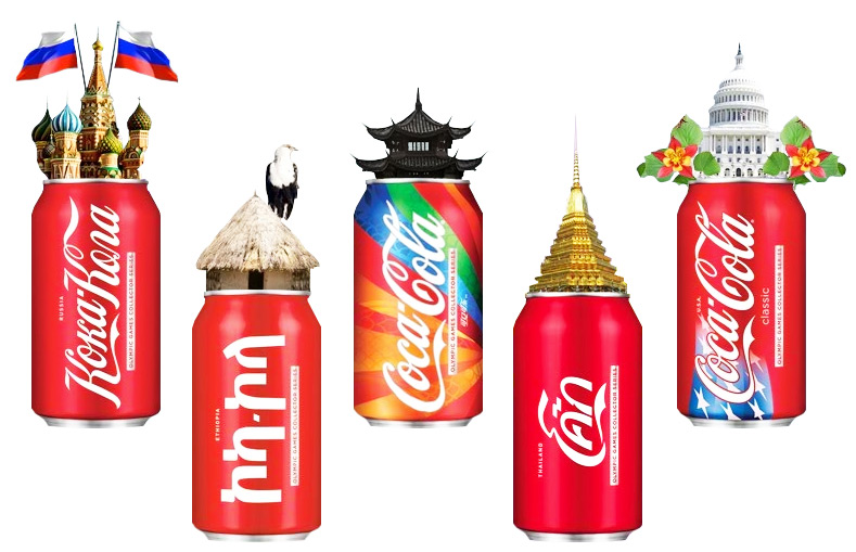
But why would you do such a thing? Well, firstly, by removing words you avoid the dilution of brand equity that can come as a result of multi-language use.
E.g.
Not only that, you can also create more emotional connection to a brand. Consumers are likely to feel more connection to cuddly Colonel Sanders than to the harsh KFC text.
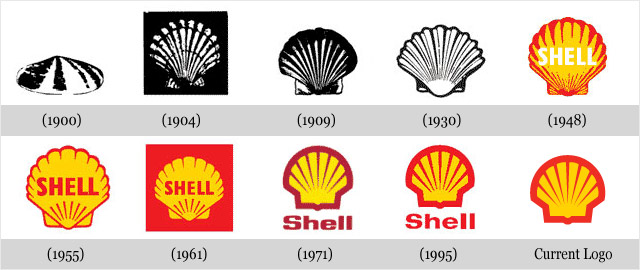
When successful, these visual ‘divorces’ leave the consumer unaware of any actual change—i.e. they work best if you have a unique and well established symbol (like Shell’s shell) that’s not played around with too much. The net effect is that brands can look more assured, confident and dominant.
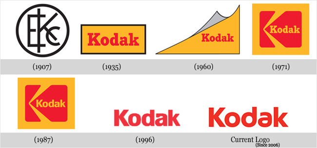
The reverse is true of brands that lose their way and their bottle and revert back to a text only treatment. Is it co-incidence that both brands shown below have had their fare share of problems recently?
Kodak has moved away from the K symbol logo to word only:
Image: www.veryangrytoad.com
Similarly, Yahoo has moved back from a Y! logo mark to the full text version:
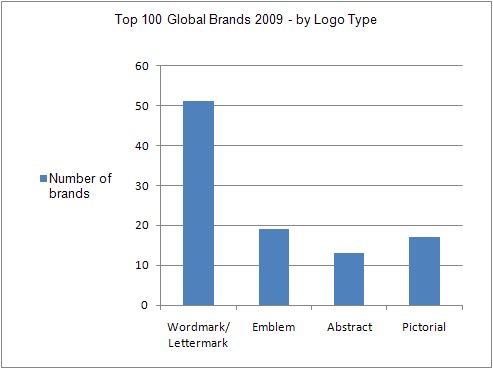
However, word only logos still provide the simplest brand expressions and are also the most popular.
Indeed, 8 of the top 10 brands—from Interbrand’s Top 100 brands of the world 2009—use a simple wordmark or lettermark logo.
Source: Interbrand’s 2009 Top 100 Global Brands (2) Analysis Design Crowd.com
With text only treatment remaining so popular it’s not surprising those big brands (e.g. BMW, LG, BP, Adidas, Nestlé) that might have the option to ditch their words in favour of emblems have chosen to stick rather than twist. If it ain’t broke, don’t fix it….
Which takes me back to the Starbucks redesign.
Removing the words feels peripheral when compared to the overall change to the brand’s visual architecture. Close your eyes and the visual DNA for Starbucks has always been a green circle with a brown centre.
The redesign has moved away from these core elements in favour of a simplified green crowned princess with wavy hair—can you tell if she’s a mermaid anymore? It makes me think of a pack of playing cards or a new iPhone app icon. The Starbucks logo does little to remind me of the heritage of the brand or leave me with a clear sense of what brand I’m looking at. I think they may have gone too far in one step when perhaps they could have made the same brand statement while still holding onto more of the existing brand equities. That’s why Shell’s evolution worked so well.
However, I understand why they have done it. Now they’re increasingly expanding into grocery products and growing their digital customer engagement they need to have a logo that gives them greater flexibility. Also, the time we have to engage with consumers is becoming so fractional and fleeting, brands increasingly need to be recognisable through minimal information. Hence why so many social media brands are known instantly through simple icons—think Twitter.
So, do I like new-look Starbucks? Actually, no. But then nobody liked van Gogh’s work at first!
About the Author
Dave Timothy is Senior Account Director at Anthem Worldwide, UK. He heads up the Nestle account team at Anthem. This covers a full range of design services across their Confectionery, Professional and Food & Beverage teams, working with brands like KitKat, Smarties, Aero and Nescafe on a regular basis.
