White breads, white rice, white sugars are all out with the stigma that white is bad for your health. So what colors are in? Green has been a long-standing color of healthy eating, but now, more than ever; it is about eating a variety of foods that make up the color wheel. Packaged foods and beverages are taking notice and using this to their advantage when designing their packages.
Americans are becoming more educated in reading nutrition labels and are more concerned about what ingredients are in their foods. There is a proven shift towards healthier eating and what we buy at grocery stores. Grocery shelves are filled with words like fresh, raw, organic, all natural, whole grain, gluten free, no corn syrup, low fat, fat-free, low calorie, etc. With a surge of new brands offering alternatives for healthier eating, the competition is growing and shelf space is becoming tighter. To win, brands must catch the consumers’ eyes visually through the branding and packaging, emotionally with a relevant brand story and most importantly, with a product that delivers on quality, taste, and price.
So how are brands capturing the consumer’s attention? Color. What colors really stand out in this new “healthier” market?
Frozen in Green…Not Anymore
Although 57% of consumers prefer fresh over frozen when asked by Packaged Facts, the truth is consumers are still buying frozen. Frozen foods accounted for approximately $50 billion in 2012. Frozen vegetables racked up $5.7 billion in sales last year, frozen meals had sales of $14 billion, frozen snacks racked up $1.6 billion, all up from previous year according to Neilsen and Mintel. Frozen is getting healthier and less green, in the literal color sense.
Green has been the longstanding iconic color of “healthy”, symbolic of fresh produce, green leafy vegetables, a bountiful harvest and from classic characters such as Popeye and his spinach, the Green Giant and Sprout. But green is quickly becoming an over-used color to represent healthy and “good for you” in the frozen marketplace. Frozen food brands such as Green Giant, Bird’s Eye, Healthy Choice, Seeds of Change, Amy’s Kitchen, Kashi, just to name a few used to live behind refrigerated glass doors in a sea of green. But that was then.
Today in the healthy frozen meal section, you see more real ingredients pictured which reveals more colors. Red, orange, yellow and blue are becoming key colors to break out from the sea of green. Weight Watcher’s Smart Ones is completely branded in red. Lean Cuisine owns orange. Lean Cuisine Honestly Good is packaged in blue with iconic Lean Cuisine orange. Green Giant has added blue to their Valley Fresh Steamers. Bird’s Eye Steam Fresh comes in a blue bag with purple and yellow ribbons to call out flavors. Even Healthy Choice, the biggest green color package culprit has broken out with the 100% Natural collection to use green as the key accent color against a natural earth-tone background.

Whether it’s for convenience or price, frozen foods are a staple in American diets. Thankfully, the frozen market is following the health trend and offering healthier options in packages other than green.
Super Foods in Chakra Colors
As a part of the new American diet, like everything else, there are trends that stick out. Right now, it is all about super foods, foods that are said to prevent illness and major diseases. The super food trend brings with it super colors to the marketplace. For example, kale is the new spinach, chia seeds are the new raw almonds, Açaí is the new blueberry, maple water is the new coconut water, coconut oil is the new olive oil, fermented is the new raw. And to prove this, based on SPINS Superfood sale tracking, Açaí-laced products grossed nearly $200 million in the United States last year while blueberries raked in only $3.5 million. Coconut oil, the wonder fat, sold $62 million in 2012, double the previous year’s level. So what do these products look like?
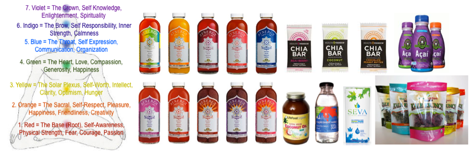
They bring a well-balanced spectrum of super colors from the chakra chart. The colors of the chakra are based on the rainbow and each relate to one of the seven main energy centers in our body. Foods that are chakra colors are linked to many healthful benefits. For example, yellow and orange foods contain antioxidants such as vitamin C and carotenes and bioflavonoids, green foods have sulforaphane, isocyanate, and indole which are beneficial to the liver, blue foods are packed with antioxidants, anti-inflammatory, and cancer-fighting chemicals, red foods have lycopene and rich antioxidants, and purple foods contains anthocyanins and may help delay onset of Alzheimer’s disease, and lower risk of some cancers. It only makes sense that super food products would bring the colors of the rainbow to our diet.
Snack Brighter
Snacking is a large part of the new American diet. Americans are opting for 5 small snacks throughout the day rather than sitting down for 3 meals a day. The 18 to 44 year old group is the largest group to snack and have increased their snacking occasions over the past year according to Technomic. We consume over 30% of our daily intake of calories from snacks and women snack just slightly more than men according to the USDA’s Agricultural Research Service (ARS). Snacks are convenient, usually single serving, and less expensive than full meals. Unique flavors, new ingredients and healthier options are key drivers in this market. Nearly 60 percent of snack launches recorded by Innova Market Insights in 2011 had a health positioning of some kind. Move over Doritos, there’s a new healthier snack craze happening.
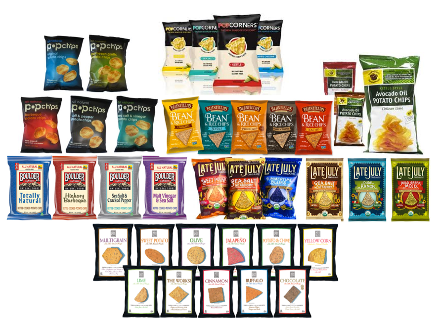
As you can see, these brands are not your expected crunchy, hippie, trail hiking looking brands. These brands are actually gaining shelf space next to Fritos, Doritos, Pringles, and Ruffles. They are branded for flavor, ingredients and quality, not just “better for you”. These are the new competitors in the chip aisle. They use colors that stand out at the shelf and again, it’s not all about using the color green to denote healthy. Bright colors, even if it’s more white space on the packaging, are used to capture our attention in hopes that we’ll try something new. And, many of these brands are owned by the big guys, Frito-Lay, Kraft, General Mills, Kellogg Co, and Procter & Gamble; signaling healthfulness coming to the mainstream.
Liquid Bold
As palate diversifies in color, we can’t ignore the shifts in the beverage department. Consumers are seeking healthier beverage choices. Full sugar sodas may be a thing of the past. SupermarketGuru.com’s CEO Phil Lempert reports that shoppers are willing to spend up to 31% more for healthy versions of carbonated beverages. And the top drivers for this shift are weight-loss, overall health, reduced sugars, more satisfying taste and vitamin supplementation. Water tops the healthy drink list, then green-tea, milk, 100% juice, coffee, tea, smoothies, yogurt, protein and diet drinks follow in this order. American’s are the biggest purveyors of bottled beverages, including water. So how do brands compete?
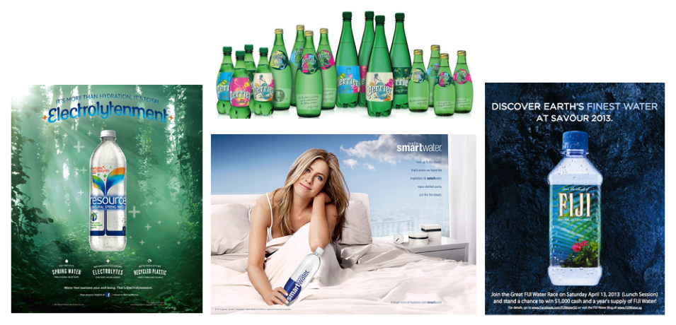
Go premium. Get artsy. And target women. Pepsi is also looking to join the premium water market with “Om”, set to launch sometime in the next year.
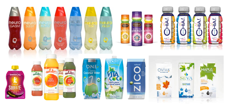
Aside from the water market, here’s a look at the colors of other trending beverages. From protein rich to natural ingredients, benefit driven to convenient packaging, like bottled water, this is a market that seems to be color driven to attract the female consumer. They use bold hues from the chakra chart to enhance the healthful benefits of the beverage.
Overview
As Americans are becoming better educated about their health, the food and beverage market are keeping abreast of the shifts by introducing healthier alternatives in frozen, snacking, and beverage. Many of these brands may still be considered specialty brands, however in reality they are part of Fortune 100 companies in the food market or will be snapped up soon as the shift towards healthier options grows.
Green will always be a prevalent color in the healthy marketplace, however we are and will see a brighter palette of colors on shelves to capture the attention of the consumer, especially the female consumer. Colors of the chakra will be more prevalent and designs will place brands in a more premium playing field. As Americans turn to healthier options, we look forward to seeing more brands entering the marketplace with smart use of color integrated with premium designs and innovative packaging.
If you would like to know more about Toniq, please email us at info@toniq.com or tweet us @brandeffervesce. And check out www.toniq.com/blips for daily trends and inspiration.
About the Author

Ms. Swanson founded Toniq in 1999 after leading several design firms to world-class status with her emotions-based, visual approach to brand strategy development. At Toniq, she continues to evolve her strategic expertise by seeking new ways to connect with consumers.
Swanson’s years of trend tracking, design management and research have coalesced in a theory of “Brand Effervescence ™” an innovative approach to brand building. This image-based approach is a synthesis of cultural anthropology, consumer trends research, marketing and design, and a study of the psychology of symbolism and color.
Cheryl Swanson can be contacted at cheryl@toniq.com or 212-755-2929 x218.