On October 28th, Russia unveiled the logo of the upcoming international football championship to be hosted in the country in a four-year time. The Official Emblem of the 2018 FIFA World Cup Russia was revealed by FIFA president Sepp Blatter during a popular evening show on the state-owned TV channel «Pervyi Kanal»—surprisingly, over a video feed from space… where Russian astronauts from the International Space Station «Mir» actually «showed» the logo to the planet Earth.
Adding to the technical complexity and pompous nature of whole process, the logo presentation was simultaneously projected on the front of Moscow’s famous Bolshoi Theatre, ending up as a spectacular light show.
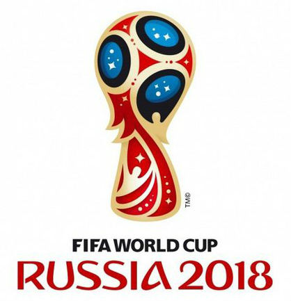
While Mr. Blatter sees in this piece of identity a representation of Russia’a «heart and sprit,» the agency owning the authorship, Brandia Central, says it «references Sputnik and Russian icon painting style,» the majority of Russian designers sees none, referring to the logo as a «cocktail of space and Khokhloma poured into a Brazilian chalice.»
«It stroke my eye that there was an attempt to stuff this logo with all types of clichés imaginable: from Russian achievements in space exploration to Khokhloma. And probably, there’s some challenge behind this. I’m slightly disappointed that this work doesn’t convey any distinct message about Russia, although the reason to spread it is very worthwhile — the event has a global audience of more than 3.6 billion people,» says Aleksandr Zagorsky, Senior art director at Depot WPF, a Moscow-based branding agency.
«As a result, we broadcast a slightly blurred message that, well, yes, we do have space and Khokhloma — but these are clichés that don’t help to communicate Russia’s distinct positioning. That was the case with the Sochi Olympics 2014 identity—it was a purely typographic work as dry as dust that told nothing about Russia as a country.
What is Russia like? Intelligent? Powerful? Imperial? Creative? Forward-thinking? A totally abstract work together with reluctance to make any clear statement are disappointing.»
Aleksandra Istratova, art director of Geometry Global, Moscow, agrees with Mr. Zagorsky in her comments:
«I was expecting to see some fresh interpretation of the well-known Russian symbols, to see some bold typography as well—instead, what we got from the Portuguese colleagues was just a formless set of stereotypes.»
Andrey Kozhanov, creative director of FRONT:DESIGN agency comments:
«I know this story with a multi-level pitch inside out: almost all Russian agencies refused to take part in this endeavor. Why? There was a 200-page brief in English from FIFA with tight deadlines; it was a free pitch with an endless list of possible participants, with some unclear criteria of selection.. Overall, it was a too time-consuming, enormously resourceful commitment with unclear results.»
«I know that there was one Russian agency among eight participants in the pitch. I wonder what that agency’s solution was.»
«Regarding the work by Brandia Central. It’s hard to judge without seeing their solution in dynamics. I see these red and golden symbols widely associated with Khokhloma— everybody [in Russia] is just sick of that.»
Secondly, the graphic solution resembles the logo of 2014 FIFA World Cup in Brazil, so it lacks individuality.
Thirdly, the typeface used for «Russia 2018″ is so artificial, clunky and lacks professionalism. Probably, the authors tried to reflect their vision of the Russian spirit of the championship in this logo.»
On the contrary, Yuri Mikhalchenko, art director of SmartHead, thinks that the typography is the strongest point of the project because it «conveys distinctive features of the Russian culture, links to its traditions and national heritage» (strangely, given that it’s far from the Cyrillic typographic tradition).
«I’m amazed with this attempt to combine so many images and symbols of Russia in one small logo. But why does it resemble Edvard Munch’s «Scream» then?» asks Maria Efimova, art director of TBWA Moscow.
Several experts agree that the «magic windows» look more like scary black holes provoking an ambiguous feeling close to anxiety. Some see a resemblance to an alien.
Nevertheless, the judging panel selected Brandia Central’s variant to be the Official Emblem of the 2018 FIFA World Cup Russia, so we will be looking forward to seeing more visual identity elements rolling out in the coming years.