Europe loves wine. Sure, Belgium has its beer and Britain (and France) its cider, but really, wine is the most popular drink on the continent.
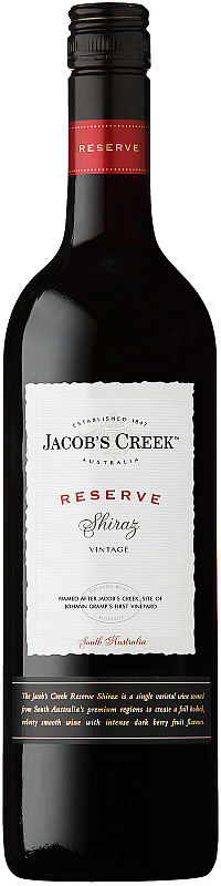
And as the rise of ‘branded’ wines continues apace, Europe has not been exempt. While the modern focus on branded wine tends to look across the Atlantic and ‘Down Under’ (Blossom Hill, Jacob’s Creek et al); Europe was first on the scene with Blue Nun back in the 1920s and le Piat D’or in the 1980s. Although the market for these wines declined as the New World took off, now names such as Campo Viejo have opened up the market for quality wine brands across Europe.

But establishing a pan-European brand, particularly in wine, is not without its problems. And you don’t have to be a big brand to appreciate that what works in one market may fall flat in another. For example: a wine that is seen in Germany as modern and youthful, may be seen as familiar and tired in Italy—or any number of variations on the theme.
So how can you create a single brand and packaging design that reconciles, addresses and perhaps in some cases, sets out to counter these perceptions?
Understanding is key
Understanding drinkers in each market is key, as well as looking at how wines are displayed and marketed—and even talked about. In France, brand names are irrelevant, as it’s all about the grape. But in the UK, we know that quite often brand names are relied on by less confident consumers.
So this insight means that something like ordering on labels is of key importance. So for example, in markets where variety is important, this will have to be prominently placed. But if a wine is also being sold in a market where the brand name is crucial, there will have to be a careful placing of both, with the two details prominent but nether dominating.
This is just one of dozens of insights that can impact on design of a wine for multiple markets.
Designers also need to consider what constitutes premium/youth/quality in each market. It’s at this point that you can discover incredible associations with things like typefaces, which can be perceived completely differently by different demographics in different countries.
Sometimes, a brand’s presence can be built by breaking rules. So a standard ‘Bordeaux’ style bottle will speak to traditionalists and those looking for a safe choice. Any deviation from this will make a wine stand out a great deal: potentially a good thing for those looking to create a strong brand. However—while this can be successful, gimmickry is never a good long-term strategy—particularly in something as central to a brand as pack structure.
There is no element of a design that does not make a difference in a project like this, and there’s no doubt that reconciling a wine brand design across multiple markets is a huge challenge. But get it right and you can be part of a huge and growing market.
About the Author

John Mathers currently holds position of Managing Director at London-based Holmes & Marchant. He was previously CEO at Enterprise IG (now The Brand Union) and has held similar posts at Fitch and Blue Marlin. He is also a former president of the Design Business Association, and is currently on the advisory board of DOTT Cornwall.