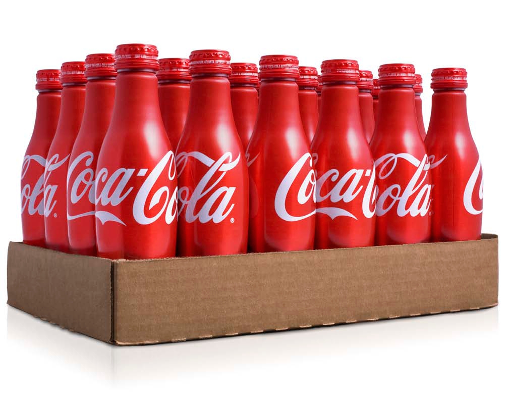
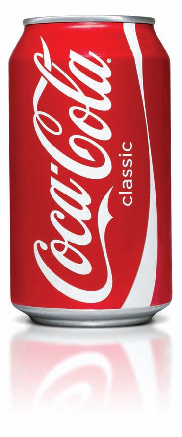
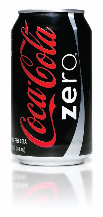
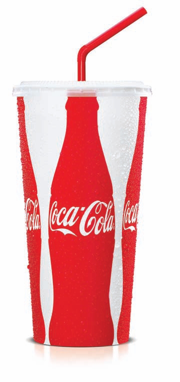
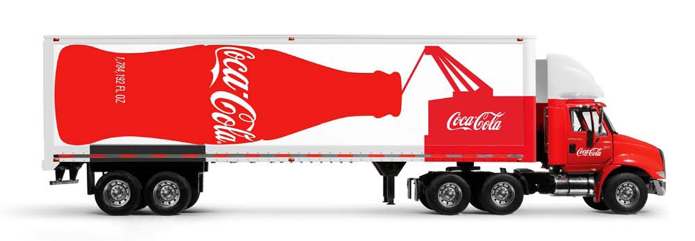
In yearly 2006 Turner Duckworth branding consultancy started redesigning Coca-Cola’s core range.
Challenge: Make Coke feel happy, fresh and honest again
Design strategy: Create emotional resonance with the fewest possible elements
Brand idea: Coke brings joy
Dates: 2006–present
3 core points:
- Clarity. Distill the brand to its essence. Present it in a dramatic and unexpected way. Simplicity clarifies brand relationships. If it doesn’t add anything we take it away
- Wit. The brand responds to its context making it relevant every time it appears
- Scale. Keeps the trademark fresh
Results
- Coke is starting to be known for great design again.
- We’ve consistently been awarded new projects including a rebrand of one of Coke’s majors.
- We’ve just won another Clio Award 2008, FAB Awards 2008 and Cannes Lions Advertising Awards 2008.

